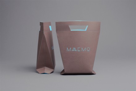
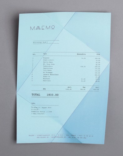
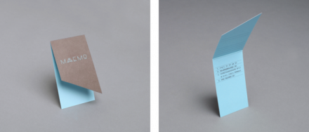
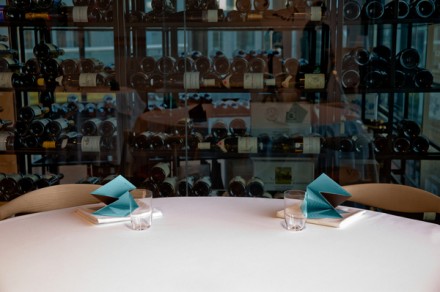
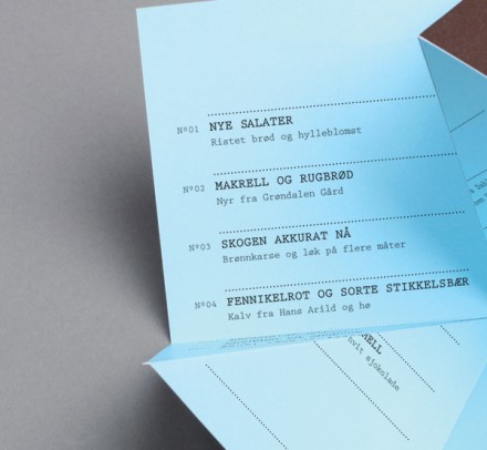
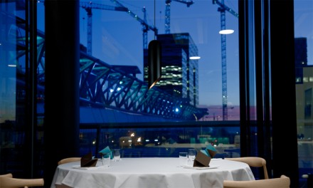
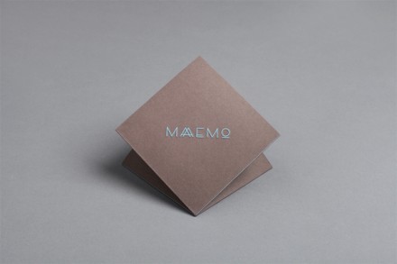
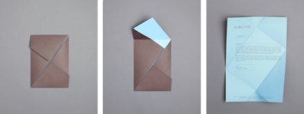
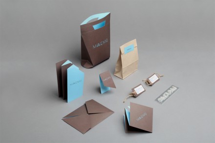
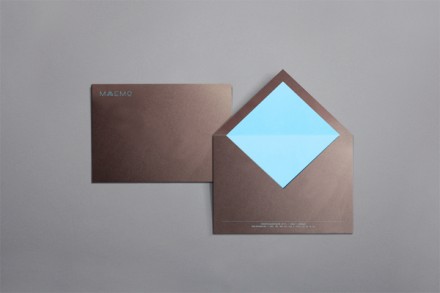
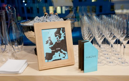
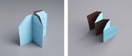
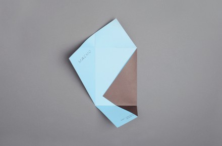
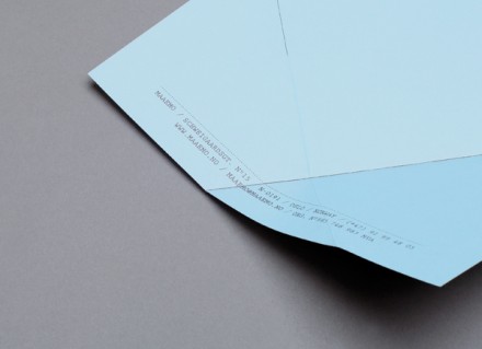
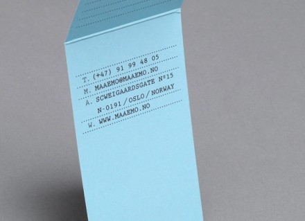
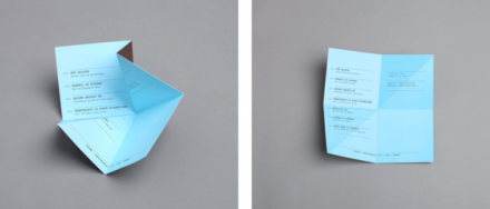
Scandinavia is known for it’s off-kilter styles especially to us Americans. However, they’re always pushing the boundaries of the “accepted” and innovating new ways of seeing, thinking and experiencing everyday things. Maaemo is a gourmet restaurant in Oslo and its brand identity pushes the boundaries with unique folding of the printed elements proving that design isn’t just about color and graphic treatments.
The team at Uniform Strategic Design talks about their work:
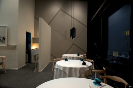
Maaemo is an ecological gourmet restaurant in Oslo, Norway. The cuisine of Maaemo is Nordic/Scandinavian, and the name derives from Finnish language meaning “Mother Earth”. The restaurant has a Norwegian owner, Danish cook and a Finnish sommelier, so it is truly a Scandinavian collaboration.
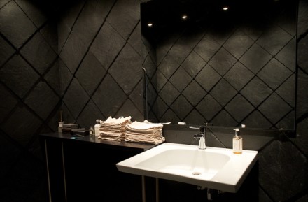
The design for Maaemo is inspired by Scandinavian nature and architecture. The design reflects on lines, shapes, rhythm and light creating a poetic, Nordic modernism.

