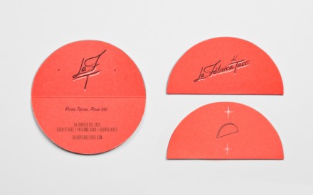
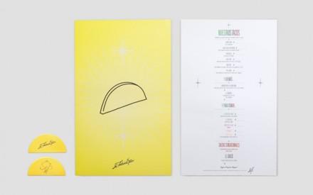
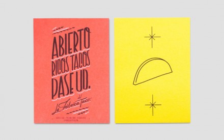
This yumminess hails from Argentina and was designed by the people at Anagrama. The La Fabrica Del Taco, or The Taco Factory, jumped out at me especially because of it’s business card design which folds just like a taco. Simple, but effective. Beyond that it has a sort of Luchador Wrestling kind of design style which brings in that Mexican feel.
The project is described by Anagrama:
This project, in collaboration with Lucas, was created for a Mexican restaurant in Argentina. It was a very gratifying project mainly because we consider our gastronomic tradition as one of the greatest Mexican cultural legacies which has become an ambassador our identity in other countries. Taking this into account, the design process was conceived adapting references from the Mexican pop culture, specifically, custom hand made signage which typically uses uses saturated neon colors, a very simple symbology and an ingeniously traced typography.

