There are so many articles written on the design of logos, restaurant logos and company logos. It’s like beating a dead horse, but I wanted to lay out how the logo plays into the rest of the elements that create a restaurant’s brand and identity.
Often times, a restaurant wants a logo to do much more than it should or effectively can. A lot is expected of our little friend The Logo and unfortunately her strength is in her simplicity. Maximum meaning, minimal means. Form follows function. These axioms hold especially true when it comes to logo design.
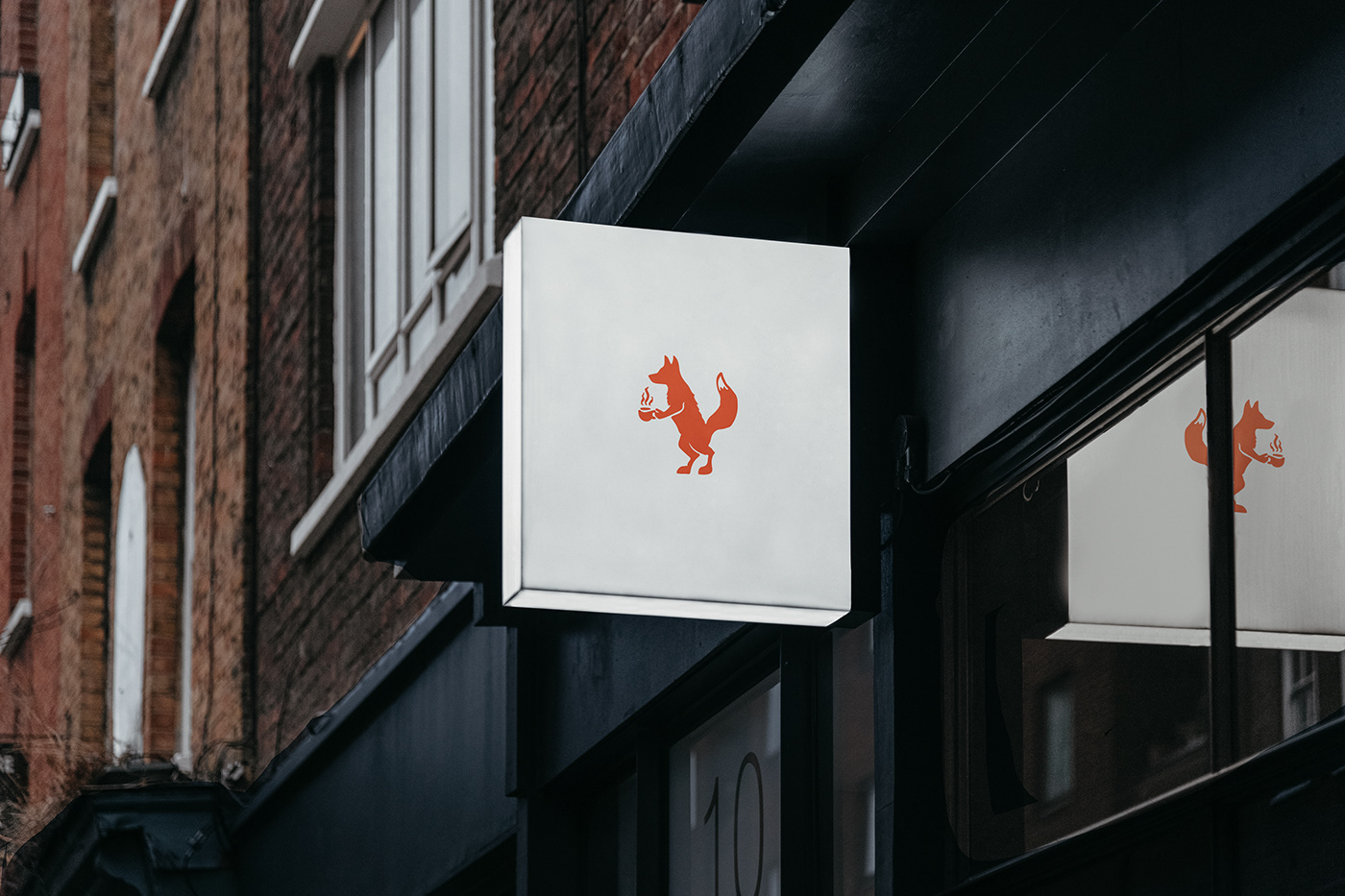
The core of logo design is inherently tied to the core of the brand. Every good brand can distill its experience into 1-3 words. Logically, that’s exactly where the beginning of designing a logo exists. 1-3 words. That’s all you can portray effectively with any logo: Especially a restaurant’s logo.
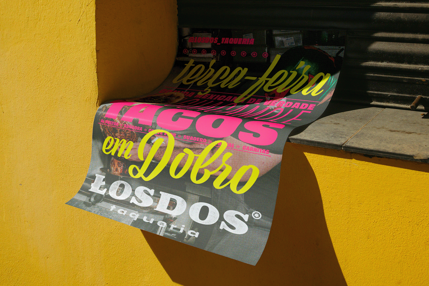
Your logo is the foundation, epicenter, center point of the rest of the visual identity and brand for the restaurant. Other elements stand on the logo and build upon it with graphic treatments and accouterments that extend the brand’s vibe and feel. I’m talking about photographic style, graphic elements, color palate, and the tone of writing all rest on the logo.
With all that strength and power I can see why most think a logo should be an illustration, but that’s not the case. Here are some things to avoid when designing your restaurant’s logo:
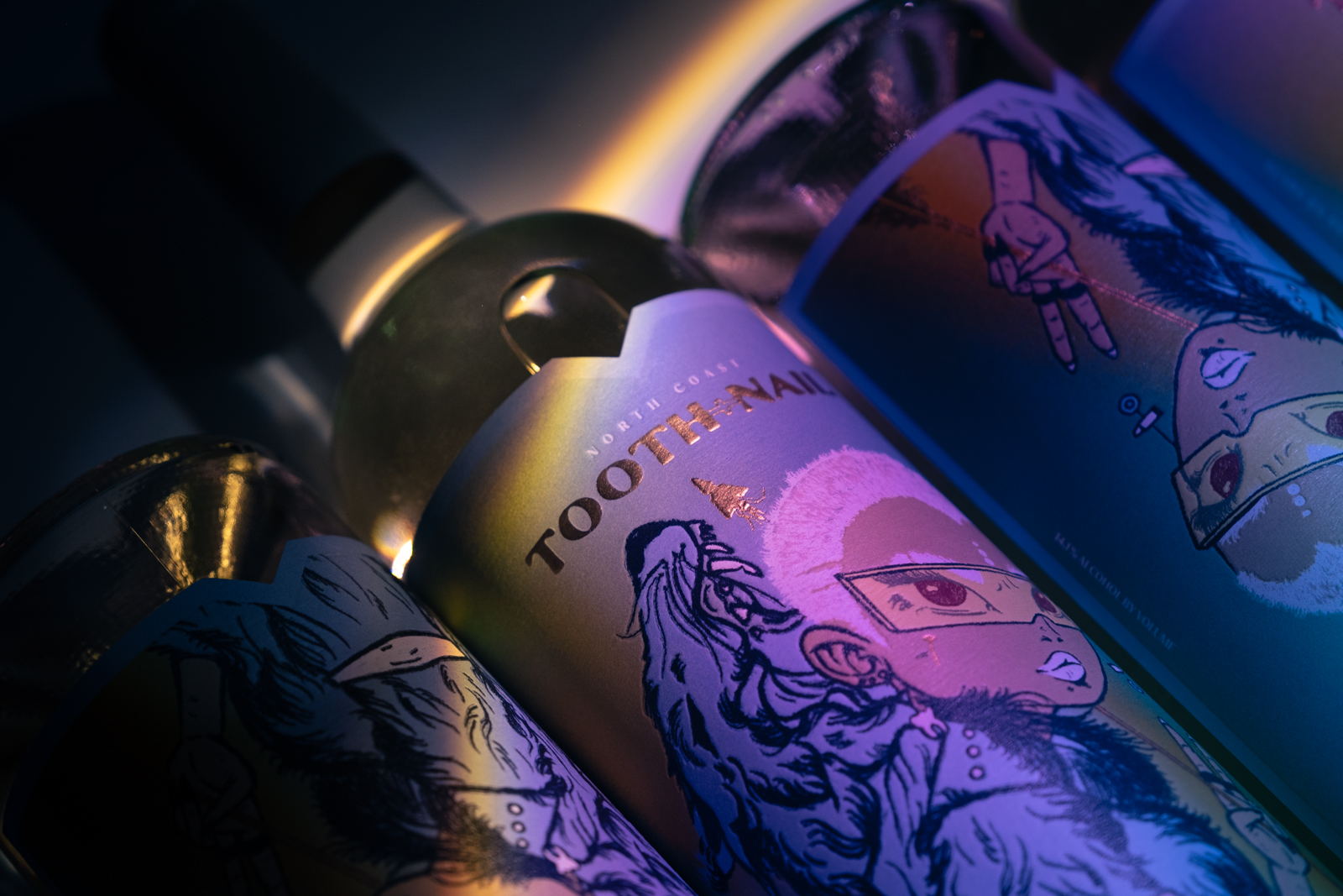
1. Detailed Illustration. It has no place in a logo. In the design of menus, on posters, ads? Yes. Definitely. Illustrations can be a unique way of positioning the vibe, but NOT in your logo.
2. The Mustache. “Unique Grillhouse & Bar/Club” or “Upscale Seafood Haven.” Look, it’s a good idea to use a positioning statement or mustache to give the restaurant a description, but your other marketing elements should do that job and therefore; you don’t need it when the logo is featured on those elements. IE: The menu has the food, do you really need to tell people what kind of restaurant you are when they’re looking at your menu? The outdoor signage? Yes, but it’s part of the actual sign DESIGN, not a part of the logo itself.
3. Clip Art. It’s not a logo. It’s garbage. Period.
There are a lot more things that are “no no’s” but these are some major, frequently seen atrocities. Stay away from them. Look at other restaurants on this blog and other blogs out there. See what constitutes good design. Define your brand in 1-3 words and have a designer follow it like a religion.
What are some horrible logos you’ve seen?

