The team at Concrete put together a phenomenal, chocolately brand identity for this dessert shop restaurant, Xococava. Rather than summarizing myself, I’ll post their description as they nailed it.
Xococava (pronounced shoco-cava), an extension of its big brother restaurant, Cava, is whimsical hybrid of a stand-up tapas bar crossed with an ice-cream parlour. Inspired by Spanish and Mexican cultures of chocolate and Italy’s love affair with gelato, Xococava features artisanal ice cream and hand-made chocolate. With such unusual creations as prune/Pedro Ximenez sherry ice cream and choriso, dark chocolate truffles, the store caters to Toronto’s burgeoning “foodie” culture.
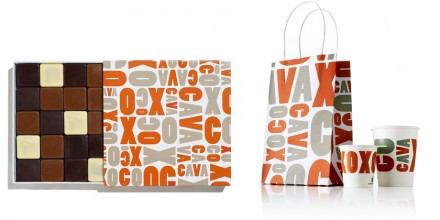
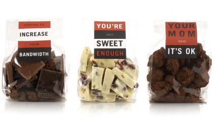
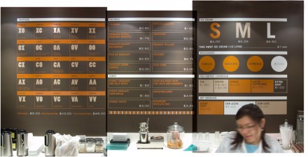
The identity’s thick typography and strong colors make it pop and scream “dessert” without bludgeoning the viewer with visual cliché. It’s alternating color treatment implies choices and options. I especially appreciate how the logo expands into a pattern/texture on other applications whereas things get simpler in other areas for readability. The sister store, Cava, was covered earlier this year.


