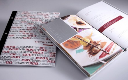
Metro Buffet & Grille Restaurant Branding

The brand for Metro Buffet & Grill is driven by photography, great photography. With a strong black, white, and red color palette it gives off a clean, crisp feel which are elements not usually found in your traditional buffet setting. I like the way the Asian characters follow the same style as the typeface used throughout. It adds continuity not often seen and not easily executed. Designed by Power Point Creative.

Discuss this Project

Leave a Reply

This site uses Akismet to reduce spam. Learn how your comment data is processed.

The Forktales Podcast™: Interviews with restaurant industry leaders and visionaries

Restaurant and advertising industry headlines and thinking

Reviews of restaurant experiences from around the globe 

Reviews of our favorite design, business, & restaurant books

Our favorite typography and fonts

Inspiration in your inbox

Get the latest inspiration in your inbox every Monday morning, for FREE!

"*" indicates required fields

This field is for validation purposes and should be left unchanged.

Delicious Bits in your Inbox!

Get the latest and greatest content delivered to your inbox for free!

"*" indicates required fields

This field is for validation purposes and should be left unchanged.