Crazy Chaos Meets Simple and Clean

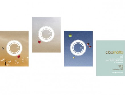
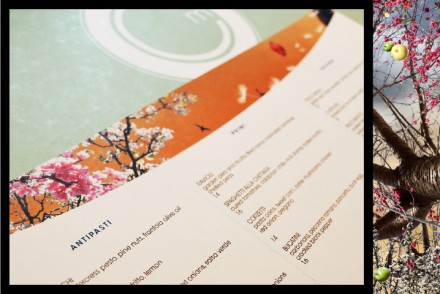
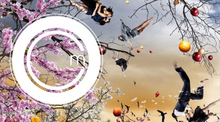
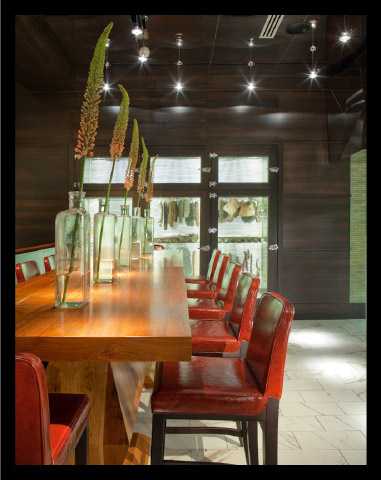
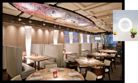
More brilliant work from Boy Burns Barn for Chicago’s Cibo Matto, an Italian eatery billing itself as an ultra-modern place. The great twist on what BBB did for Cibo Matto is take the literal translation of the Italian meaning for “cibo matto” and apply it to the branding and design of the concept and the restaurant. It translates to “crazy food” and Cibo Matto employs the crazy in some of their design, including the ceiling mural with dancers, flying fruit and nature. The design of the logo is clean and simple, drawing in customers with its intrigue without standing in front of the food.

04cibo

05cibo

01cibo

02cibo

03cibo

Discuss this Project

Leave a Reply

This site uses Akismet to reduce spam. Learn how your comment data is processed.

The Forktales Podcast™: Interviews with restaurant industry leaders and visionaries

Restaurant and advertising industry headlines and thinking

Reviews of restaurant experiences from around the globe 

Reviews of our favorite design, business, & restaurant books

Our favorite typography and fonts

Inspiration in your inbox

Get the latest inspiration in your inbox every Monday morning, for FREE!

"*" indicates required fields

This field is for validation purposes and should be left unchanged.

Delicious Bits in your Inbox!

Get the latest and greatest content delivered to your inbox for free!

"*" indicates required fields

This field is for validation purposes and should be left unchanged.