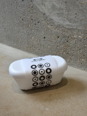
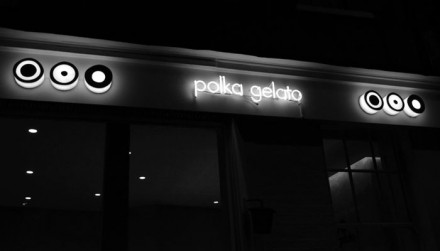
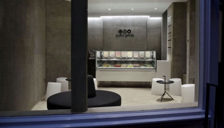
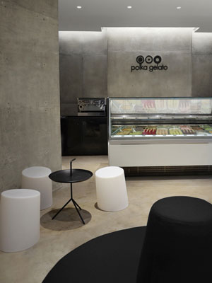
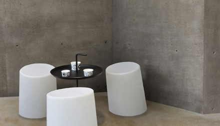
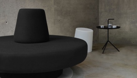
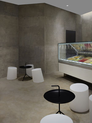
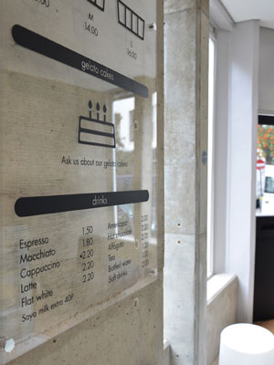
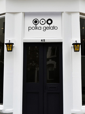
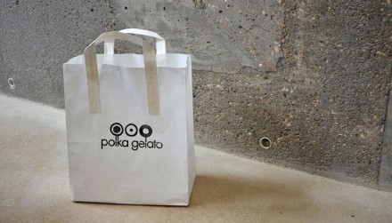
An ice cream shop doesn’t have to be filled with pastels or neons. Ice cream is fun enough as it is, there’s often no need to window dress a delicious treat if it can stand on its own. Vonsung designed the branding of UK gelato shop Polka Gelato and though it’s now closed, they did a great job presenting the marketplace with a change of pace. Centered around the monochromatic black and white color scheme, Polka Gelato features a polka dot theme filled with various shadings. The interiors of PK are where things get really interesting. Filled with concrete and abstract-inspired, modern seating spaces, the shop inspires an economical luxury and a design that is consistent with the historic building they were located in. Economical ice cream is easy to come by, but it’s not often you find a place serving up scoops inside a space that looks like it came from the mind of an art-house collective.

215-03-polka

215-04-polka

215-05-polka

215-06-polka

215-07-polka

215-08-polka

215-09-polka

215-10-polka

215-11-polka

511-01-polka

511-02-polka

511-03-polka

511-04-polka

511-05-polka

511-06-polka

511-07-polka

215-01-polka

215-02-polka

Discuss this Project

Leave a Reply

This site uses Akismet to reduce spam. Learn how your comment data is processed.

The Forktales Podcast™: Interviews with restaurant industry leaders and visionaries

Restaurant and advertising industry headlines and thinking

Reviews of restaurant experiences from around the globe 

Reviews of our favorite design, business, & restaurant books

Our favorite typography and fonts

Inspiration in your inbox

Get the latest inspiration in your inbox every Monday morning, for FREE!

"*" indicates required fields

This field is for validation purposes and should be left unchanged.

Delicious Bits in your Inbox!

Get the latest and greatest content delivered to your inbox for free!

"*" indicates required fields

This field is for validation purposes and should be left unchanged.