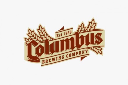
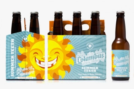
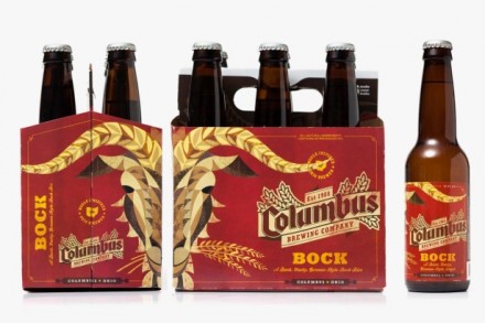
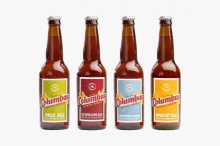
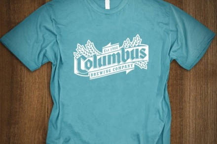
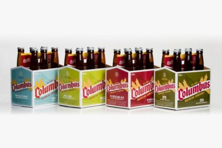
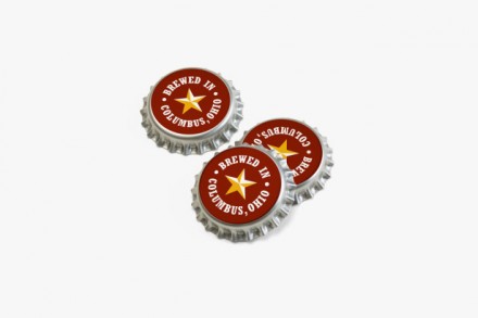
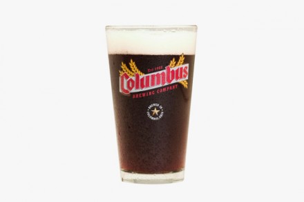
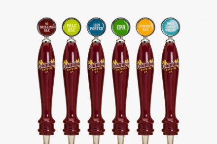
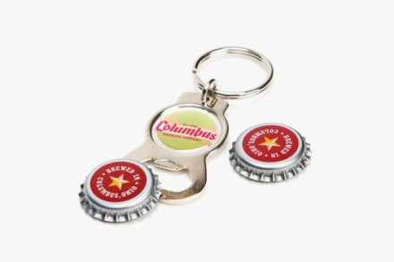
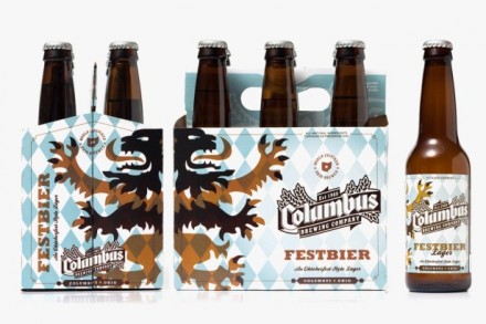
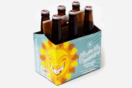
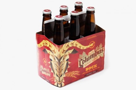
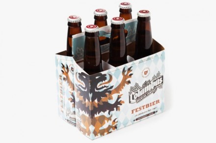
Under new ownership, Columbus Brewing Co. wanted a significant facelift, the kind of thing that would remind the residents in Ohio that they were in fact still brewing and serving beer. The new brandmark and corresponding brand appearance was expected to breathe new life into the brand and it did just that, with sales increasing by 50 percent in the first week of launch. I like what Jeremy Slagle did with the brand, giving it a heritage and making it a product that is unique and local and therefore something to be proud of. I love the hand-drawn imagery connected to each individual brew and the font that was selected for the logo is a good choice. It reflects the Midwestern vibe that Columbus natives seem to have a lot of pride in. They love their beer in that part of the country and I think choosing a vibe for the logo that demonstrates a link to the past was a smart choice. They’ve balanced nicely the line between heritage and hard-working beer brand with the light-hearted and modern side of life. It’s a brand that is in touch with the past but shows it’s still got some surprises.