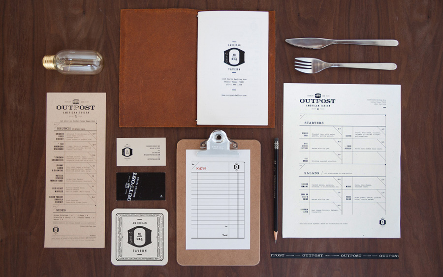
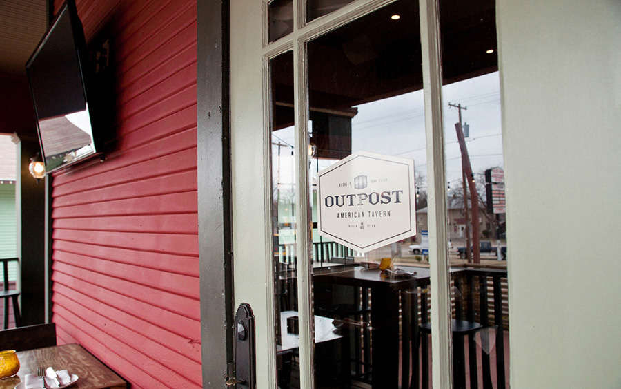
I have always respected the work of Foundry Collective. They certainly have a way of interpreting a restaurant’s true brand by creating new, approachable experiences. Outpost Tavern’s identity features their attention to detail and unique touch.

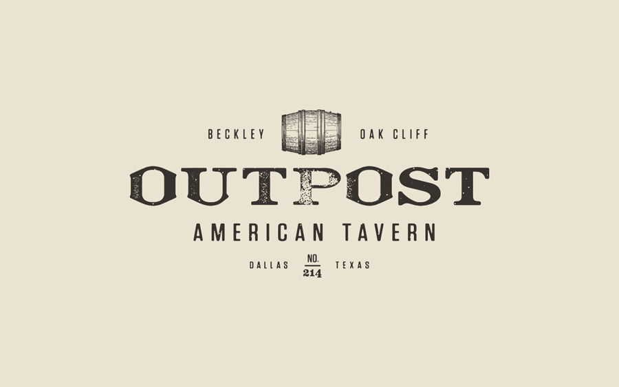
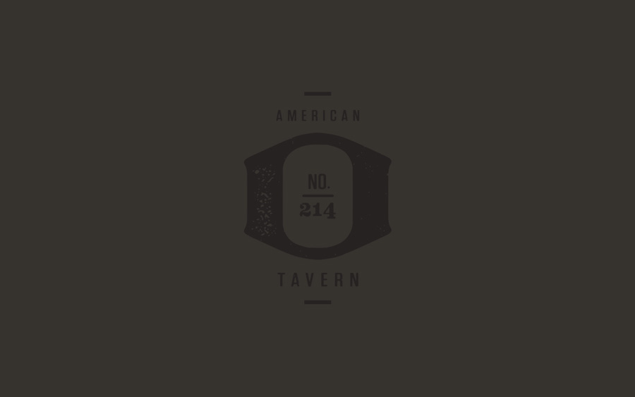
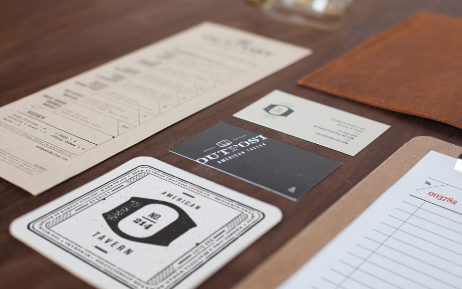
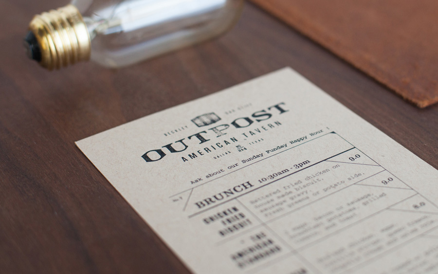
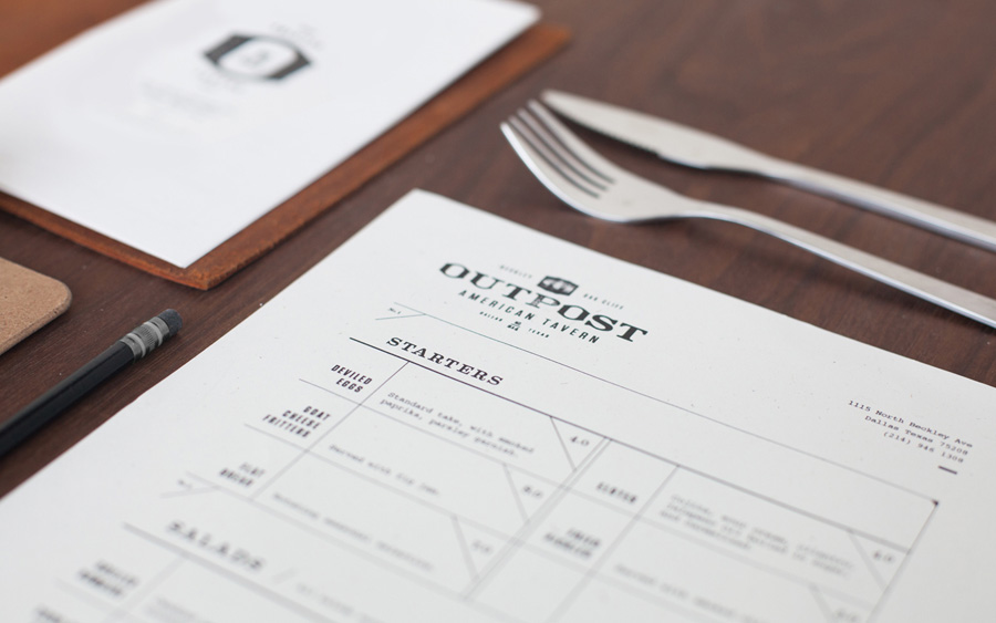
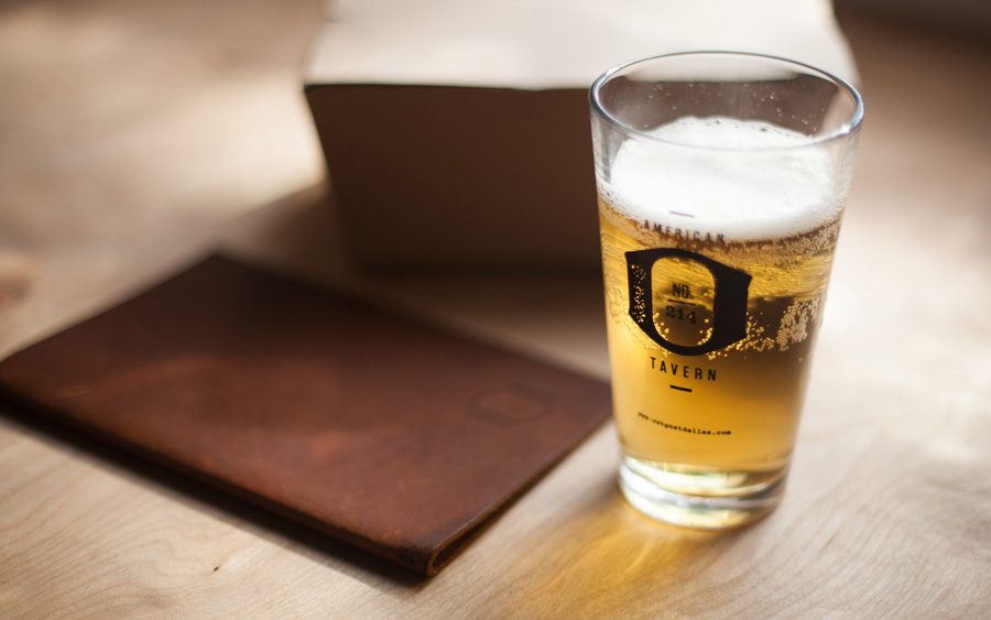
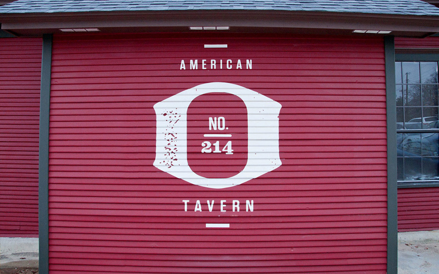
The team leverages the “O” form in a custom typeface that portrays the old-western style without being overdone, or cliche. This type turned mark it easily recognizable as it extends the brand’s identity throughout multiple touch points.

Old woodcut style illustrations and distressed treatments on type and graphic add that rustic touch one would expect from the concept’s offering. The use of old fashioned, classic ledger lines and treatments further roots the brand in the old west.

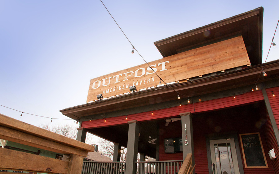
Interiors and exteriors designed by Coeval Studio.

foundryco-mrcup-17

foundryco-mrcup-18

foundryco-mrcup-19

foundryco-mrcup-20

foundryco-mrcup-21

foundryco-mrcup-22

foundryco-mrcup-23

foundryco-mrcup-24

foundryco-mrcup-25

foundryco-mrcup-26

Discuss this Project

Leave a Reply

This site uses Akismet to reduce spam. Learn how your comment data is processed.

The Forktales Podcast™: Interviews with restaurant industry leaders and visionaries

Restaurant and advertising industry headlines and thinking

Reviews of restaurant experiences from around the globe 

Reviews of our favorite design, business, & restaurant books

Our favorite typography and fonts

Inspiration in your inbox

Get the latest inspiration in your inbox every Monday morning, for FREE!

"*" indicates required fields

This field is for validation purposes and should be left unchanged.

Delicious Bits in your Inbox!

Get the latest and greatest content delivered to your inbox for free!

"*" indicates required fields

This field is for validation purposes and should be left unchanged.