A unique twist on a pretzel brand

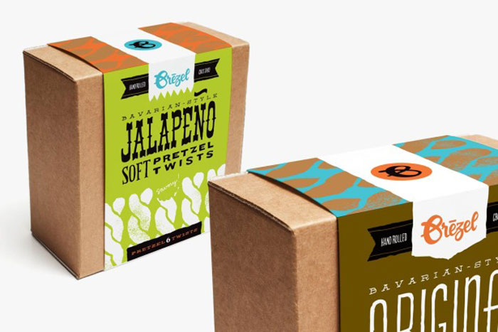
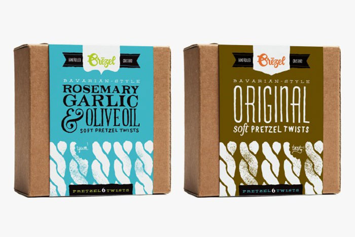
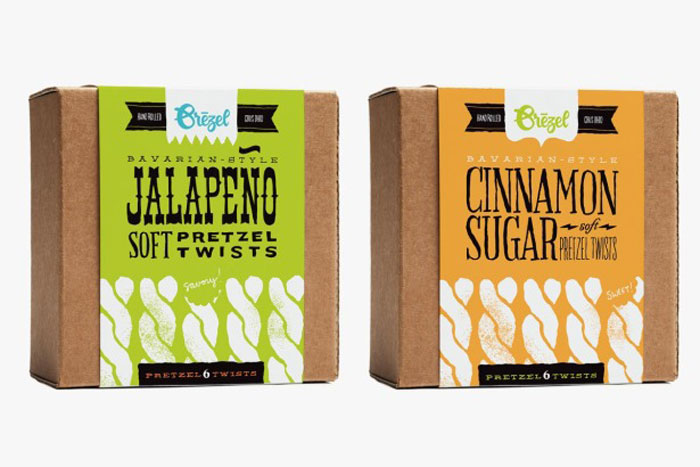
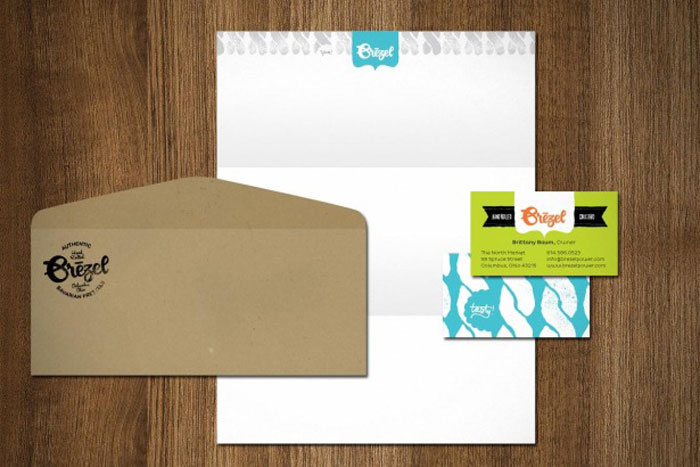
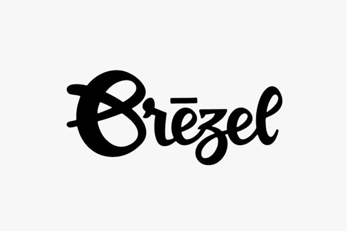
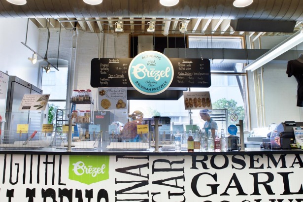
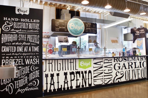
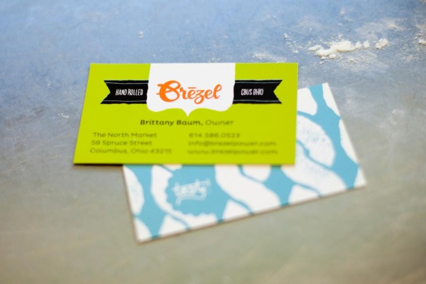
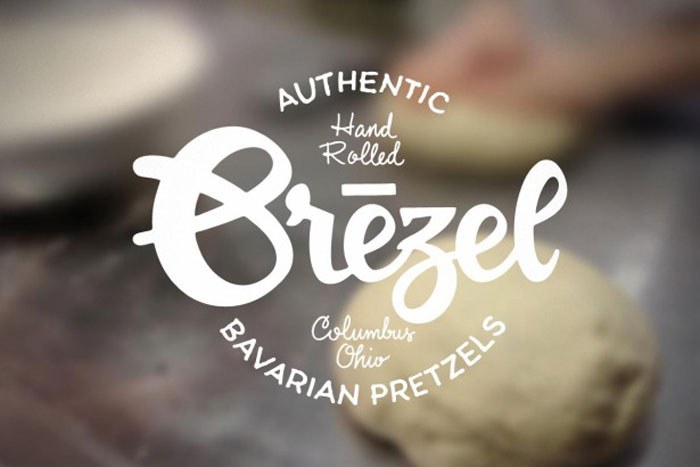
Pretzel’s are a twisted type of baked good. Pun intended. This identity designed by Jeremy Slagle leverages smooth typographic selections, customized logotype and some awesome patterns and colors to standout and step away from a typical snack package design.

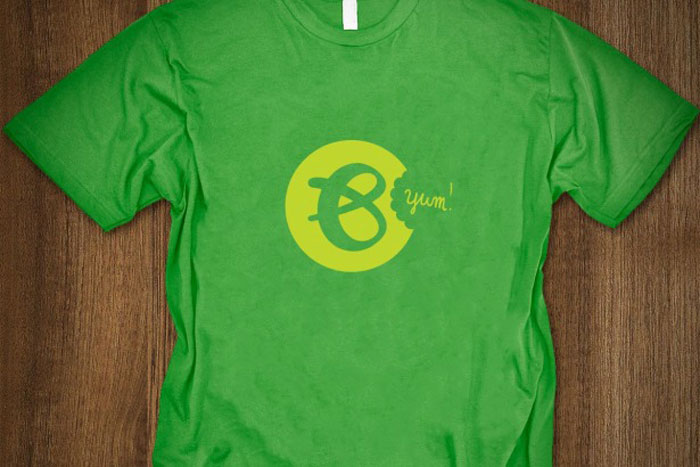
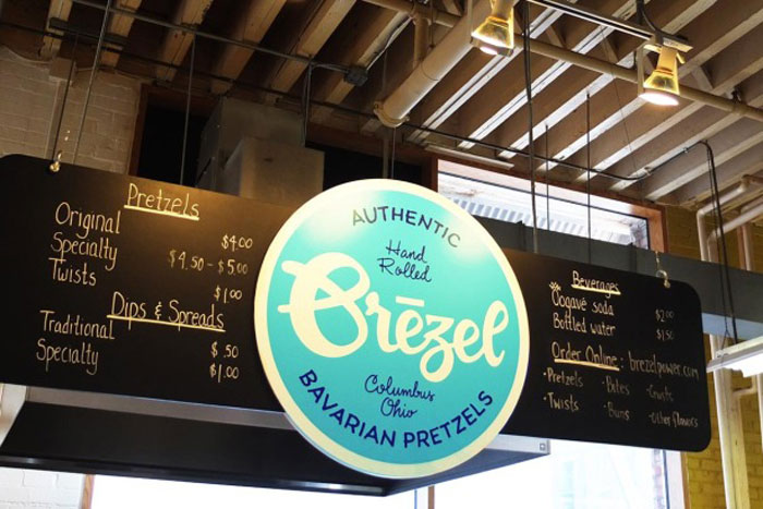
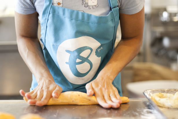
A lot of times it’s easy to choose a typeface and tweak it a bit to have some visual metaphor that sticks with a consumer. However, Slagle takes it much further by custom drawing a typeface that matches the “B” pretzel formation. This makes for a truly unique logo that sets the bar high for other brand touch points for the pretzel stand storefront and packaging.

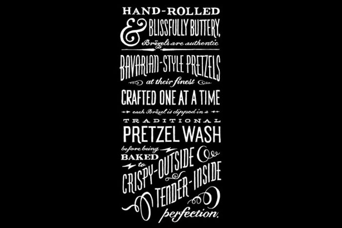
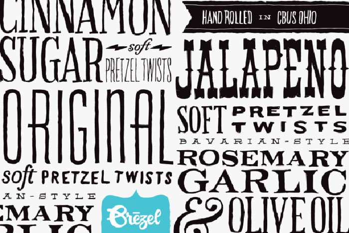
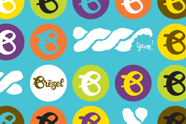
The brand comes to life as the designer uses handdrawn typefaces as textures, patterns and colors as a device to standout from other stands, and fun, playful graphics.

02_7_13_brezel_2

02_7_13_brezel_3

02_7_13_brezel_4

02_7_13_brezel_5

02_7_13_brezel_6

02_7_13_brezel_7

02_7_13_brezel_8

02_7_13_brezel_9

brezel_12

brezel_13

brezel_14

brezel_15

02_7_13_brezel_10

02_7_13_brezel_11

brezel_4

Discuss this Project

Leave a Reply

This site uses Akismet to reduce spam. Learn how your comment data is processed.

The Forktales Podcast™: Interviews with restaurant industry leaders and visionaries

Restaurant and advertising industry headlines and thinking

Reviews of restaurant experiences from around the globe 

Reviews of our favorite design, business, & restaurant books

Our favorite typography and fonts

Inspiration in your inbox

Get the latest inspiration in your inbox every Monday morning, for FREE!

"*" indicates required fields

This field is for validation purposes and should be left unchanged.

Delicious Bits in your Inbox!

Get the latest and greatest content delivered to your inbox for free!

"*" indicates required fields

This field is for validation purposes and should be left unchanged.