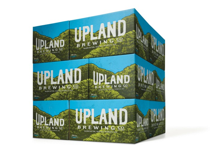
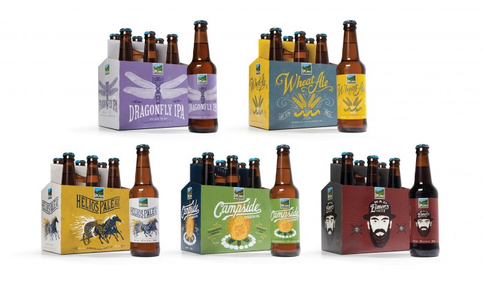
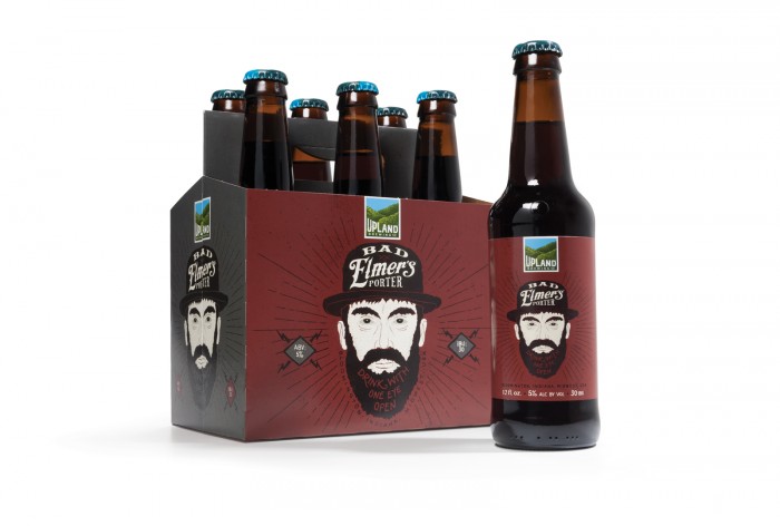
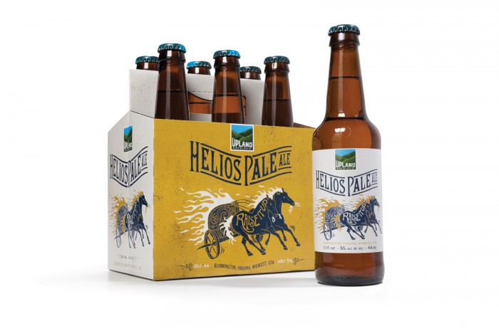
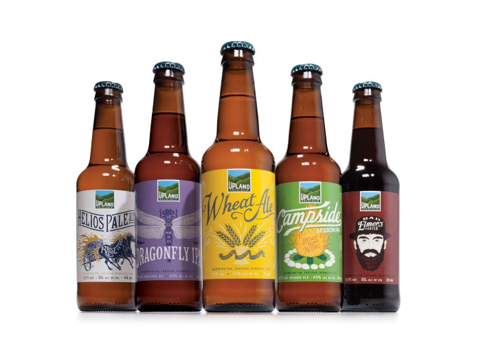
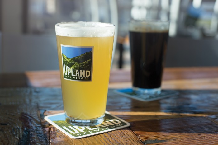
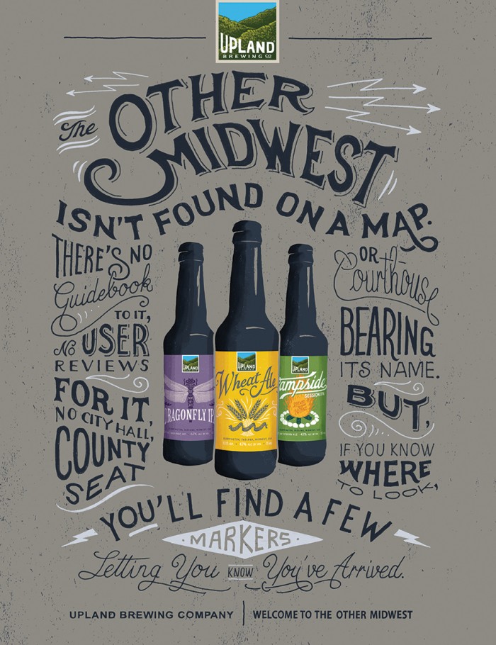
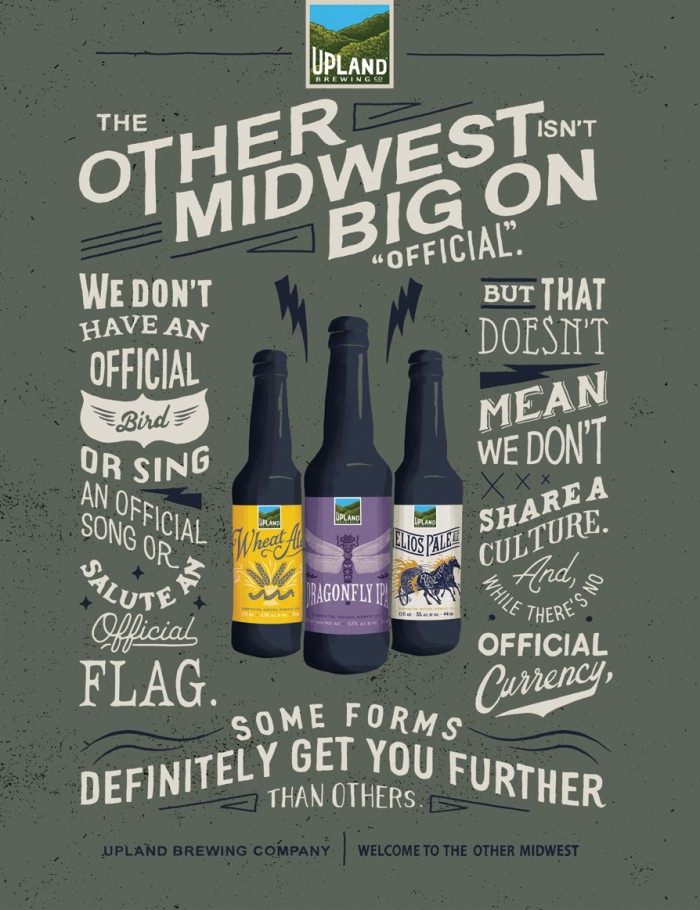
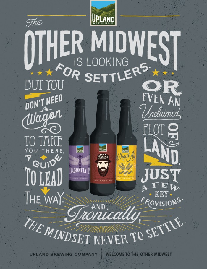
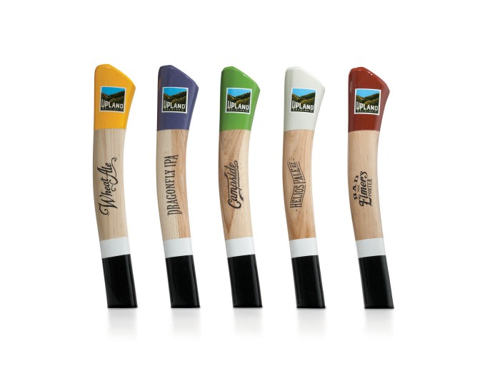
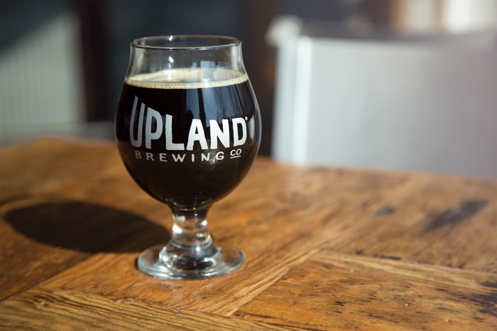
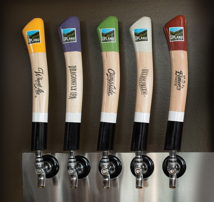
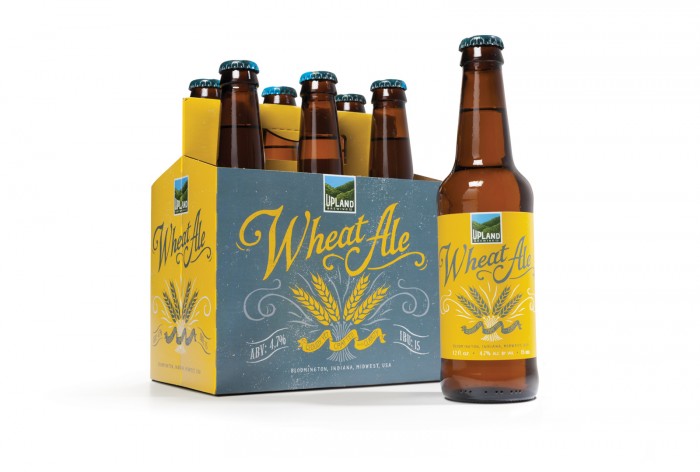
The team at Young & Laramore endeavored to rebrand the Upland Brewing Company with a fresh new look spanning from brand logo to tap handles and more. The new look is an exercise in hand crafted goodness with excellent illustrations accompanied by hand drawn typography. A unique color palette sets each beer category apart from the other while the overall image stays anchored in the handcrafted identity. Here’s what the team had to say about the project:

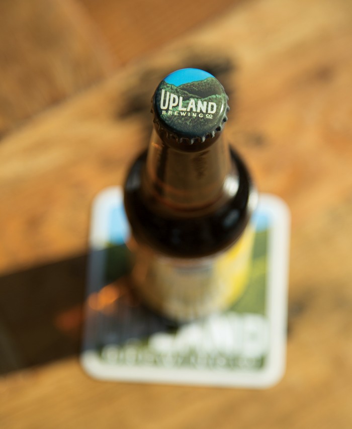
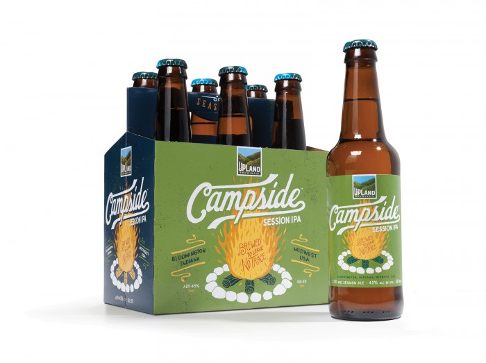
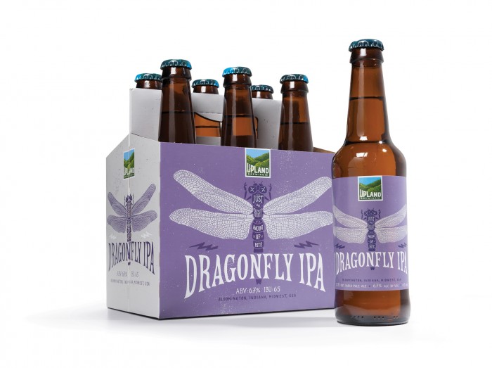
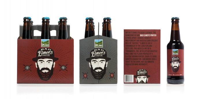
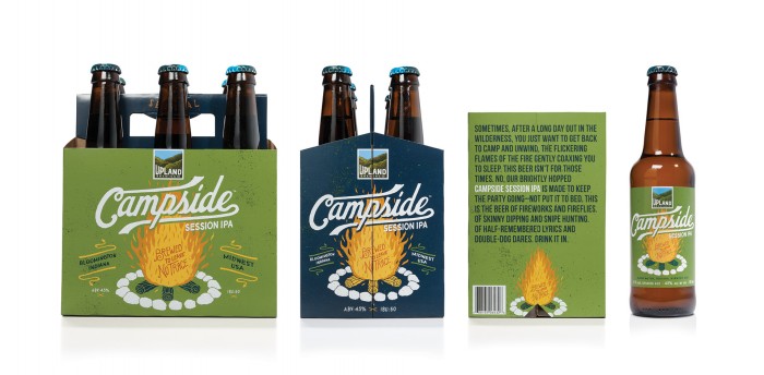
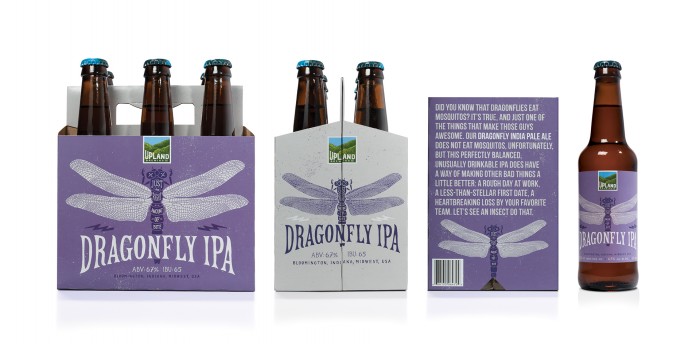
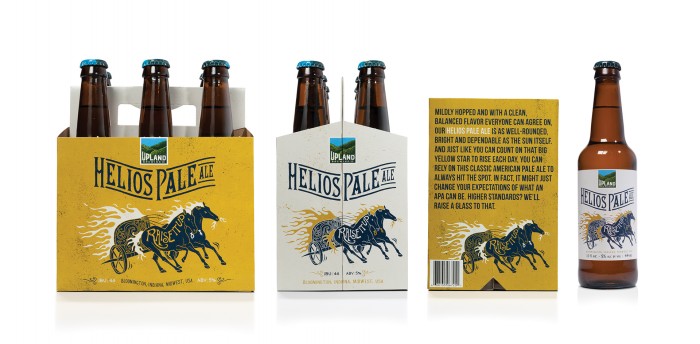
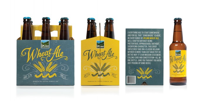
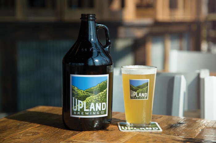
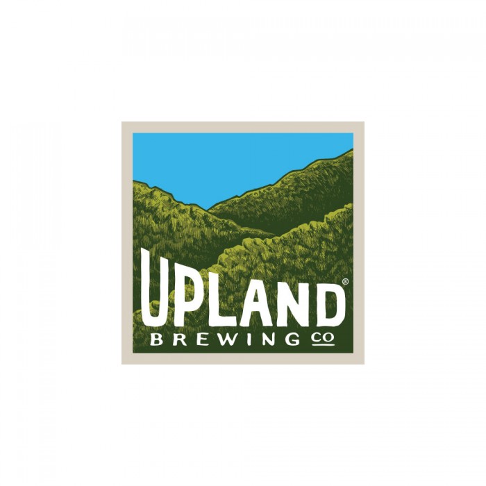
The hand-crafted nature of the beer is reflected in the extensive use of hand-lettered type and illustrations, whether in the distinctive hills logo, or in the packaging and related materials.

The personality of the company, meanwhile, comes through in the descriptions of each beer that accompany the illustrations (Dragonfly IPA: “Just the right amount of bite”), as well as a longer story about each beer on the bottom of its carrier.

24PK_Stacked

All6pkbottle

BAD_ELMERS_PORTER_6PK

Bottlecap

CAMPSIDE_6PK

DRAGONFLY_6PK

Family_BadElmers

Family_Campside

Family_Dragonfly

Family_Helios

Family_Wheat

Growler

HELIOS_PALE_ALE_6PK

Hero_Bottles

PintGlass

Print1

Print2

Print3

TapHandles

UplandLogo

UplandSnifter

UplandTapHandles

WHEAT_ALE_6PK

Discuss this Project

Leave a Reply

This site uses Akismet to reduce spam. Learn how your comment data is processed.

The Forktales Podcast™: Interviews with restaurant industry leaders and visionaries

Restaurant and advertising industry headlines and thinking

Reviews of restaurant experiences from around the globe 

Reviews of our favorite design, business, & restaurant books

Our favorite typography and fonts

Inspiration in your inbox

Get the latest inspiration in your inbox every Monday morning, for FREE!

"*" indicates required fields

This field is for validation purposes and should be left unchanged.

Delicious Bits in your Inbox!

Get the latest and greatest content delivered to your inbox for free!

"*" indicates required fields

This field is for validation purposes and should be left unchanged.