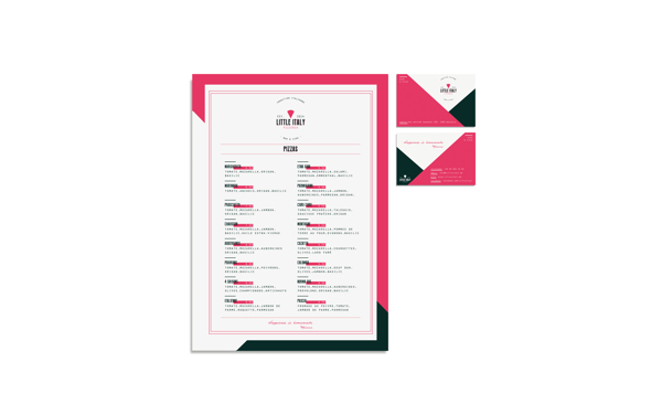
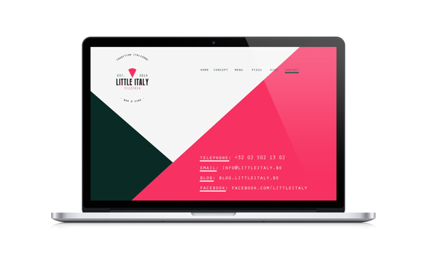
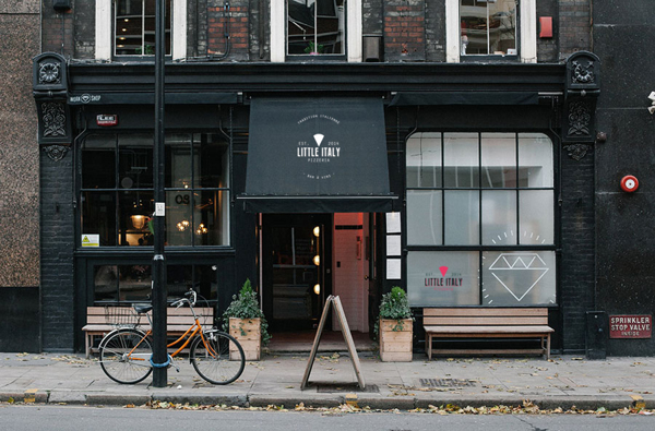
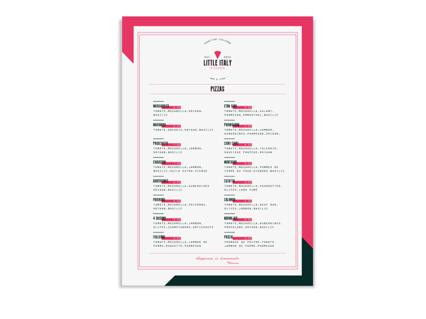
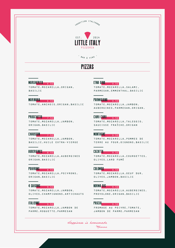
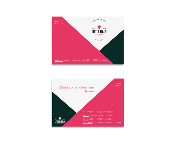
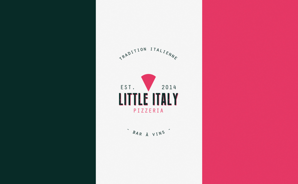
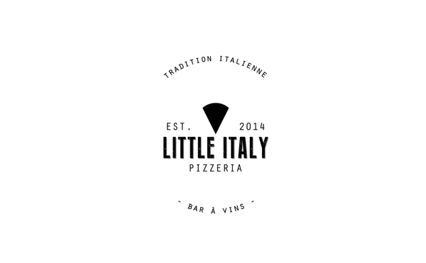
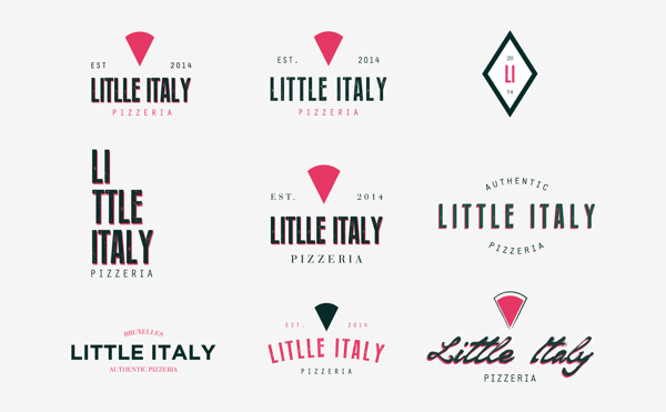
What’s really working for me on this restaurant’s brand identity design is the color choices. The layouts and typography are great, but the color choices are awesome. Instead of falling into the cliché red, green and white that define every pizza shop from Atlanta to Alaska, Dimitris Kostinis chose variations in those hues that make it pop without losing the Italian heritage. It’s truly a new vibe for an old-world cuisine.

a7b7dcb13bcd10c5f4257feb8dc72437

04f316b8702a23c6cd30b1fc4bf04a94

73a61c6ff06ec4cd02bd0c0b79ed6451

3a1e3a9a3bcf93f3a768a8328dd372d6

RVB de base

95a461129bcbec0241f6f7f8c79d8088

1bb4112313092f7e33432c8a09e0104c

e050a1725170a8dfdc045ccb7163ee19

2ff4a855e6a8a3b757db19018d5bdb5b

Discuss this Project

Leave a Reply

This site uses Akismet to reduce spam. Learn how your comment data is processed.

The Forktales Podcast™: Interviews with restaurant industry leaders and visionaries

Restaurant and advertising industry headlines and thinking

Reviews of restaurant experiences from around the globe 

Reviews of our favorite design, business, & restaurant books

Our favorite typography and fonts

Inspiration in your inbox

Get the latest inspiration in your inbox every Monday morning, for FREE!

"*" indicates required fields

This field is for validation purposes and should be left unchanged.

Delicious Bits in your Inbox!

Get the latest and greatest content delivered to your inbox for free!

"*" indicates required fields

This field is for validation purposes and should be left unchanged.