El Paso Chile Co packaging and branding

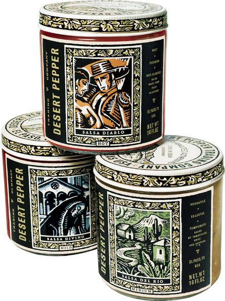
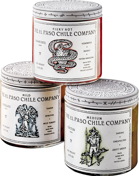
Charles S Anderson crafted the new packaging and branding for the El Paso Chile Company. The identity features hand drawn, distressed style illustrations that evoke the feeling of the southwest. With authentic naturally distressed paper textures and an earthy color palette, the identity for El Paso Chile Company comes together quite nicely. It wasn’t all by chance. The team traveled to Texas to take a donkey ride through the desert by request of this uber-eccentric client.

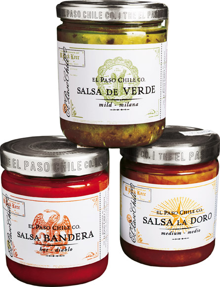
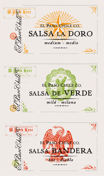
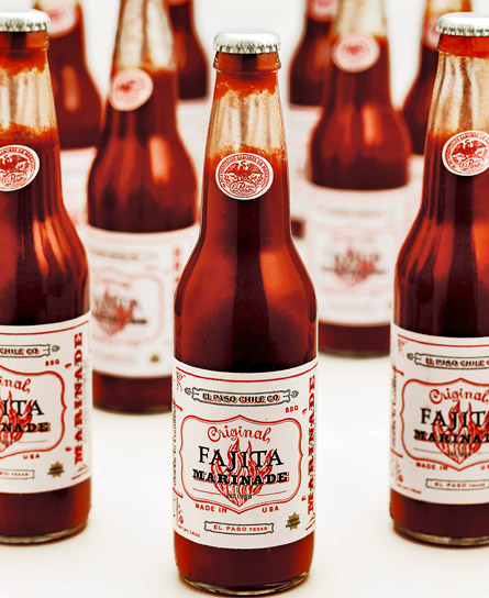
In addition to packaging for their line of salsas, we also worked on naming. After rejecting names like “Gasping Gringo” and “Exploding Armadillo,” we finally settled on Salsa Del Rio, Salsa Diablo and Salsa Divino. To convey authenticity, for his new fajita marinade, we packaged it in Mexican beer bottles with label art built from pieces of printed scrap unearthed from flea markets in Mexico City.

elpaso_salsa_shot3

elpaso_salsa_shot2

elpaso_salsa_shot1


elpaso_salsa_labels

elpaso_fajita_shot1

elpaso_fajita_logo

Discuss this Project

Leave a Reply

This site uses Akismet to reduce spam. Learn how your comment data is processed.

The Forktales Podcast™: Interviews with restaurant industry leaders and visionaries

Restaurant and advertising industry headlines and thinking

Reviews of restaurant experiences from around the globe 

Reviews of our favorite design, business, & restaurant books

Our favorite typography and fonts

Inspiration in your inbox

Get the latest inspiration in your inbox every Monday morning, for FREE!

"*" indicates required fields

This field is for validation purposes and should be left unchanged.

Delicious Bits in your Inbox!

Get the latest and greatest content delivered to your inbox for free!

"*" indicates required fields

This field is for validation purposes and should be left unchanged.