The Primal Kitchen branding

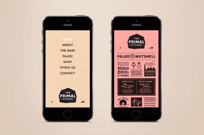
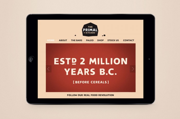
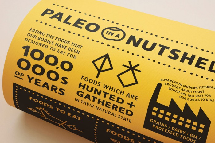
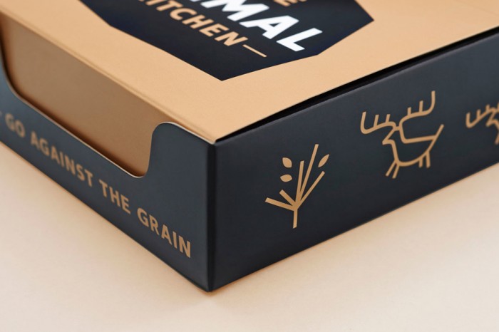
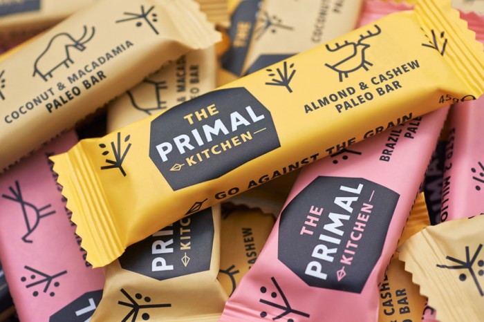
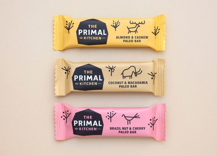
The brand identity and packaging design for The Primal Kitchen, a paleo only snack company, is marked by pastel, natural colors and strong typography. Simple line-based illustrations help pull together the graphic language keeping true to simple, natural tone as they pull inspiration from cave drawings. An excellent modernization of what defines “paleo.” Designed by Midday.

08-The-Primal-Kitchen-Website-Midday-BPO

07-The-Primal-Kitchen-Website-Midday-BPO

06-The-Primal-Kitchen-Print-Midday-BPO

03-The-Primal-Kitchen-Packaging-Midday-BPO

04-The-Primal-Kitchen-Packaging-Midday-BPO

02-The-Primal-Kitchen-Packaging-Midday-BPO

00-The-Primal-Kitchen-Logo-Midday-BPO

Discuss this Project

Leave a Reply

This site uses Akismet to reduce spam. Learn how your comment data is processed.

The Forktales Podcast™: Interviews with restaurant industry leaders and visionaries

Restaurant and advertising industry headlines and thinking

Reviews of restaurant experiences from around the globe 

Reviews of our favorite design, business, & restaurant books

Our favorite typography and fonts

Inspiration in your inbox

Get the latest inspiration in your inbox every Monday morning, for FREE!

"*" indicates required fields

This field is for validation purposes and should be left unchanged.

Delicious Bits in your Inbox!

Get the latest and greatest content delivered to your inbox for free!

"*" indicates required fields

This field is for validation purposes and should be left unchanged.