
Identity design can be an extremely subjective endeavor for any company. With the highly competitive nature of the industry, a restaurant’s identity can be a make or break decision. That’s why it’s important that design be rooted in objective facts. What’s the company’s mission, it’s attitude, it’s personality? These questions and more need to be not only answered, but pumped throughout every artery, vein and capillary of the restaurant’s organization. Then, and only then, can visual design resonate appropriately. Otherwise we’re just a bunch of graphic decorators arguing over whether or not our Mona Lisa is smiling.
The restaurant industry runs rampant with many brands. Some are designed quite well, others could use a crash course in basic principles of good design. What I’ve seen over the years is forward thinking brands who value design pushing ever closer towards simplification of their restaurant’s brand logo. The reason for this push is clear: The simpler the logo, the quicker a person will recognize it. That’s design 101.
These brands have been on a journey simplify their logos into the most minimal form possible. It makes it easier to extrapolate visually, while reinforcing their brand’s attitude and personality. Let’s take a deeper look at each of the major restaurant chains who are pushing ever closer to their simplest forms.
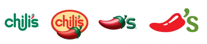
Chili’s restaurant brand evolution. Chili’s started with an excellent typographic treatment that incorporated a chili in place of an apostrophe. The natural progression for the brand was to inch closer to the graphic representation of the brand name. Over the years they moved closer and closer to this ideal. Currently their brand identity is spearheaded by the flat graphic chili brandmark.
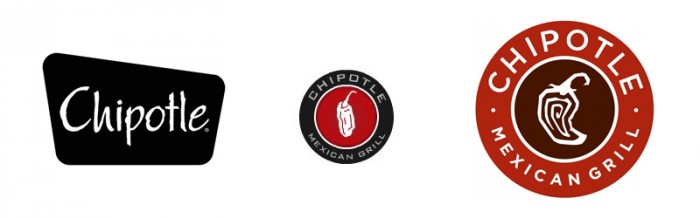
Chipotle’s restaurant brand evolution. Yes, even the model for every fast casual visionary recognizes the need to move towards a graphic representation of their brand. In their short lifespan, Chipotle has moved from a logotype using an overused typeface to a concise circular lockup leveraging excellent type and a semi-zany pepper design. It’s easy to see they are inching closer to a pepper graphic as their brand’s mark.
![]()
Domino’s restaurant brand evolution. It’s not all about peppers. The pizza industry also understands the need for quick brand recognition. Domino’s pizza has been tweaking their logo towards simplification landing them in their current rendition where the domino graphic is simple and recognizable. It’s already being used separate from the logotype in certain instances establishing the brand’s strength.
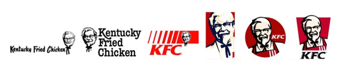
KFC’s restaurant brand evolution. Who doesn’t love the colonel? Kentucky Fried Chicken has been building towards a simpler, cleaner look over the years opting for their streamlined colonel illustration and a brand abbreviation. The look establishes familiarity and approachability while setting it aside from competing brands.
![]()
McDonald’s restaurant brand evolution. Mickey D’s is constantly evolving their brand logo towards simplification. Their iconoclastic golden arches is one of the most recognized brands in the world; with good reason. Currently the restaurant really doesn’t need a logotype to accompany the mark. The golden arches represent all things McDonald’s perfectly.
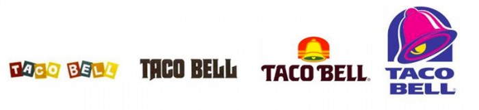
Taco Bell’s restaurant brand evolution. Taco Bell made a bold move years back when they pulled away from their warm colored classic brand logo. They unleashed a bold new design that used colors rarely seen in restaurant branding. The identity move is excellent and one can easily see Taco Bell making a move towards further simplifying their identity further by using just the bell. Only time will tell.
Simple brands get more attention because of their easy-to-interpret and rapidly recognizable nature. A restaurant logo’s job isn’t to convey the food sold. It’s job is to convey a message, attitude and personality. If the food can be somehow injected, that’s not a bad thing. It’s just not point number one. These brands understand the need for a minimal logo with maximum meaning and their growth and dominance support it as being a great move.
What other logo evolutions have you noticed? I purposely left out Wendy’s because there has only been one major change in the brand’s history. Who do you think could use a brand overall or change?


One Response
I love the 7 excellent restaurant brand evolutions