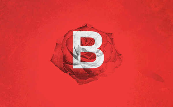
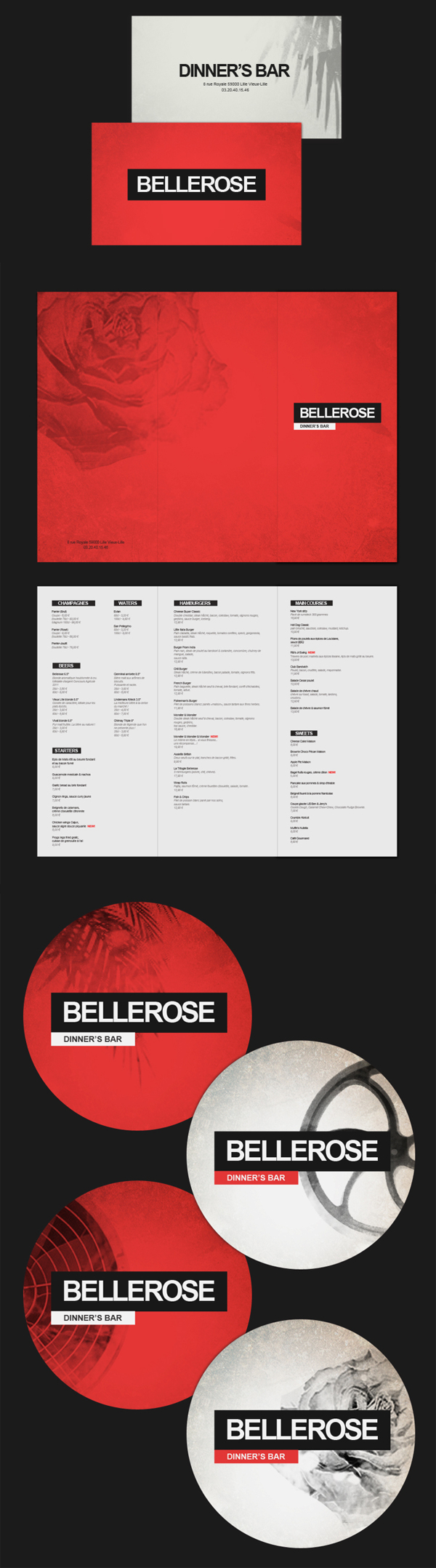
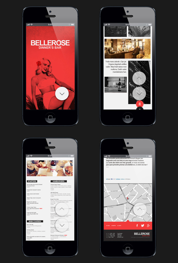
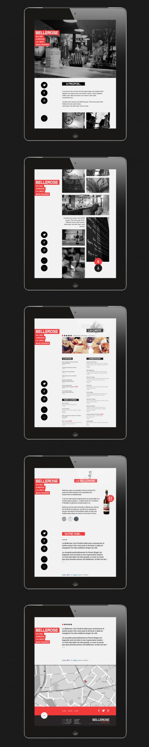
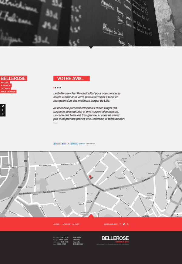
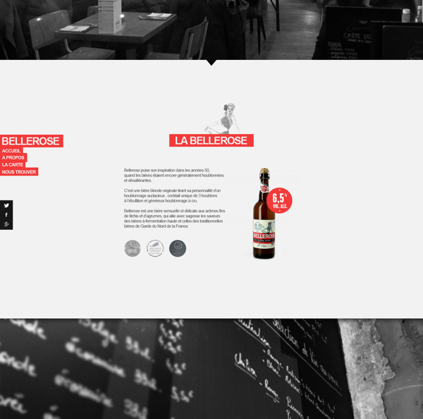
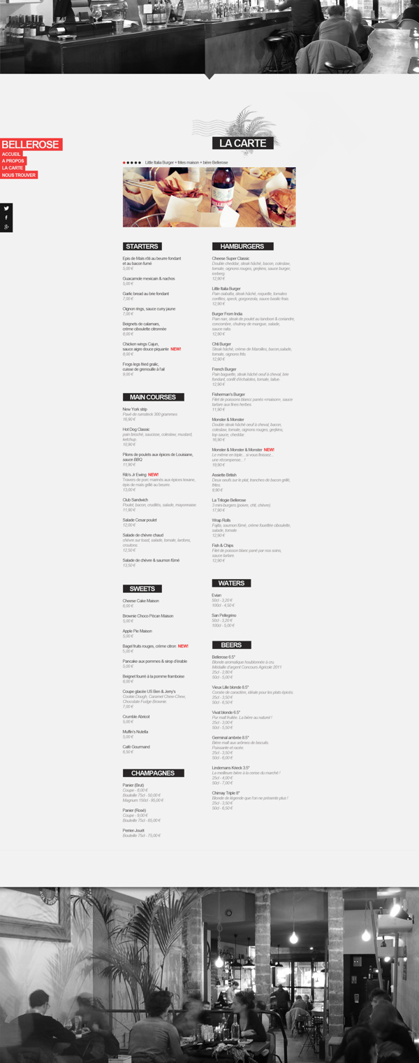
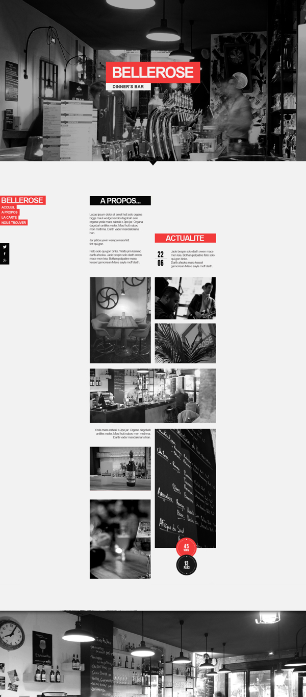
I’m not afraid to admit that I’m not a fan of using Helvetica. It’s the go-to for designers who are too lazy to either A. design their own typeface, or B. find a better solution. It’s not that Helvetica is bad, it’s just bland at this point in the type game. With that said, the brand identity for Bellerose uses Helvetica quite nicely. Not only is this typeface used in a smart way, the website for the restaurant is very well done. With attention to details and every page laid out by design, the website is a smooth experience that’s unique to Bellerose. Great work by Thomas Le Corre.

0d855282ec3f36a0776c53def4485217

b002f8ec7e9255832c7996dbd547ce37 (1)

b002f8ec7e9255832c7996dbd547ce37

bc87f7656e075d01adab62543b83e971

7f928b5d5e49e475ca8e4d1eeaf6cd9a (1)

7f928b5d5e49e475ca8e4d1eeaf6cd9a

2df28e163e7c8cc98de87450fe678166

d2dfe921ff7a91eeb4ceafd0fe8f1721

7113d8740e781ed50cb5abad15e0a79e

fa1f16561a3cd4c334ea0ca8a4995876

Discuss this Project

Leave a Reply

This site uses Akismet to reduce spam. Learn how your comment data is processed.

The Forktales Podcast™: Interviews with restaurant industry leaders and visionaries

Restaurant and advertising industry headlines and thinking

Reviews of restaurant experiences from around the globe 

Reviews of our favorite design, business, & restaurant books

Our favorite typography and fonts

Inspiration in your inbox

Get the latest inspiration in your inbox every Monday morning, for FREE!

"*" indicates required fields

This field is for validation purposes and should be left unchanged.

Delicious Bits in your Inbox!

Get the latest and greatest content delivered to your inbox for free!

"*" indicates required fields

This field is for validation purposes and should be left unchanged.