The Perfect Pint restaurant and bar branding

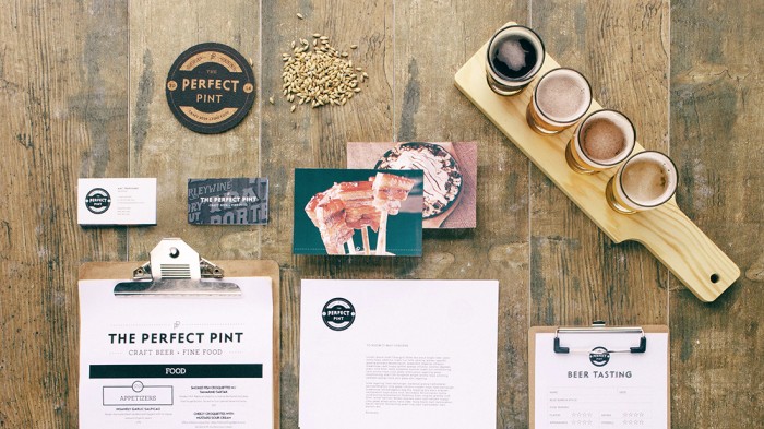
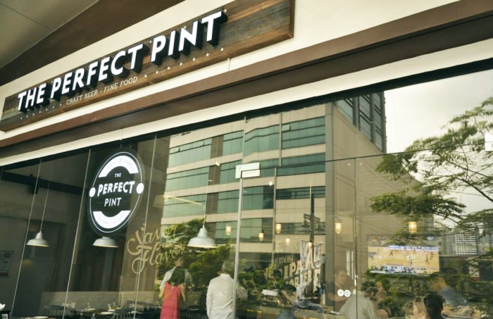
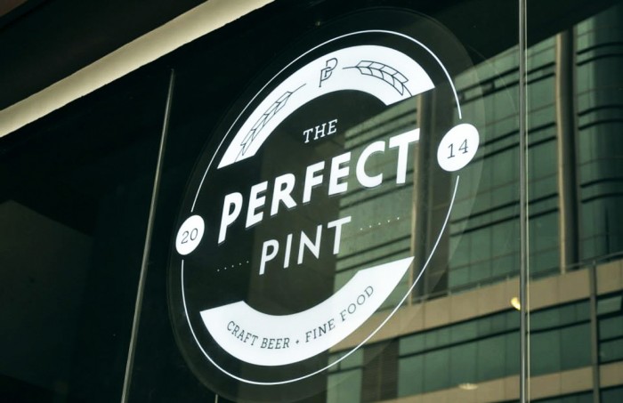
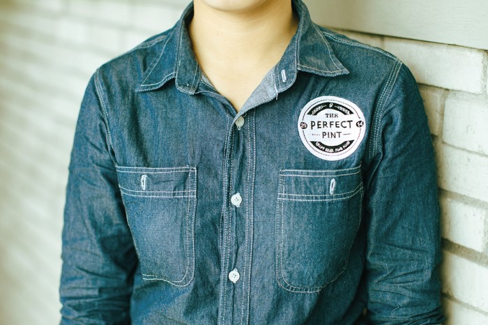
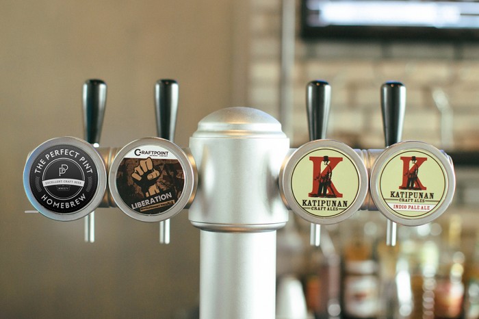
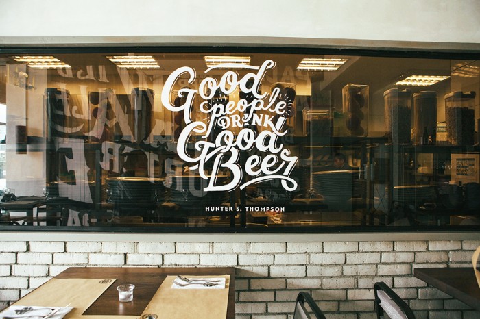
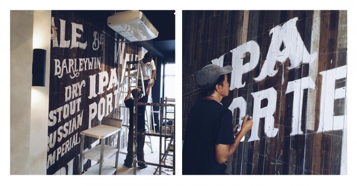
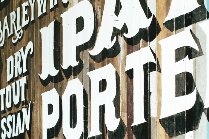
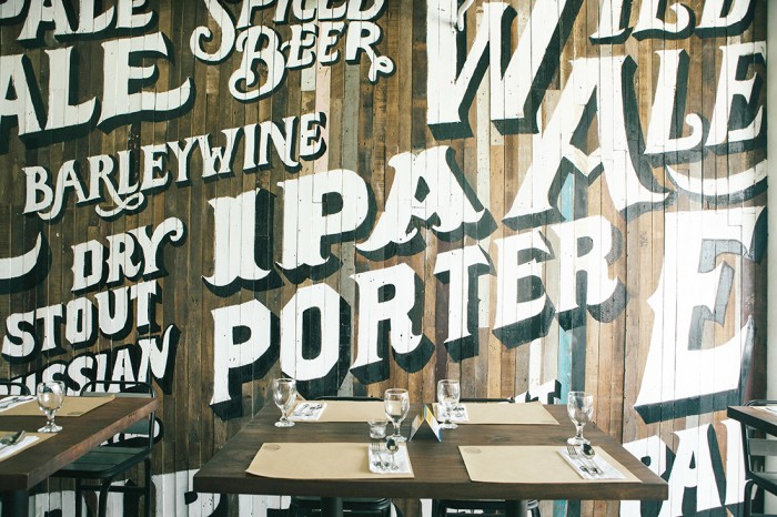
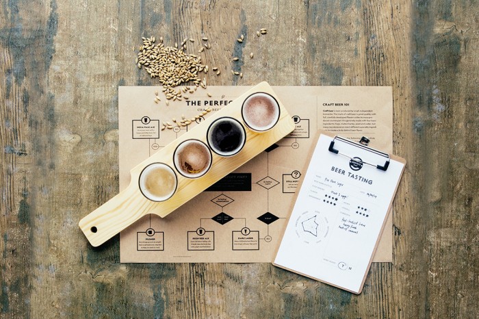
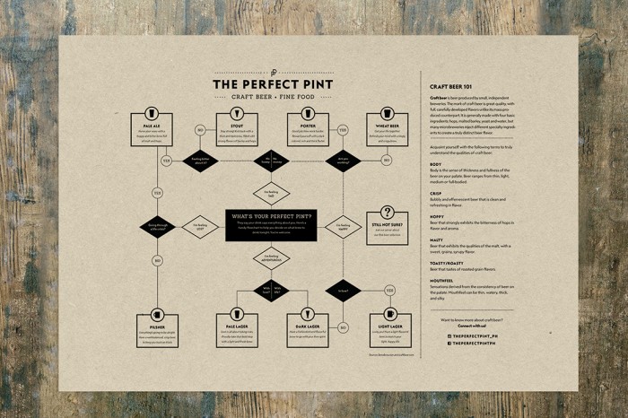
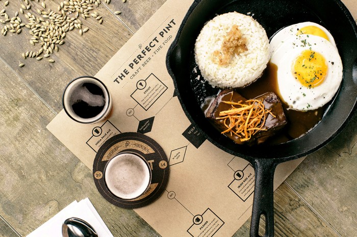
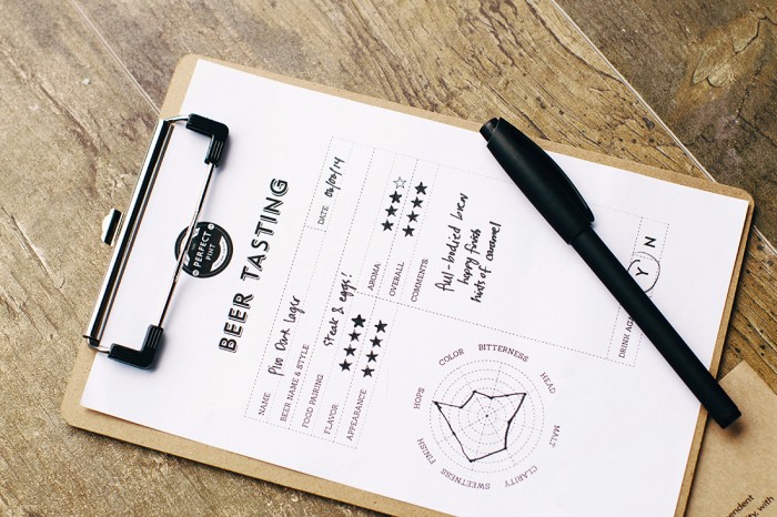
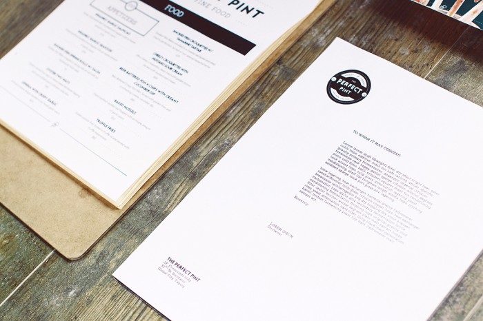
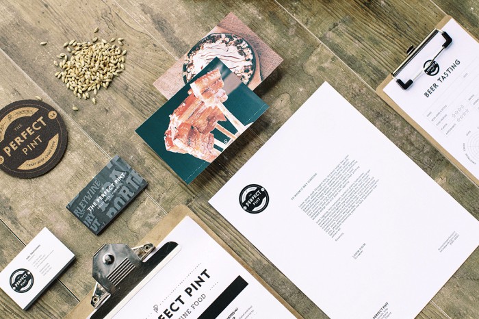
I want to go here. I want to belly up to the bar and have myself a tasty, perfect pint. The design for The Perfect Pint is the epitome of hipster-esque design in use. Classic graphic treatments with simple typographic combinations over top reclaimed wood. Not that it’s a bad thing. Sometimes you gotta go with what works for the experience you’re trying to convey. So, while the look and feel of the restaurant and bar’s identity may not be innovative, it is a case of excellence because it hits the market correctly. It works.

Designed by Serious Studio.

sign

sign2

21-TPP-30

tpp_washroom

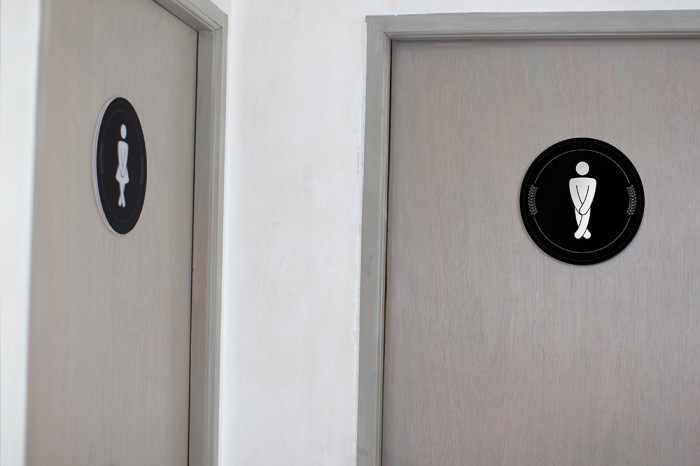
It’s the little things like these bathroom signs that cause a smirk and a memory with guests. They’re in brand and make an otherwise boring design element, fun and memorable.


19-TPP-24

17-TPP

process

14-TPP-7

13-TPP-2

12-TPP-3

paperbag-pp

10-TPP-35

07B-PP_placemat

09-TPP-20

05-TPP-19

03-TPP-12

04-TPP-14


02-PP_logo-with-wb-variation-half

00-TPP-33

Discuss this Project

Leave a Reply

This site uses Akismet to reduce spam. Learn how your comment data is processed.

The Forktales Podcast™: Interviews with restaurant industry leaders and visionaries

Restaurant and advertising industry headlines and thinking

Reviews of restaurant experiences from around the globe 

Reviews of our favorite design, business, & restaurant books

Our favorite typography and fonts

Inspiration in your inbox

Get the latest inspiration in your inbox every Monday morning, for FREE!

"*" indicates required fields

This field is for validation purposes and should be left unchanged.

Delicious Bits in your Inbox!

Get the latest and greatest content delivered to your inbox for free!

"*" indicates required fields

This field is for validation purposes and should be left unchanged.