El Pollerio restaurant branding

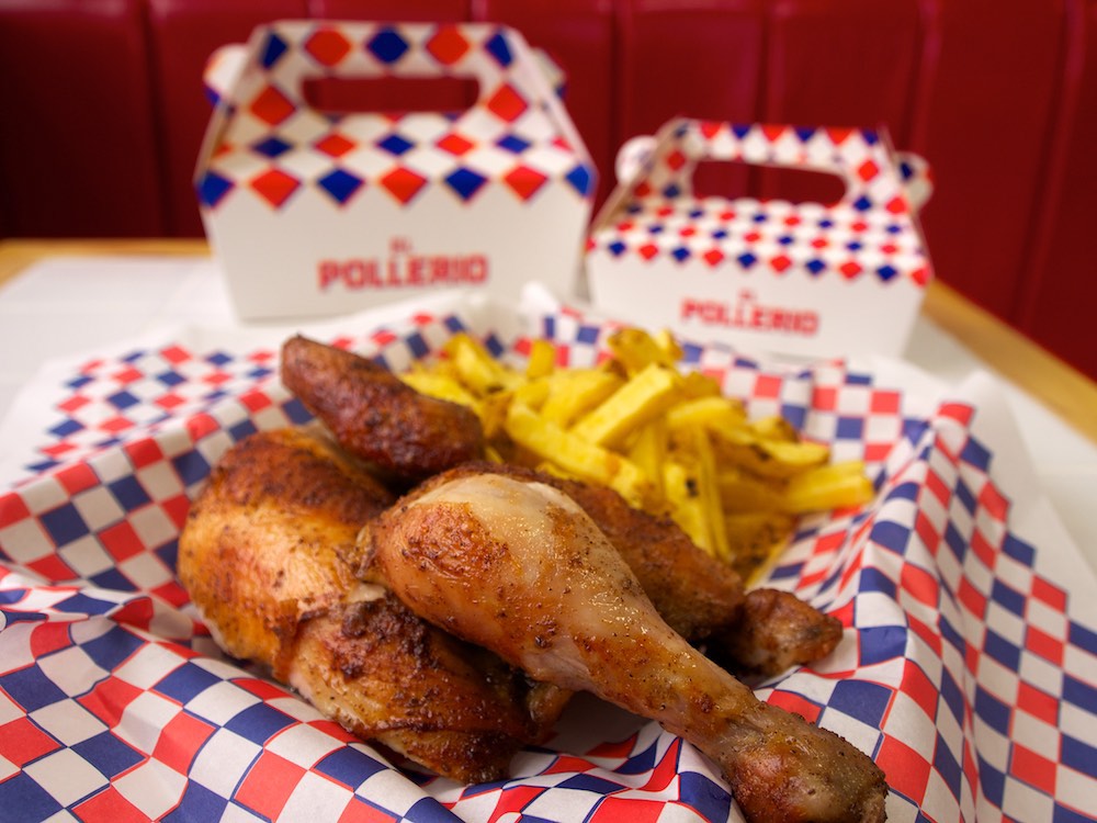
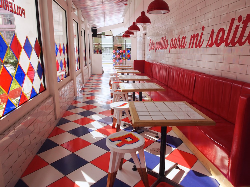
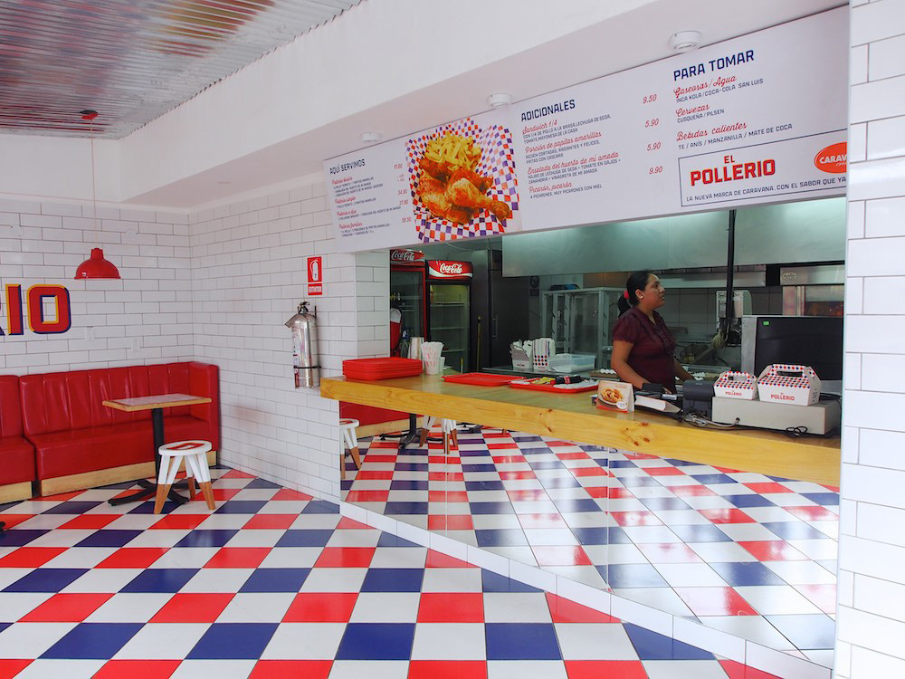
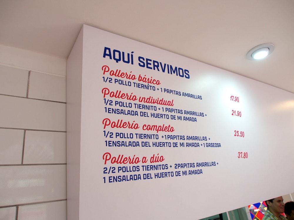
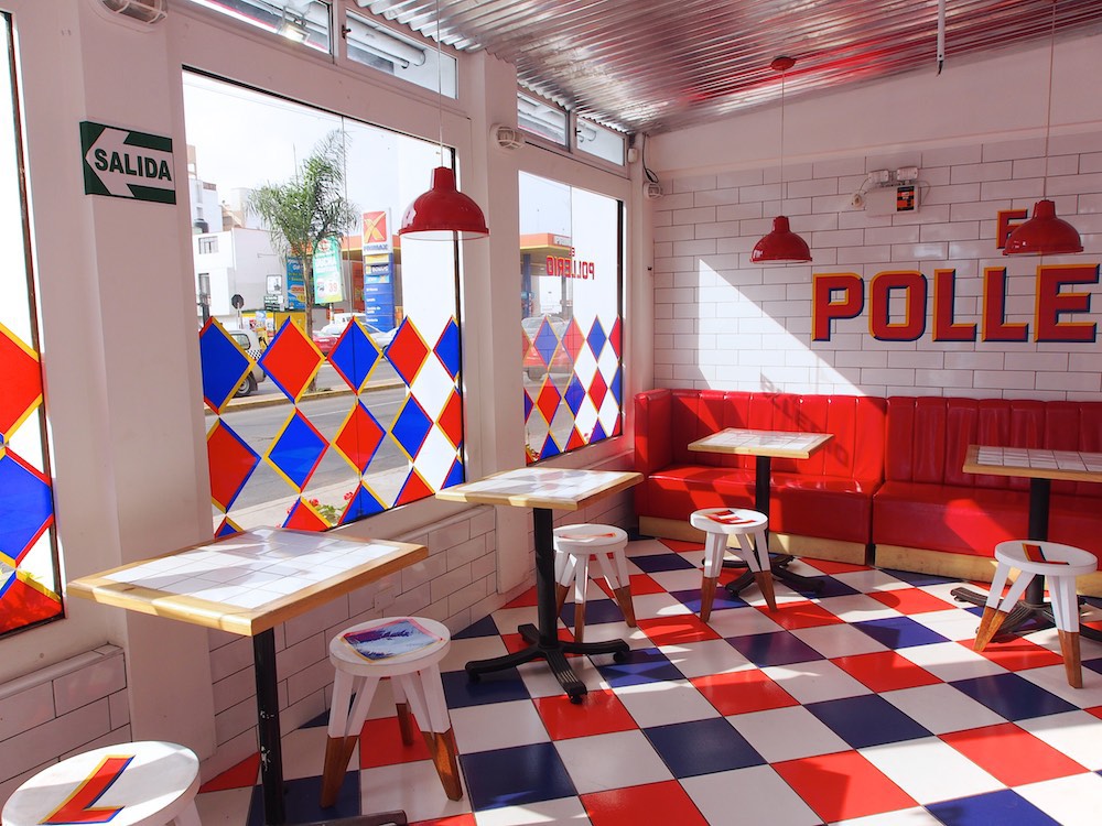
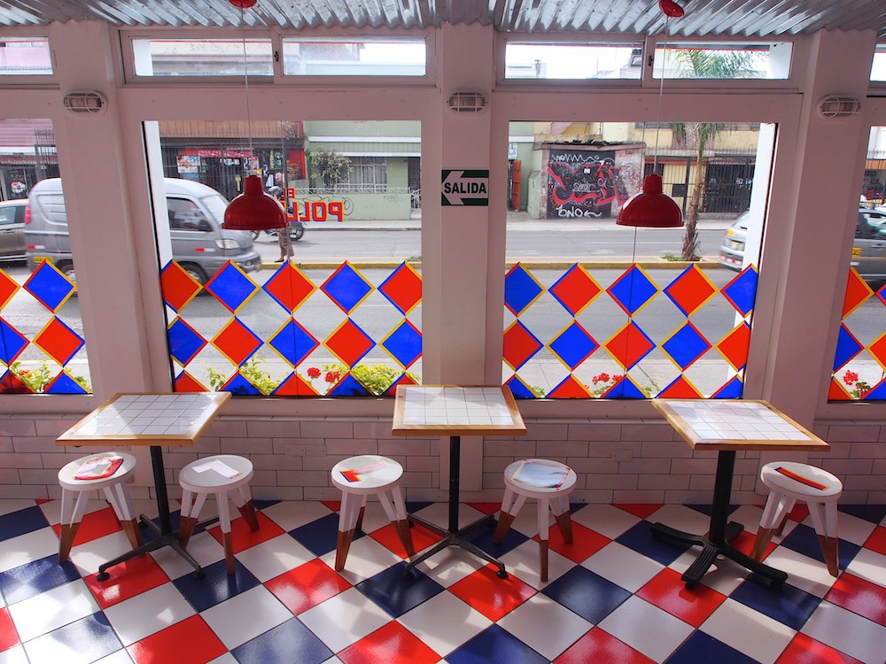
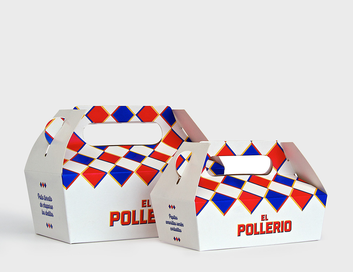
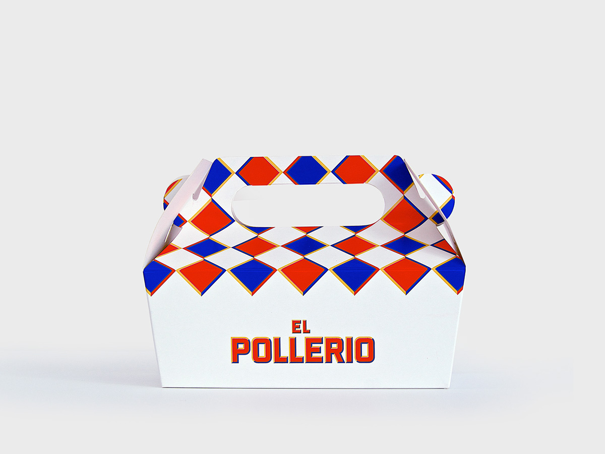
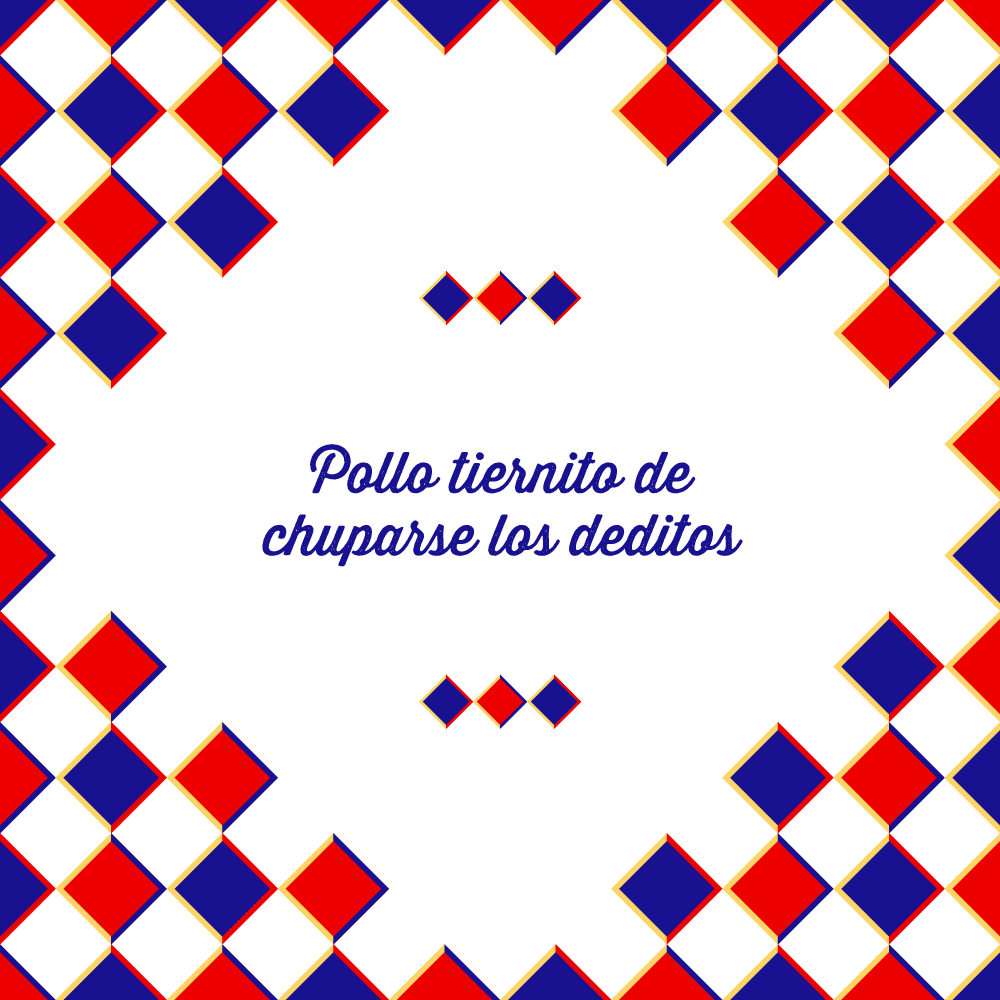
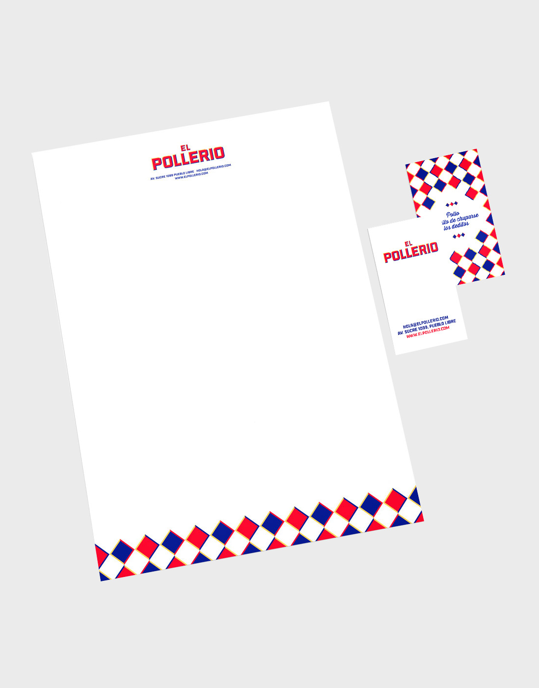
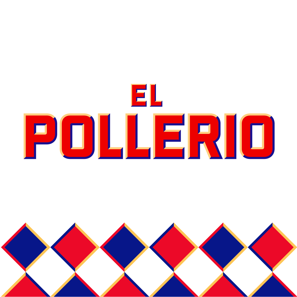
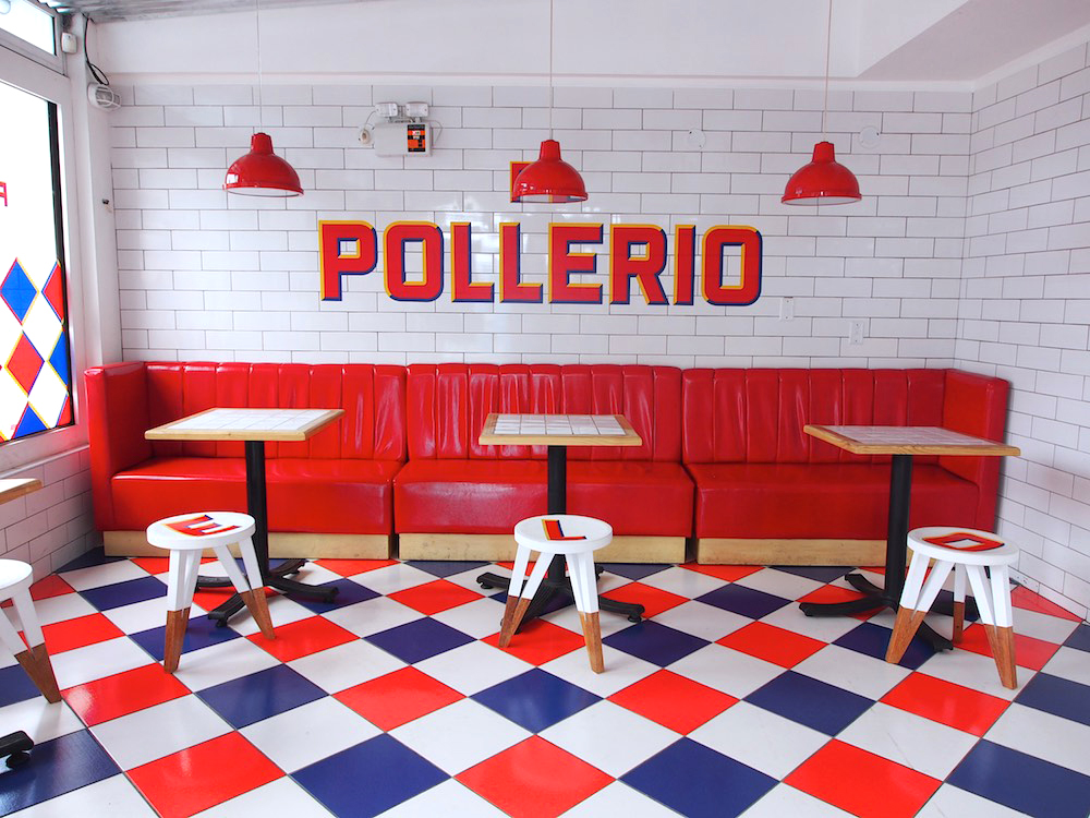
The team at IS Creative Studio dodges cliche imagery in exchange for a vibrant, loud brand identity design aesthetic. The direction uses a strong pattern as a defining element, rather than the standard idea of a “logo.” This creates a visual cue that is carried across all brand touch points for this rotisserie restaurant. What strikes me is how this pattern, which would normally seem elementary due to the use of primary colors, actually is refreshing and strong. It sets the concept apart from what would be expected. Well done.


a03a43169cc2a31f6d37f55804b1d0ce

730d1e95f979faf7e67312daccb0ba22

ae6e33ac81376053684892d819f37a05

9a87e204e8c4e08744d7ac3136a384c3

61785754a2836185d831281d33ababc7

c7f72133760e9c154b9026e94cbddc3e

d39ee2ac92f88fe1b591501f9c404d29

ae6eb27305b076b276b2d2ca872af056

b6ad37f5a5b50767b214aaf71eea9ea0

10c1ac241815c9deb683c2d7617c6052

a0e9ca2bf8f9e39e6fed3a26295d9e7a b002a12c47441a1595fecdb4107c3bc3

The Forktales Podcast™: Interviews with restaurant industry leaders and visionaries

Restaurant and advertising industry headlines and thinking

Reviews of restaurant experiences from around the globe 

Reviews of our favorite design, business, & restaurant books

Our favorite typography and fonts

Inspiration in your inbox

Get the latest inspiration in your inbox every Monday morning, for FREE!

"*" indicates required fields

This field is for validation purposes and should be left unchanged.

Delicious Bits in your Inbox!

Get the latest and greatest content delivered to your inbox for free!

"*" indicates required fields

This field is for validation purposes and should be left unchanged.