Whyte & Brown restaurant branding

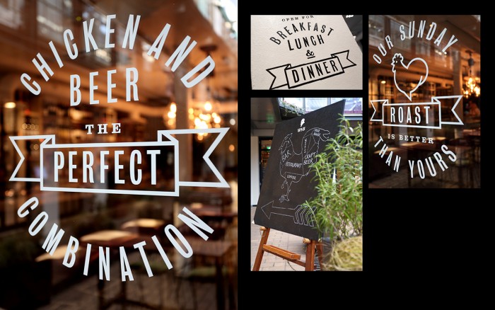
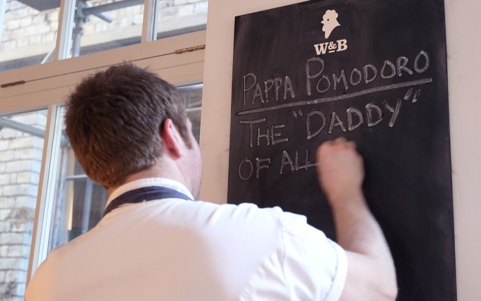
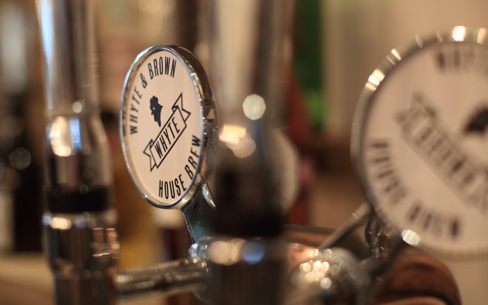
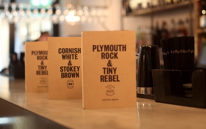
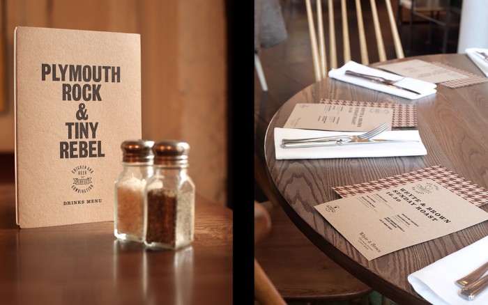
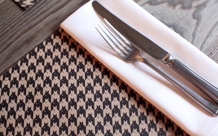
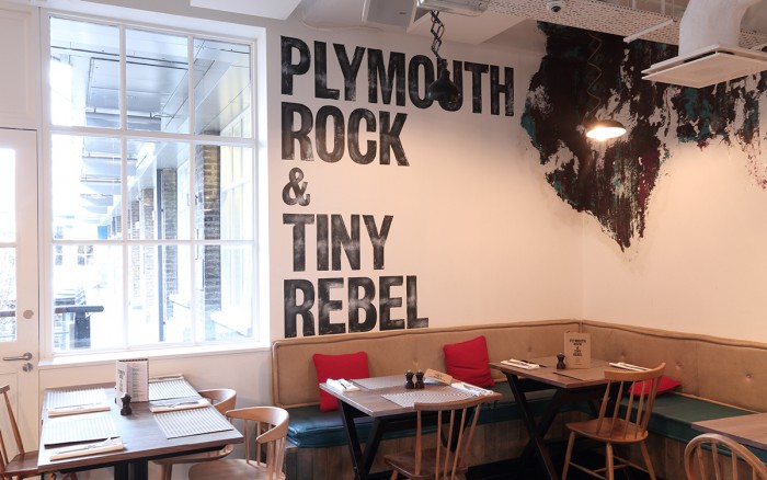
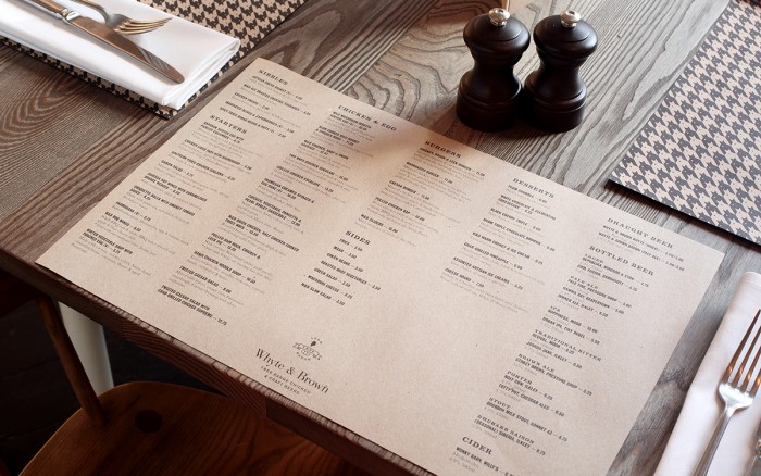
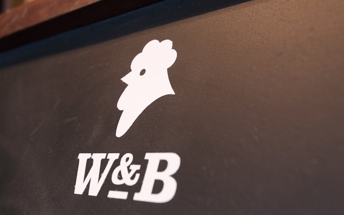
The brand identity for the restaurant Whyte & Brown, a restaurant located in London’s famous Carnaby Street, stands out with clean, modern design elements. What really jumps out at me is the chicken line-art brand mark (sort of reminds me of my own work for Seven Hens restaurant branding). It’s clean, simple and poignant. It’s simple lines meld well with the compressed sans-serif typography the design team selected for the brand’s main type family. This type-driven design style is carried throughout the restaurant’s interiors and other identity elements with excellence. Designed by October Associates

3c0dd2fc12befb3cd76cf4c190fd0404 229be9362d7b3a7a42b166e7e2ac51a9 006970e245823ba817dd0112c1daefc5 83bc32272ab30d91f7784c047ee3ad9f 05adfd3ebbeeaec833ec6f24b0ec5fe7 4c98bdffb3b3eb8a1800609573d73226 49eccfd9066a7991b4b2d39b52d0d4ec 142959177ae8a1cb3a8c5cec2d3ef492 3500054ca5ec9c5920412d2d3aaf6b86

The Forktales Podcast™: Interviews with restaurant industry leaders and visionaries

Restaurant and advertising industry headlines and thinking

Reviews of restaurant experiences from around the globe 

Reviews of our favorite design, business, & restaurant books

Our favorite typography and fonts

Inspiration in your inbox

Get the latest inspiration in your inbox every Monday morning, for FREE!

"*" indicates required fields

This field is for validation purposes and should be left unchanged.

Delicious Bits in your Inbox!

Get the latest and greatest content delivered to your inbox for free!

"*" indicates required fields

This field is for validation purposes and should be left unchanged.