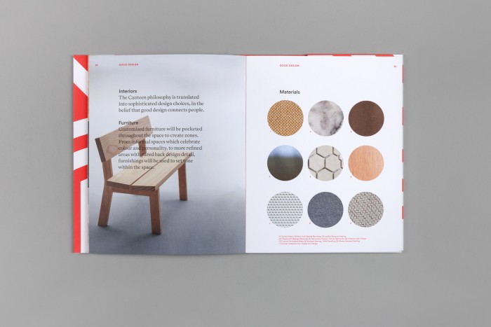
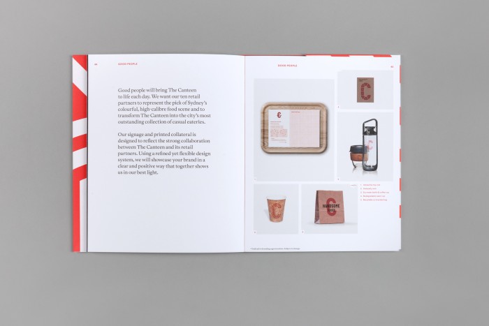
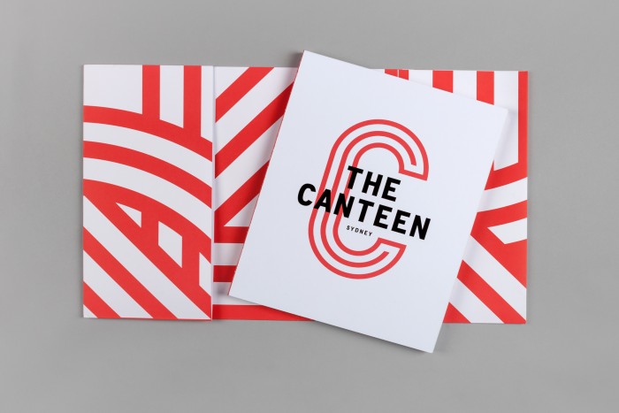
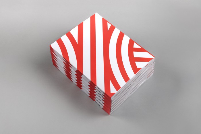
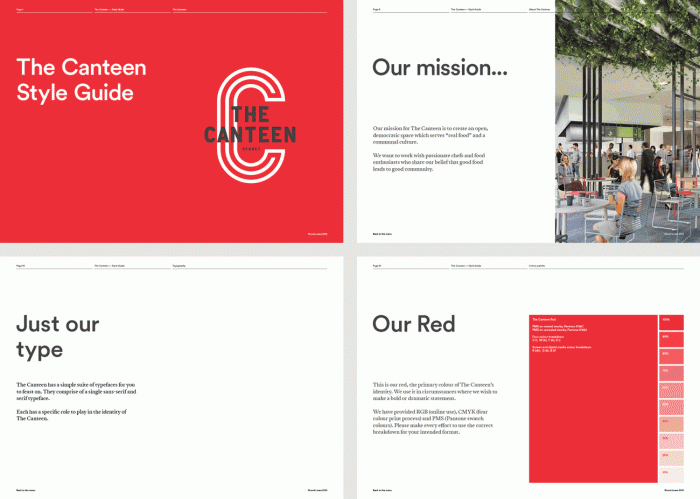
The studio, Maud, designed this excellent and thorough brand identity and accompanying standards for Canteen, a food and drink pioneer in a new development in Sydney. The identity uses a skilled hand to create a highly geometric and visually interesting family of type and graphic treatments. The vibrant red is strong and confident that’s easily recognizable and relatable. The inspiration and direction are best described by the team at Maud:
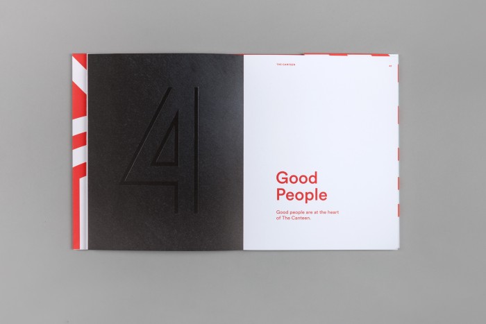
Based on the ethos that ‘good food leads to good community’, we designed an identity that inspires real food, communal culture and a collective spirit. Open and straightforward editorial and warm vibrant colours speak to a place of connection and turn the notion of a typical food court on it head, while a premium cloth-bound book emphasises the materiality and quality of the project.