The Creperie restaurant branding

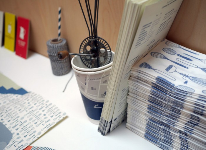
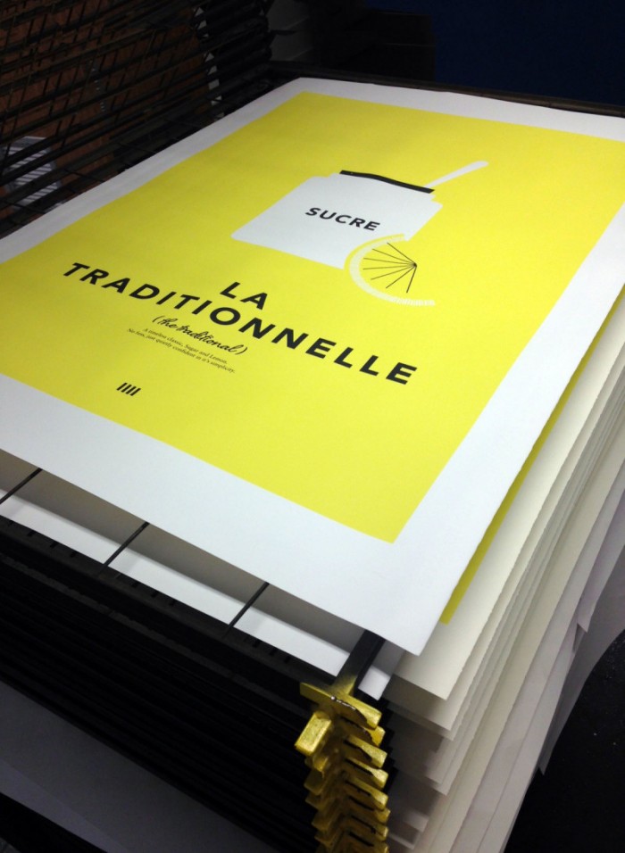
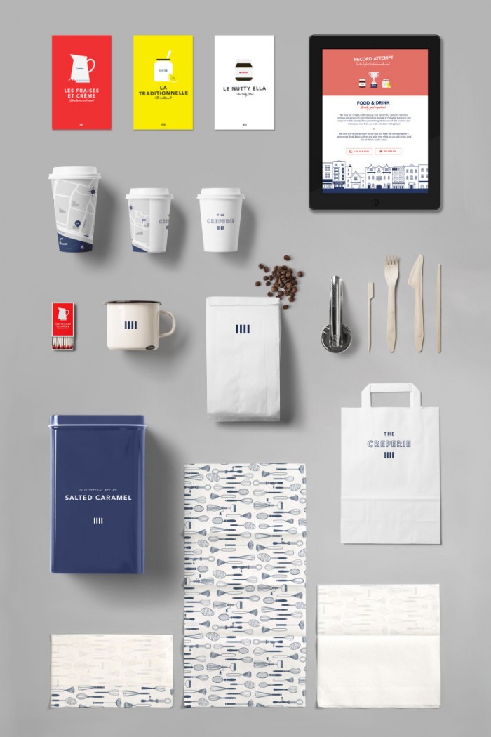
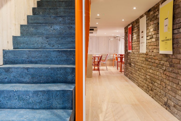
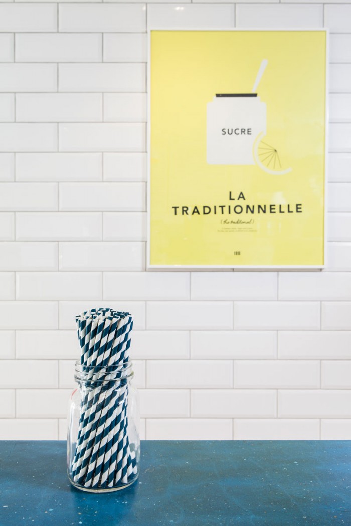
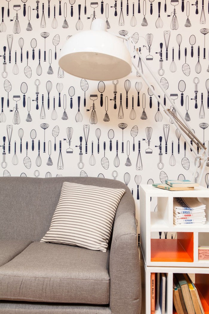
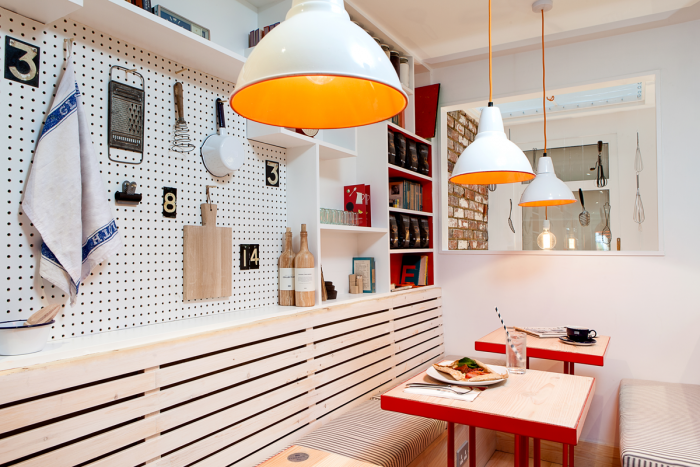
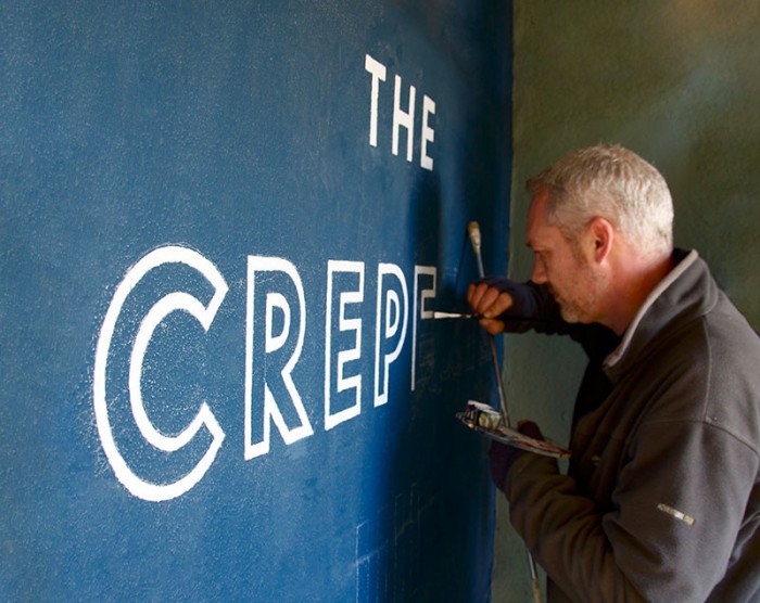
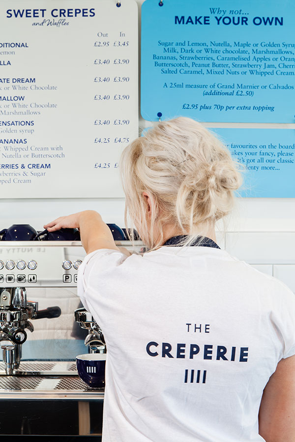
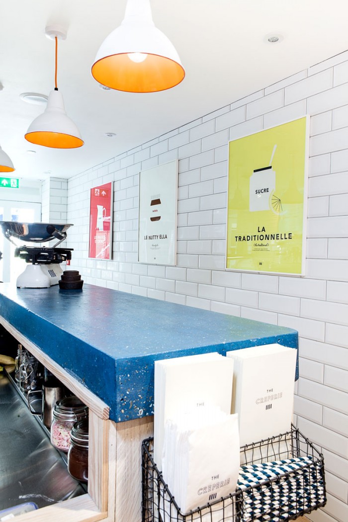
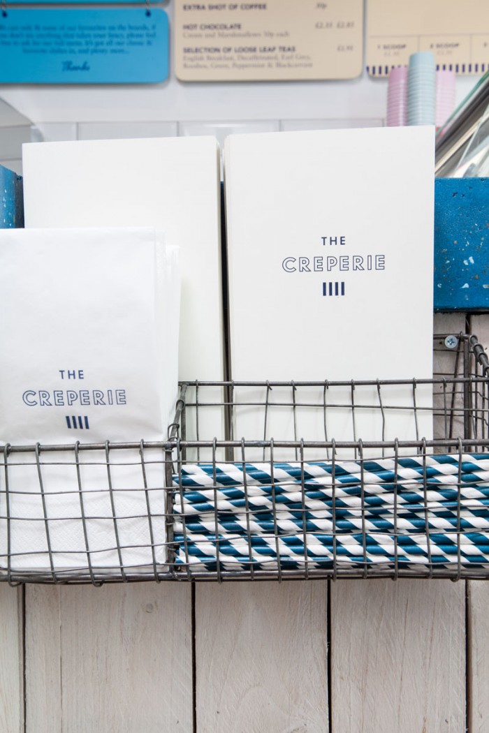
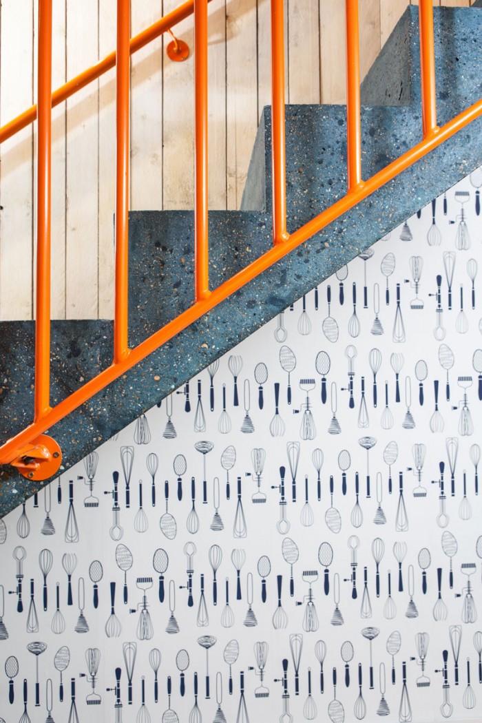
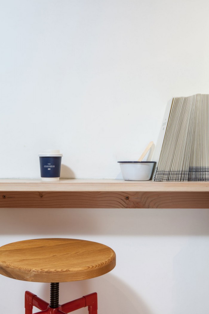
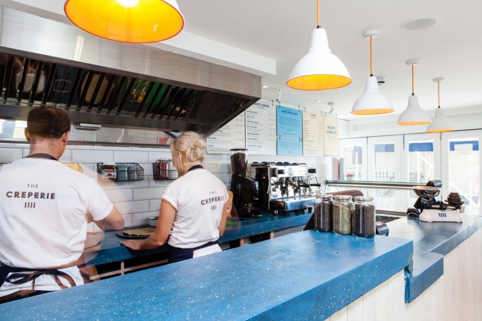
Ed Harrison design creates this super iconographic restaurant brand leveraging clean, flat design as the driver of the identity. It creates a simple and clean look that correlates to the experience directly. The brand features illustrations of kitchen utensils in blue and white color palette which puts the focus on the craft of crepe making as well as traditional, classic techniques. This implies the level of food one can expect at The Creperie.

1qAY5Rc

5YEGbUk

8OSvggO

40R89Vi

1973Xn6

a6e6QGh

af6dJ40

CkXPAdx

dZlAlJj

GSD4U0q

KwDaimg

RrcYtZw

S3l3EzE

T6V67ft


The Forktales Podcast™: Interviews with restaurant industry leaders and visionaries

Restaurant and advertising industry headlines and thinking

Reviews of restaurant experiences from around the globe 

Reviews of our favorite design, business, & restaurant books

Our favorite typography and fonts

Inspiration in your inbox

Get the latest inspiration in your inbox every Monday morning, for FREE!

"*" indicates required fields

This field is for validation purposes and should be left unchanged.

Delicious Bits in your Inbox!

Get the latest and greatest content delivered to your inbox for free!

"*" indicates required fields

This field is for validation purposes and should be left unchanged.