
Let’s just say it out loud people: Restaurant websites usually suck. There seems to be a standard issue format. Show me the menu, show me the latest food porn gallery, here are some directions, start an order. Wham. Bam. There you have it. Like a lot of things in this industry especially, no one really knows why this has been the template and MO.
A couple of the big name restaurant brands have upped the ante on the what restaurant websites should be with their latest redesigns. These brands have pushed the envelope in numerous ways to create experiences that communicate with, instead of communicate at, the audience. Here are some of my top picks and the features of the site that I think are killing it.
Taco Bell (www.ta.co)
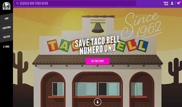
It’s easy to see why Taco Bell has been named Digital Marketer of the Year by Ad Age. They have the Midas touch when it comes to creating narratives that connect and engage with their audience. One of the biggest initiatives this year was the relaunch of their website, and the concurrent “rebranding” of the domain name to Ta.Co. Taco Bell is owning the taco.
The new website has been simplified using a steady, confident information architecture. They’re not bludgeoning the visitor with the entire story all at once. Instead, they compartmentalize the content intuitively and let the person explore as they wish.
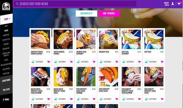
One of the most impressive and simultaneously shocking elements of the design is the food photography. Instead of a huge, expensive photo shoot of the product, they went more real with what looks like a crowdsourced array of images. This makes the food and brand seem more authentic and transparent. Two things the Millennial market absolutely loves.
Papa Johns (www.papajohns.com)
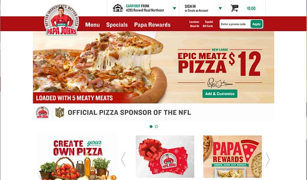
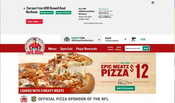
The new PJ’s updated website is much cleaner than its preceding iteration. Although I’m not blown away by much of the standard features, what does stick out as an excellent feature is the location search and set feature. It may seem like a trivial feature, but creating a seamless interaction throughout a process that has many parameters is not an easy task.
For the Papa John’s visitor, starting an order has been streamlined naturally and intuitively. Finding and setting a location is simple which leads the person into the order quickly and effectively.
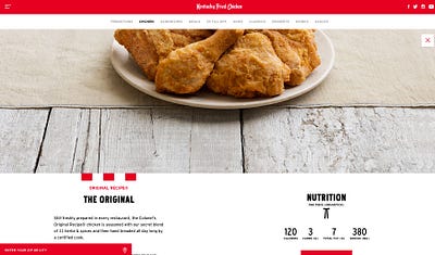
KFC (www.kfc.com)
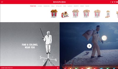
Although I’m not a big fan of the new Kentucky Fried Chicken advertisements, I do think the digital team got things right. While the snickering, podunk Colonel continues to kill a legend, the new KFC website delivers a better experience that’s quite memorable.
Two things that really make this site on another level are:
- The menu has been put front and center in a smart, unexpected way. When clicking on that food the visitor is presented with a glory/hero shot of the plate that really gets the mouth watering.
- The menu system functionality and responsive design happens smoothly and naturally. Navigating is easy and intuitive putting the focus on the right areas in a hierarchy that guides the visitor through the KFC narrative.
Overall the KFC website tells a stronger story of heritage and craft from the brands roots to how the way they used to do things continues on inside the four walls. I think the out of home advertising could learn a thing or two from the website experience.
Chipotle (www.chipotle.com)
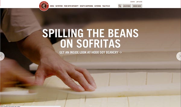
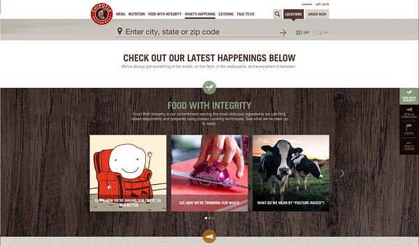
Of course the Golden Child of the restaurant industry continues to up the ante on their digital experience. Their latest website release is clean and simple to use. The hierarchy guides the visitor through the experience with simplicity. It’s not only the navigation’s intuitive nature that jumps out as a point of excellence, it’s the brand’s story telling.
Chipotle puts the focus on information and a narrative that furthers their position of sustainable, responsible food sourcing. They do it in many different ways from the straightforwardness of food source content, to less direct ways like their take on the classic video game Space Invaders. Have some fun and subliminally be indoctrinated with the Chipotle magic at:http://chipotletasteinvaders.com/
The brand continues to be at the forefront of content marketing. It’s not about shoveling deals and promotions for the burritos all the time. For Chipotle, they push their beliefs in what sustainability means in the bigger picture. They create rich content that people want to consume and share. That’s the right thinking in this new age of marketing.


