Cafe Con Leche branding

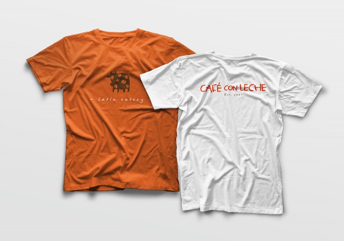
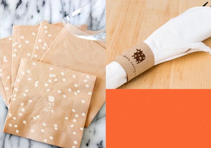
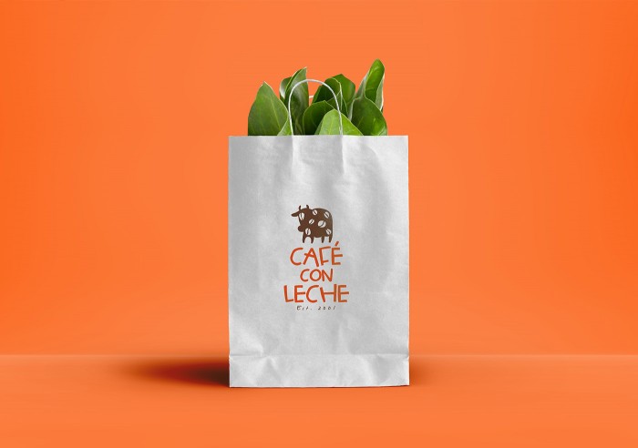
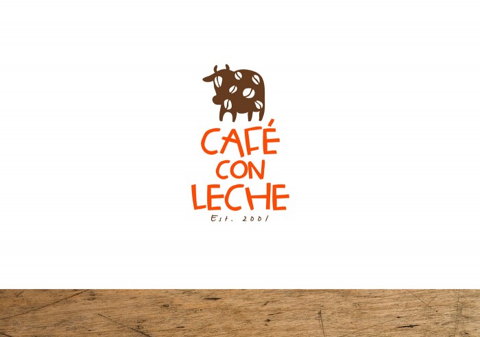
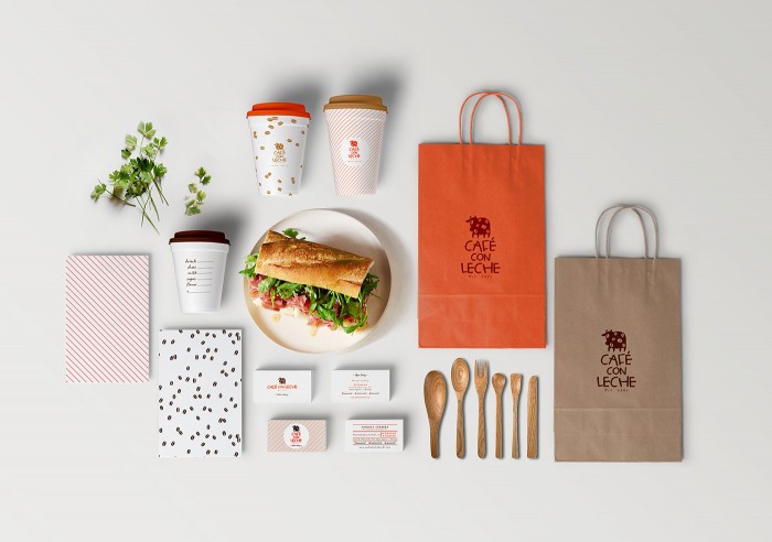
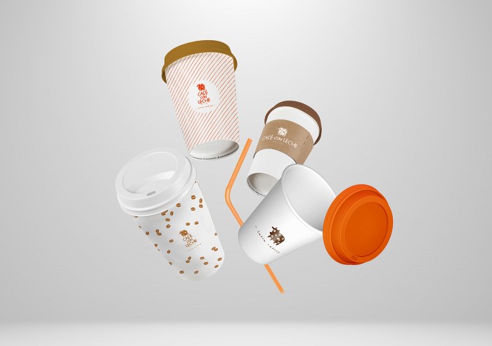
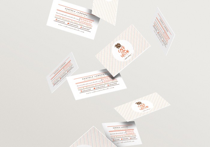
Campy, kitschy, and a lot of fun, the brand identity design for Cafe Con Leche tells a story. The colors are warm and approachable which compliments the hand-drawn, childlike illustrations and typography. The brand really hits its stride with the coffee cup designs where graphic treatments and patterns make the pieces come to life. The designer, Emicel Mata, explains the inspiration:

The brand is inspired by the rich cuisine of Latin America & the caribbean. The colors, textures and logotype reflects the contemporary, inviting, cheerful and energetic concept of the new latin gastronomy.

7ab1b929781915.5603424651ba9

7ca21629781915.560342464eb2a

7eabc429781915.560342464fce9

58ce8229781915.5603424652cfb

a9b37729781915.560342464c8d8

b3b4b729781915.560342464db0e dc30f929781915.5603424653e61

The Forktales Podcast™: Interviews with restaurant industry leaders and visionaries

Restaurant and advertising industry headlines and thinking

Reviews of restaurant experiences from around the globe 

Reviews of our favorite design, business, & restaurant books

Our favorite typography and fonts

Inspiration in your inbox

Get the latest inspiration in your inbox every Monday morning, for FREE!

"*" indicates required fields

This field is for validation purposes and should be left unchanged.

Delicious Bits in your Inbox!

Get the latest and greatest content delivered to your inbox for free!

"*" indicates required fields

This field is for validation purposes and should be left unchanged.