I’ll admit. These two slipped past me in the insanity that was 2015. Despite getting one past this goalie, they’re very much worth discussion. Both Sbarro and Cici’s when through pivotal rebrands in 2015. These were simple tweaks and knob turns. They were full on overhauls with new flagship architecture and interiors. Big moves for both brands who are experiencing very different points in their brand lifecycle.
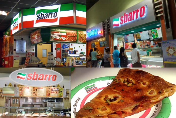
If you’re from the Northeast and visited a mall or airport growing up, you’re quite familiar with Sbarro. They were everywhere. It was the perfect place to grab a slice or two of pizza, or other stereotypical Italian food. Sbarro attracts the public who’s out shopping or on the go. This market has a lot of buying power, but as it shifted into a more heavily Millennial demographic so did the perception of value and demand. No longer was price the only factor. It was the true meaning of quality that was wanted, so Sbarro’s sales sunk. It was pizza on the go in its simplest form with cheap prices, but it wasn’t known for a quality product.
The brand was founded in 1956 in Brooklyn, New York and over the course of 50 years built the small salumeria (Italian grocery store) into a well known restaurant brand touting over 800 units. In 2011, Sbarro filed for Chapter 11 bankruptcy after being acquired by a private equity firm in 2007. They exited from Bankruptcy in June of 2014 after reconfiguring the brand from the inside out. They brought their ingredients to the forefront of the menu offering, and rebranded the concept in 2012. They also successfully sparked franchise interest and inked a number of deals that pulled this brand out of its nose dive.
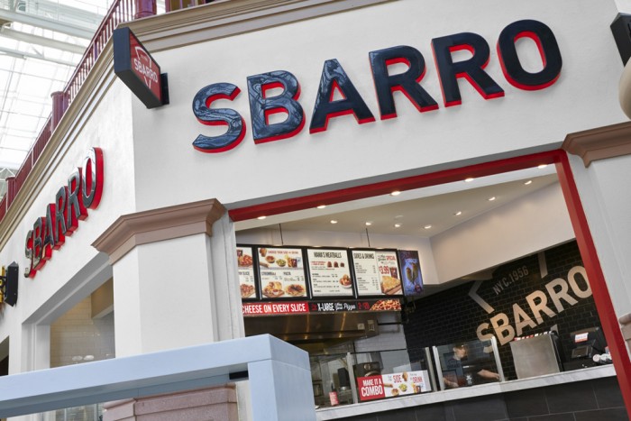
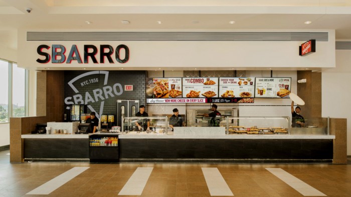
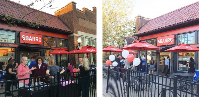
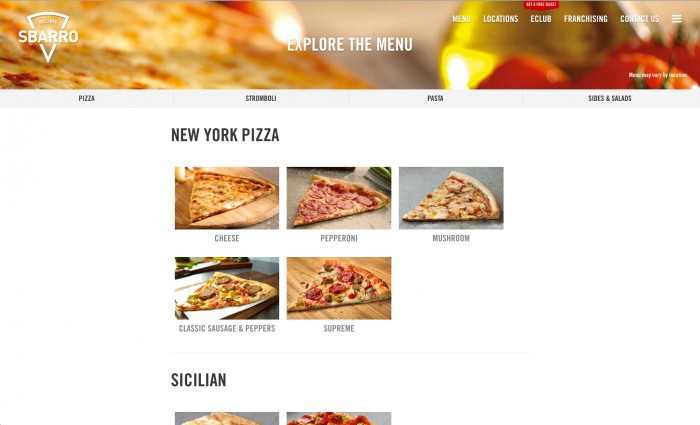
Jump to 2015 and Sbarro’s went through it’s second rebrand in 10 years. The new brand maintains the Italian authenticity message, but simplifies the graphic mnemonic device from a waving flag to, you guessed it, a pizza slice. It’s simple, clean, and modern in its style. In order to anchor it to the heritage, the designer kept an “NYC 1956” as a part of the core brand logo lockup.
![]()
What’s interesting is how quickly the brand drops the Italian colors and the pizza slice element as seen on the bag design, website, and prototype store design. I think the mark is very strong and recognizable, but not very representative of the brand’s “Why.” Why do they exist? Pizza? Well so does Papa John’s, Domino’s, Pizza Hut, Cici’s, Little Ceasar’s, etc. What’s the deeper reason for why? Why does it matter? All of this is missing in the brand messaging and design rendering it simple nice decoration, but devoid of anything meaningful that will connect with the market.
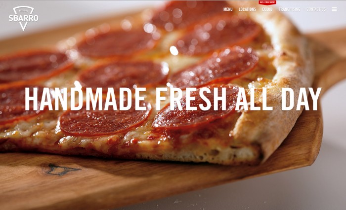
The website is very clean with the words “handmade fresh all day” across the home page. How novel. Shouldn’t it be handmade fresh all day? This is overcompensating and quite nearly apologetic. The website ticks the boxes of being cleanly designed, intuitive, and responsive. It’s a good site, but nothing groundbreaking my any stretch.
Overall, the Sbarro rebrand take things in the right direction as far as visual execution. The problem exists with what’s being communication. The brand still seems stuck in the “We make pizza” mentality. That’s something they’ll have to dig deep to get past in order to continue their growth.
Next we’ll take a look at the Cici’s rebrand and how it compares to Sbarro’s competitively and visually.
Designed by Sterling Rice Group
Thanks to Brand New for bringing this to my attention.
![]()
![]()