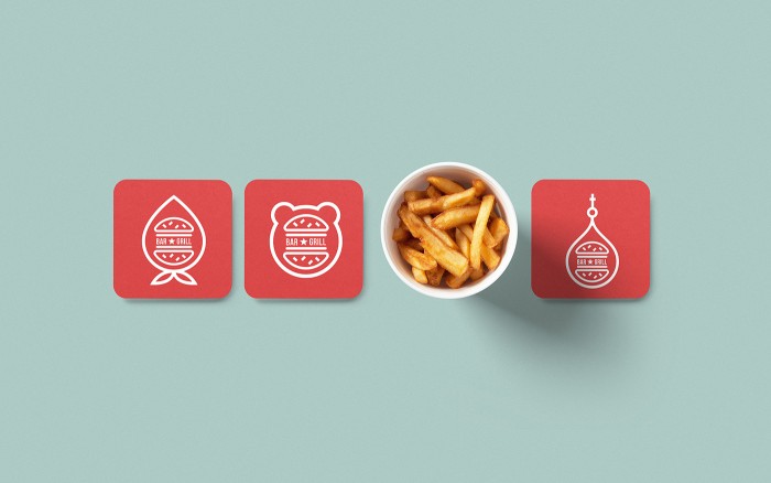
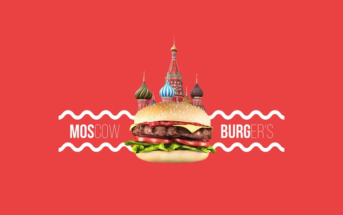
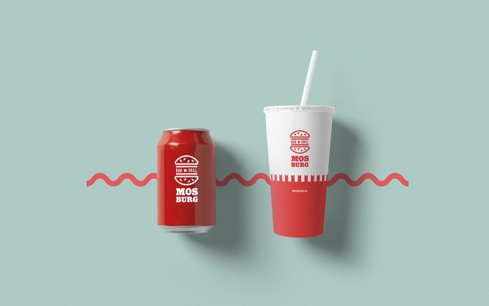
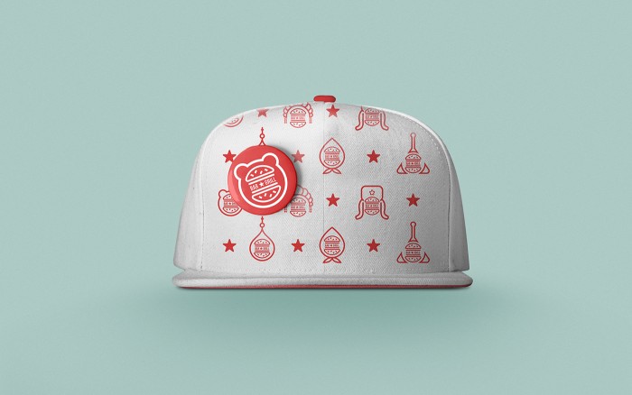
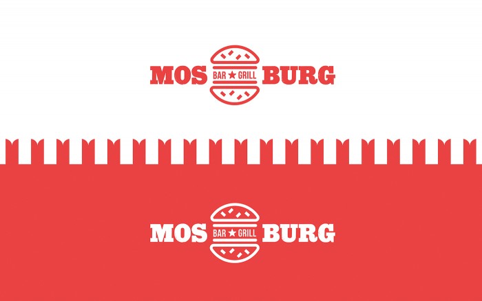
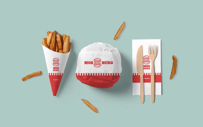
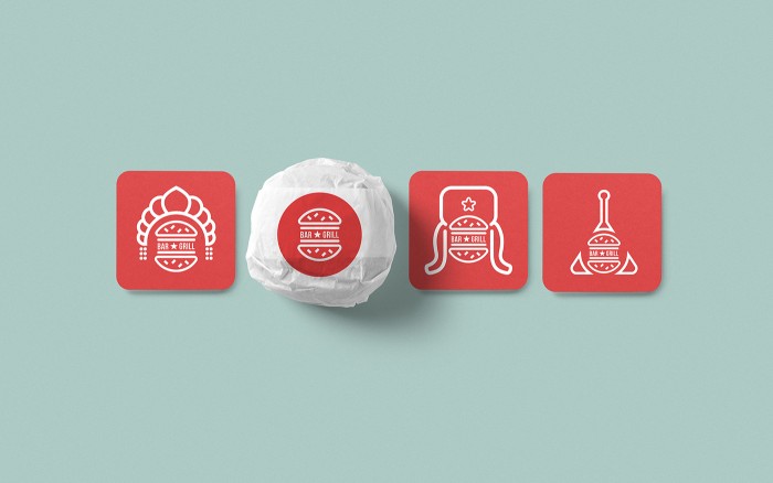
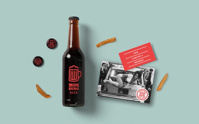
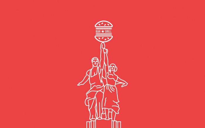
Two things that really jumped out at me about the brand identity for Mosburg was 1. the color palette, and 2. the line art illustrations. Mosburg is a burger bar and restaurant located in Moscow, Russia. The name is a portmanteau of Moscow and Burger. Kind of fun, right?

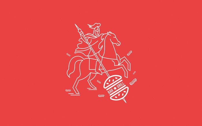
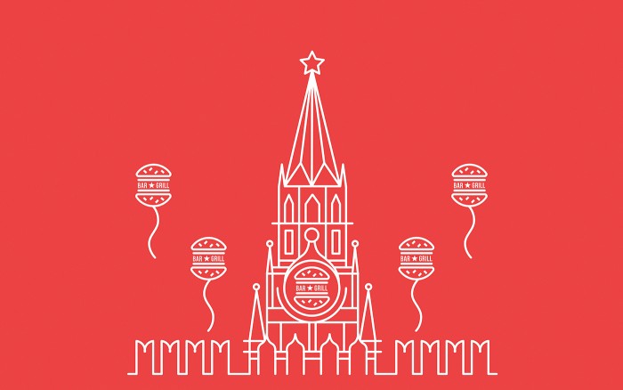
Mosburg’s brand is a display of Russian icons made modern and fresh. As A–A says in thier description, their big idea was:

to collect the most significant images of Moscow in a recognizable style. Natural burgers can now be enjoyed not only on the streets of New York, but also in the heart of Moscow – Old Arbat Street in the bar “Mosburg.

The color palette is unexpected in a great way. The teal perfectly offsets the warm red which leads the charge. It’s happily not a cliche “russian” look although Russia was partially the inspiration.

The line art is well crafted, especially the way the designer translates complex landmarks and iconography into a simple, modern form. Quite well done and memorable.

Designed by A – A

1e65f232373193.567e84669ebda

7ca45032373193.567e85c66c224

30c4fd32373193.567e84669928a

69d0f832373193.567e84669d8b7

8135aa32373193.567e8466a6836

10116632373193.567e8466a7af3

a2ea1532373193.567e8466a34f2

a6055632373193.567e84669c50c

caf7ab32373193.567e85c66d7f3

e627fb32373193.567e8466a21aa

ebb1de32373193.567e84669b250


The Forktales Podcast™: Interviews with restaurant industry leaders and visionaries

Restaurant and advertising industry headlines and thinking

Reviews of restaurant experiences from around the globe 

Reviews of our favorite design, business, & restaurant books

Our favorite typography and fonts

Inspiration in your inbox

Get the latest inspiration in your inbox every Monday morning, for FREE!

"*" indicates required fields

This field is for validation purposes and should be left unchanged.

Delicious Bits in your Inbox!

Get the latest and greatest content delivered to your inbox for free!

"*" indicates required fields

This field is for validation purposes and should be left unchanged.