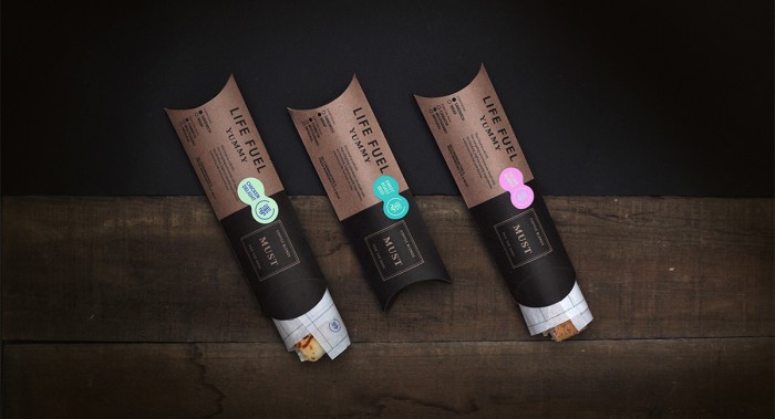
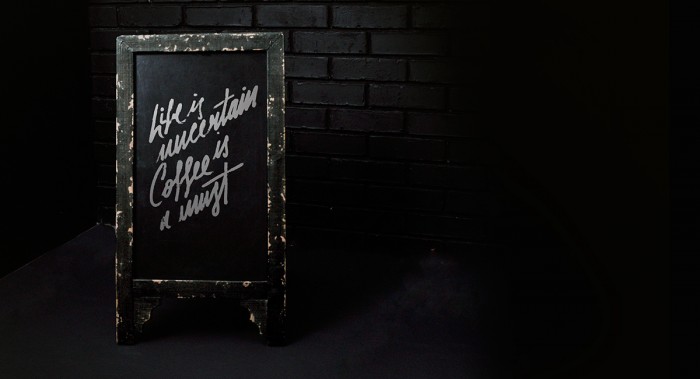
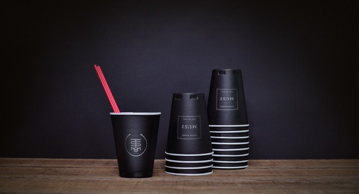
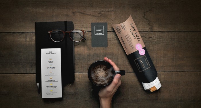
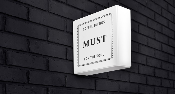
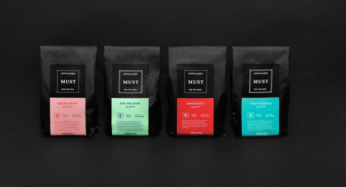
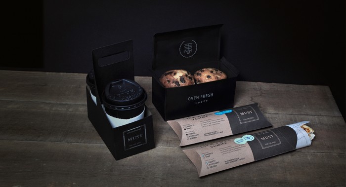
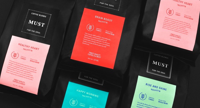
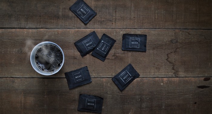
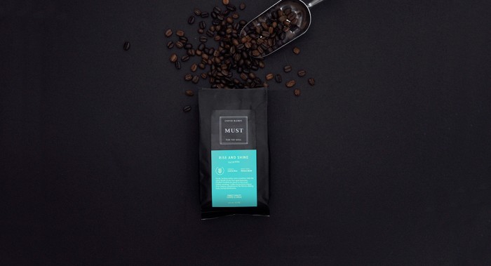
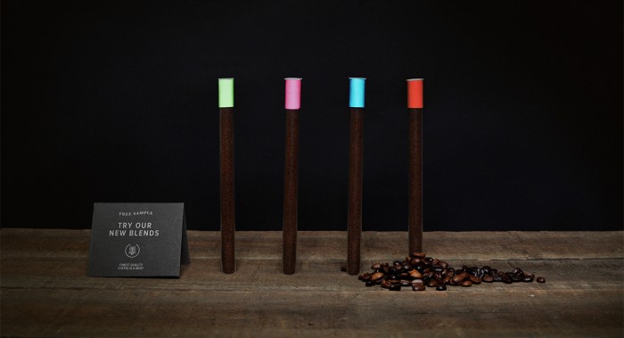
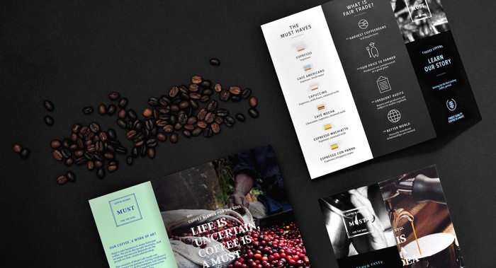
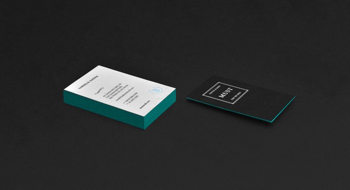
Must has brand identity on another level. Specifically, the food packaging leaps out as quite brilliant. The brand itself is a black and white palette that leverages craft paper color/texture as a third color base. With the muted palette as that base, the team at Firmalt uses bright color pops to denote the product enclosed. This can be seen on the food packaging design and the coffee bag designs. The rest of the brand maintains the black and white palette keeping things simple and modern.

Designed by Firmalt.

0f055230014349.560eb845d2a65

5df0ab30014349.560eb845d18de

6f66e630014349.560eb845def40

7c9d7c30014349.560eb845d6cc4

9e79cd30014349.560eb845d8cd2

9f865330014349.560eba39628d8

70c3e330014349.560eb845d077f

923df430014349.560eb845ce0d2

2036cc30014349.560eb845cf3bc

29529730014349.560eb8d6b17cd

68028930014349.560eb845ddd73

a8c90230014349.560eb845d4c3f

c30c2530014349.560eb845d3bdf

d6d24b30014349.560eb845dbbe9

e8afce30014349.560eb845dac3b

fc96e730014349.560eb845dcc83

giphy


The Forktales Podcast™: Interviews with restaurant industry leaders and visionaries

Restaurant and advertising industry headlines and thinking

Reviews of restaurant experiences from around the globe 

Reviews of our favorite design, business, & restaurant books

Our favorite typography and fonts

Inspiration in your inbox

Get the latest inspiration in your inbox every Monday morning, for FREE!

"*" indicates required fields

This field is for validation purposes and should be left unchanged.

Delicious Bits in your Inbox!

Get the latest and greatest content delivered to your inbox for free!

"*" indicates required fields

This field is for validation purposes and should be left unchanged.