
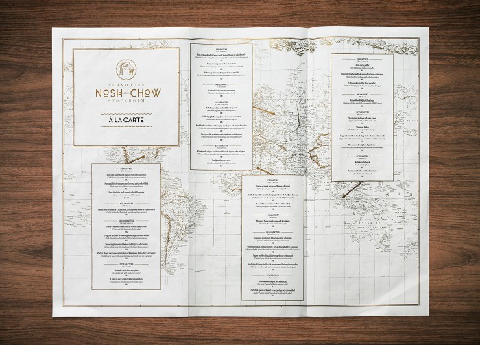
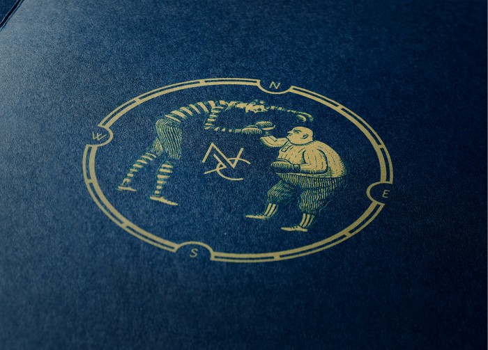
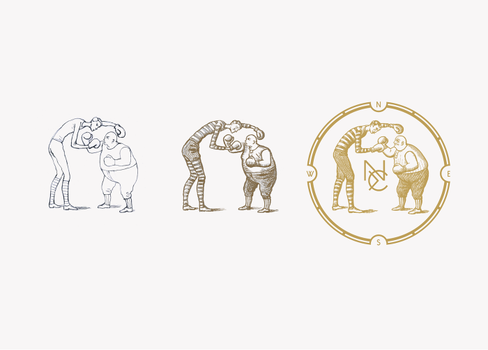
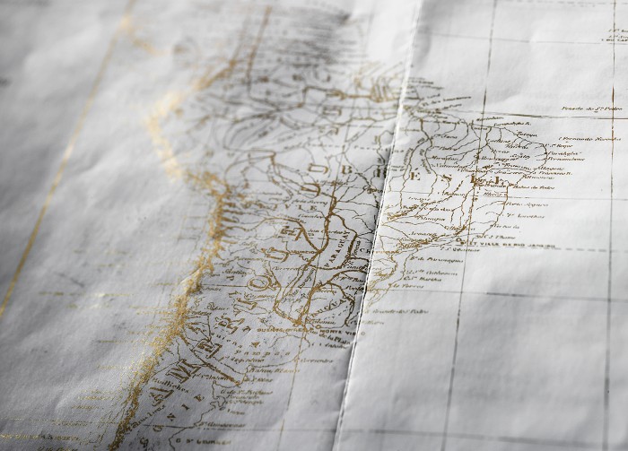
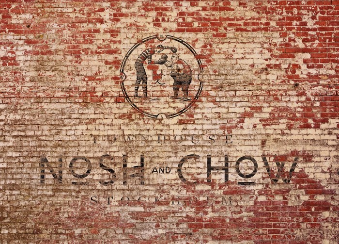
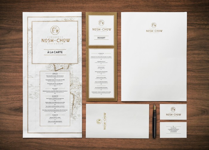
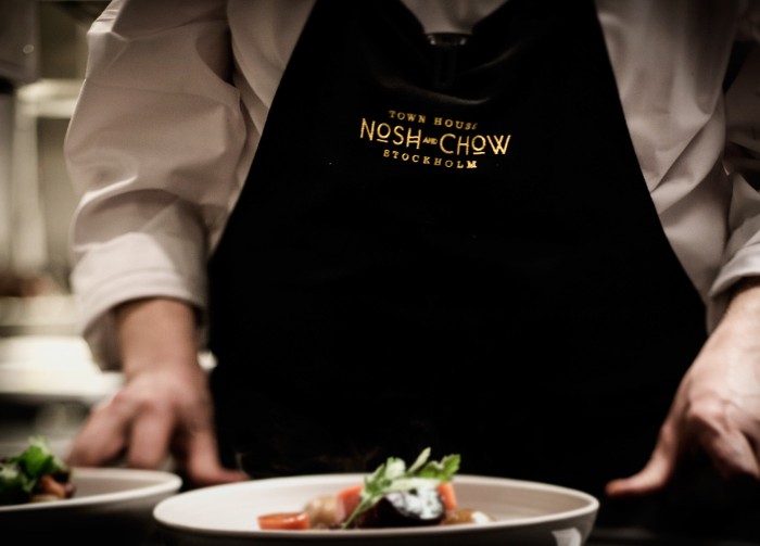
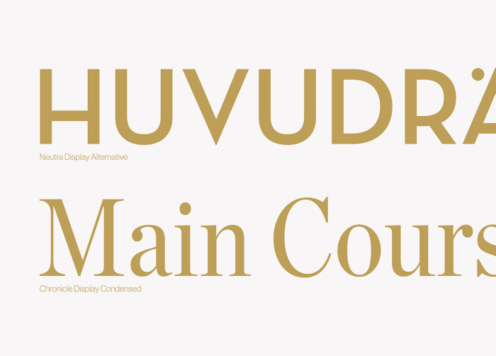
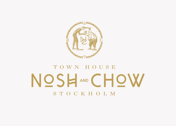
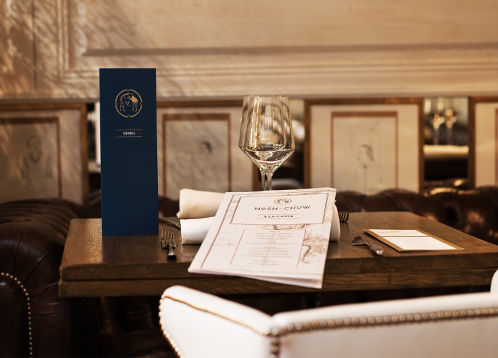
The brand identity for Nosh & Chow is an exploration in melding nods to vintage illustration with strong typographical layouts. The pen and ink illustration of a old-timey boxing match heroes the brand creating an anchor that roots all touch points to the brand. Gold metallics and navy blue hues take the forefront of the identity creating an upscale, finer experience. I especially enjoy the world map used as a device to communicate “world-influenced cuisine.”
Designed by Neumeister
d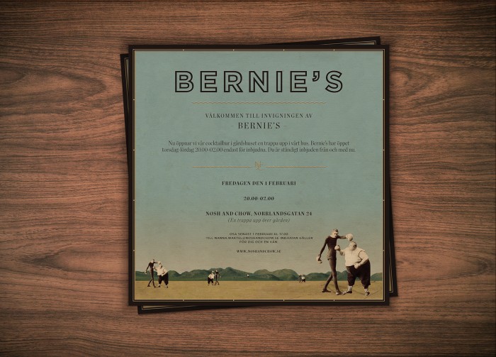
\


