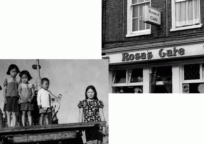
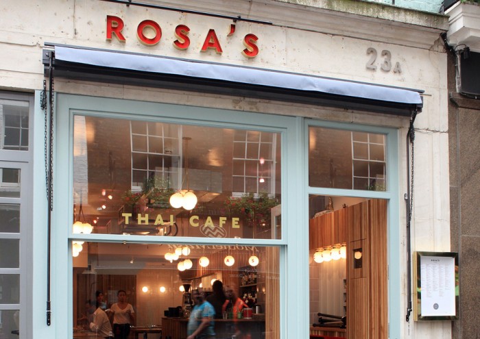
Rosa’s was a staple in London. So strong in fact that it was poised for expansion. Being at threshold of growth made it clear the restaurant had to become a brand that was thought out by design. So entered Buro Creative.

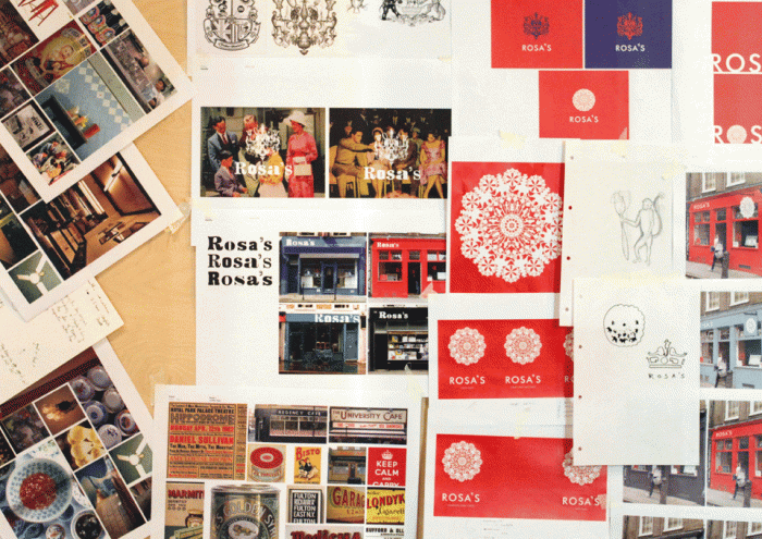
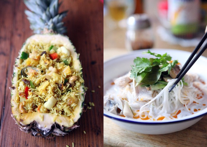
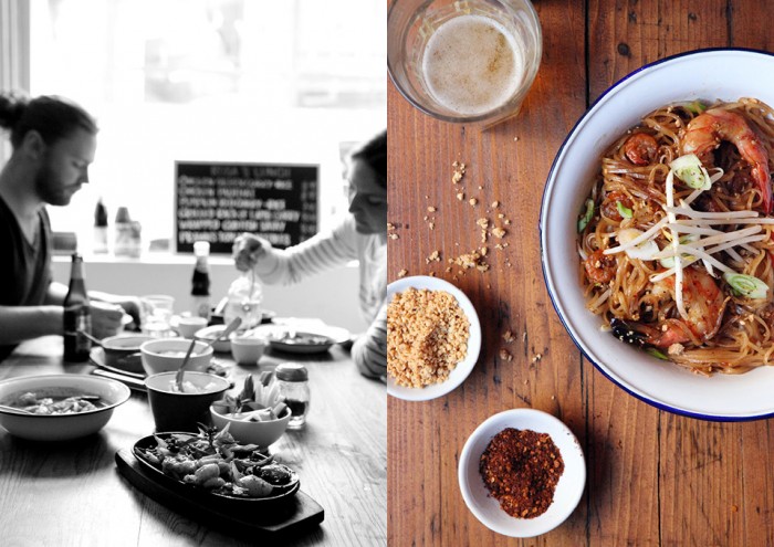
The team a Buro approached the rebranding of Rosa’s with skill. When dealing with an existing experience that’s growing, rebranding is more like an evolution, not a revolution. So, Buro evolved Rosa’s into a brand that has intrigue and communicates the Thai experience in a fresh way.

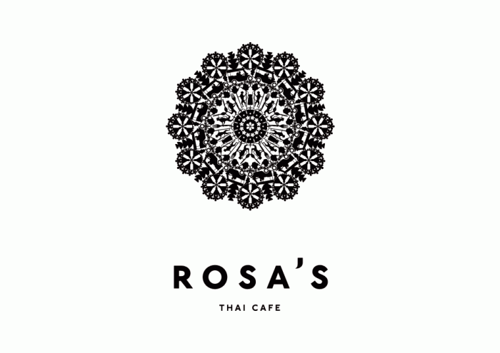
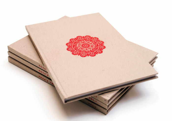
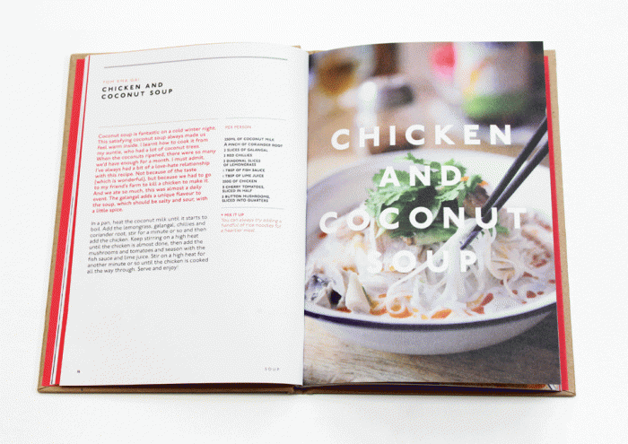
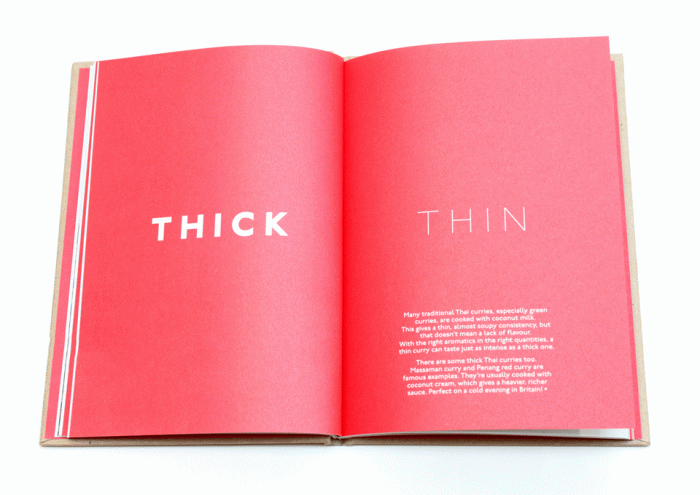
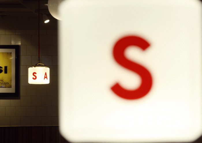
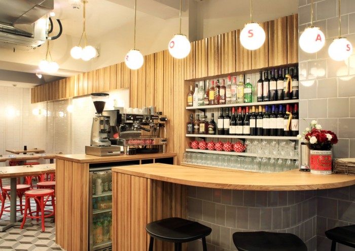
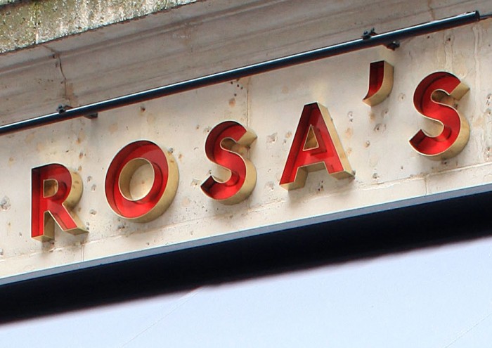
The brand mark is an interpretation of the Rose Window built with iconography inspired by Thai silhouettes. Tuk tuks, monkeys, and sriracha bottles build a lace-like pattern that is strong on it’s own and only gets stronger once the content is realized. From this base the brand builds out across multiple touch points that continues poignant communications of the brand’s true offering.

Designed by Buro Creative

BuroCreative_Rosas_1

BuroCreative_Rosas_2

BuroCreative_Rosas_5b

BuroCreative_Rosas_6

BuroCreative_Rosas_8

BuroCreative_Rosas_11

BuroCreative_Rosas_12

BuroCreative_Rosas_14

BuroCreative_Rosas_15

BuroCreative_Rosas_17

BuroCreative_Rosas_18

BuroCreative_Rosas_19

BuroCreative_Rosas_21

BuroCreative_Rosas_22

BuroCreative_Rosas_23

BuroCreative_Rosas_131


The Forktales Podcast™: Interviews with restaurant industry leaders and visionaries

Restaurant and advertising industry headlines and thinking

Reviews of restaurant experiences from around the globe 

Reviews of our favorite design, business, & restaurant books

Our favorite typography and fonts

Inspiration in your inbox

Get the latest inspiration in your inbox every Monday morning, for FREE!

"*" indicates required fields

This field is for validation purposes and should be left unchanged.

Delicious Bits in your Inbox!

Get the latest and greatest content delivered to your inbox for free!

"*" indicates required fields

This field is for validation purposes and should be left unchanged.