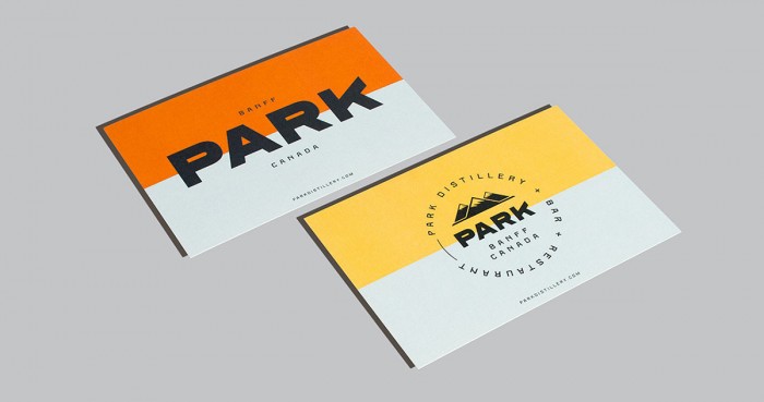
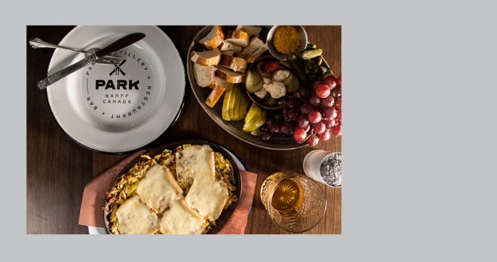
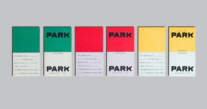
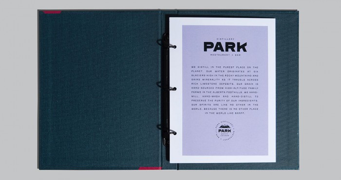
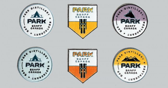
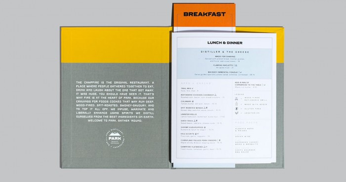
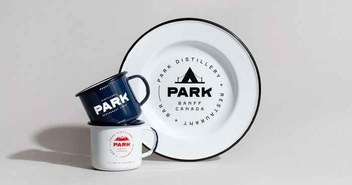
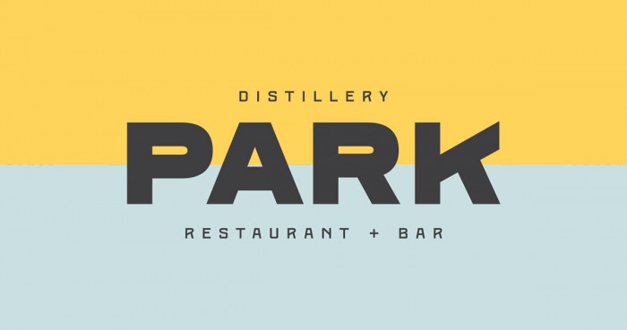
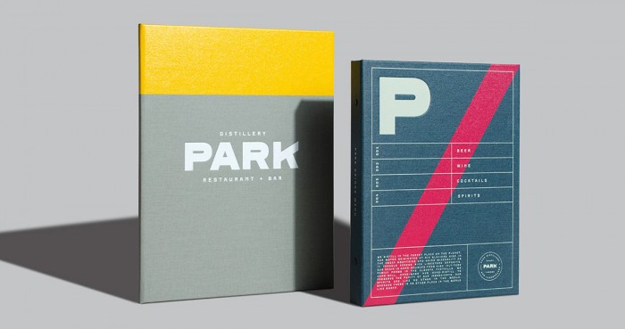
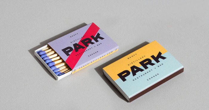
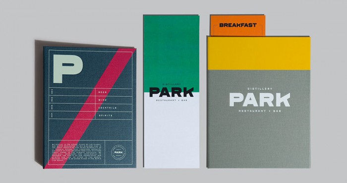
The team at Glasfurd and Walker approached the design for Park, a distillery and restaurant in Vancouver, with a simple, confident eye. The planes of color add pop while the strong typography does all the talking. They pull the color planes throughout every touch point creating continuity while allowing each element to have it’s own design. I especially enjoy the menu designs and how they take this brand identity to the next level.

Designed by Glasfurd & Walker

00f08b30636883.562c4174a006e

2dc8ec30636883.562c4174a25b6

4e323730636883.562c417499099

4fa8f730636883.562c41749d86a

9b204e30636883.562c41749eec3

91be3630636883.562c41749b6ae

9162ca30636883.562c4174a14e0

50055a30636883.562c417497eb1

01891830636883.562c4174a3677

c9fc7a30636883.562c41749697a

d70d5330636883.562c41749c71d

e1c35e30636883.562c41749a55e

The Forktales Podcast™: Interviews with restaurant industry leaders and visionaries

Restaurant and advertising industry headlines and thinking

Reviews of restaurant experiences from around the globe 

Reviews of our favorite design, business, & restaurant books

Our favorite typography and fonts

Inspiration in your inbox

Get the latest inspiration in your inbox every Monday morning, for FREE!

"*" indicates required fields

This field is for validation purposes and should be left unchanged.

Delicious Bits in your Inbox!

Get the latest and greatest content delivered to your inbox for free!

"*" indicates required fields

This field is for validation purposes and should be left unchanged.