Hardy Coffee company branding & packaging

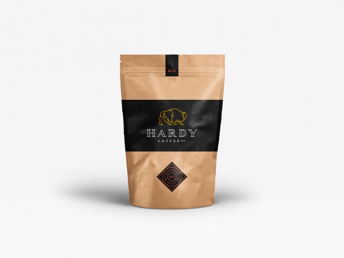
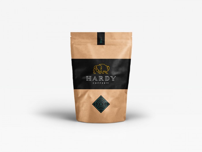
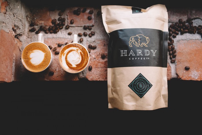
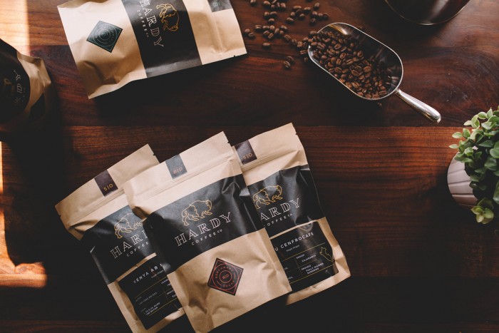
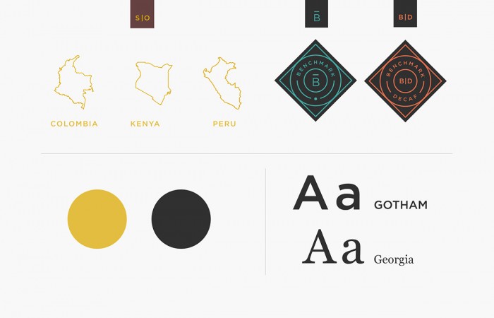
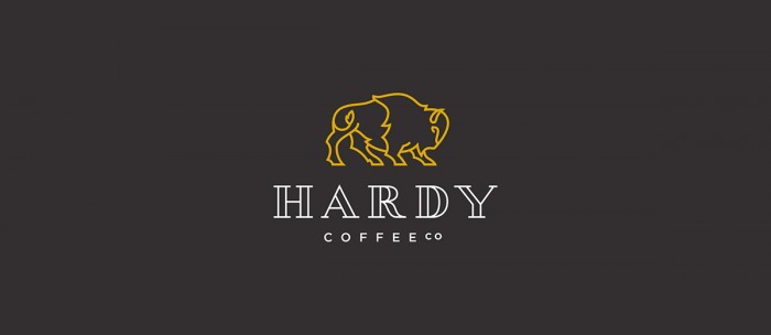
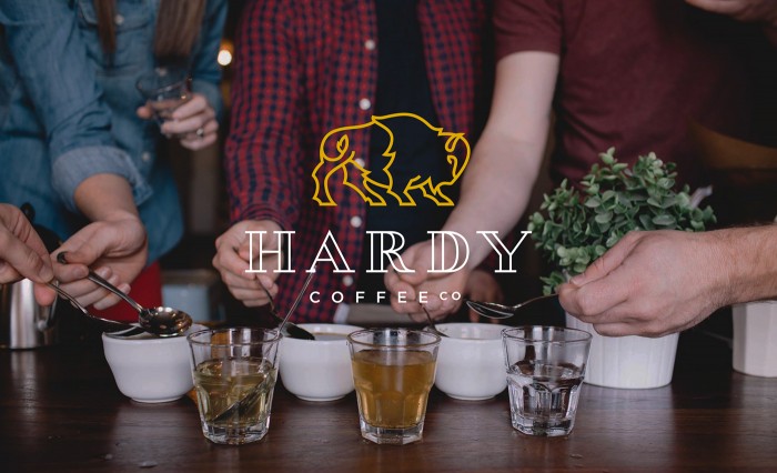
Loving the clean line work on the identity for Hardy Coffee. It’s simple, but just thick enough to be a strong representation of the brand. The heavy dark planes of color set a foundation for the buffalo icon to pop as a defining mark. The craft sealed standup coffee bags can sometimes look like a brand has been slapped on instead of designed. However the Fruitful team approaches it intelligently by creating a number of tip-on elements that make the construction tactic seam a part of the design aesthetic. Quite well done.

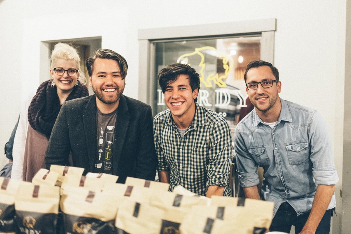
Designed by Fruitful Design

Design: Nicolas Fredrickson, Erin Pille, Dillon Wheelock, Ben Lueders
Illustration & Lettering: Nicolas Fredrickson
Photos: Hope Jewell & Hooton Images

b5d4c831972129.5668c641e9e02

2707e431972129.5668c641eaf3b

f1383b31972129.5668c641ec27c

47d88331972129.5696c2d9a0e00

173bc931972129.5696c2d99f6b8

80772731972129.5696c2d99e06c

5c516f31972129.5696c2d99c7f5

90b6e531972129.5668c641ed334

The Forktales Podcast™: Interviews with restaurant industry leaders and visionaries

Restaurant and advertising industry headlines and thinking

Reviews of restaurant experiences from around the globe 

Reviews of our favorite design, business, & restaurant books

Our favorite typography and fonts

Inspiration in your inbox

Get the latest inspiration in your inbox every Monday morning, for FREE!

"*" indicates required fields

This field is for validation purposes and should be left unchanged.

Delicious Bits in your Inbox!

Get the latest and greatest content delivered to your inbox for free!

"*" indicates required fields

This field is for validation purposes and should be left unchanged.