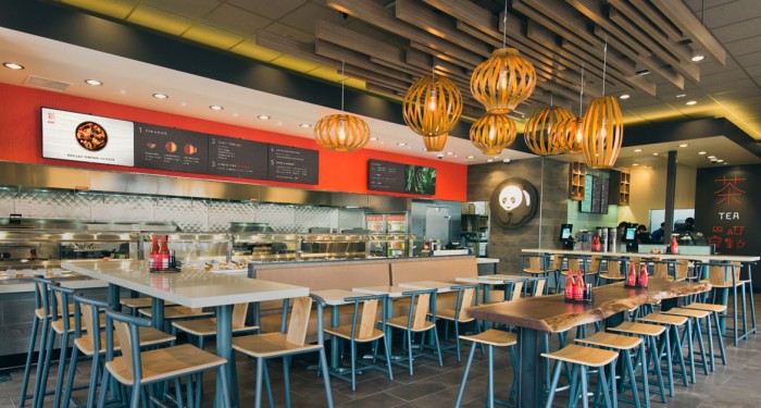
To the outsider, many of you may have a similar feeling towards Panda Express. It’s a low-quality Chinese food greasy-spoon found in the mall. Although that may have been how it was built, the trajectory of Panda is in a totally different direction. They’re not just saying it, they’re actually doing it. Part of the effort is reapproaching their brand’s identity to move away from the flashy discount-driven, cheaper look, to a clean, simple, confident look. At the helm of this rebrand is Studio MPLS and their work speaks for itself.
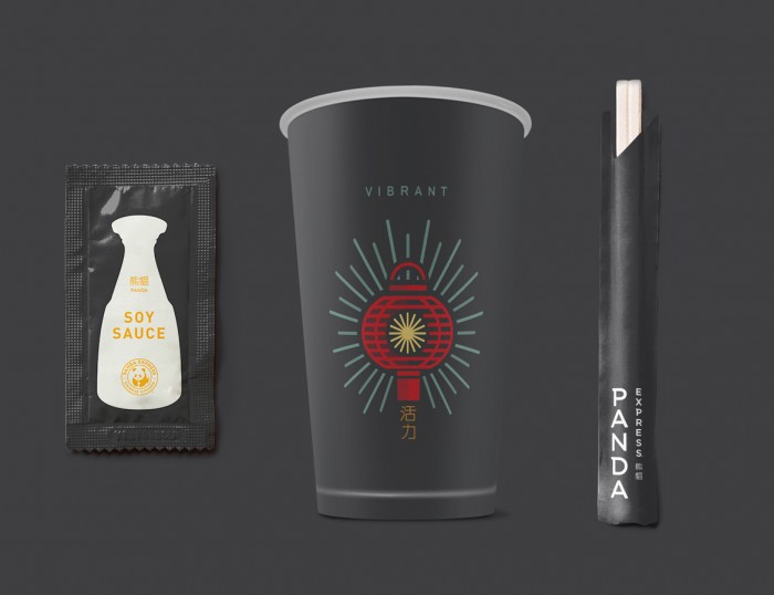
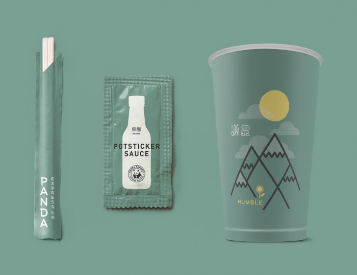
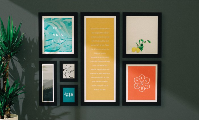
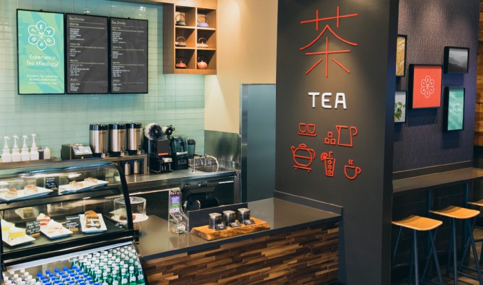
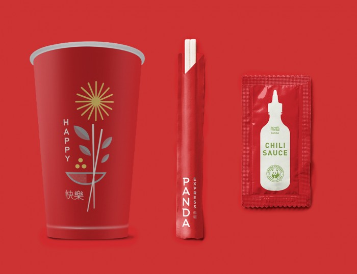
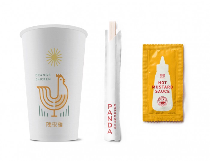
The refreshed Panda Express identity is driven by beautiful line-art illustrations representing somewhat expected Asian symbols and landmarks. The brand type has been rethought to be cleaner and more confident. The color palette is a softer approach to their former bright red and soulless black. (I hate the “color” black.)
Designed by Studio MPLS