Bieju tapiocas & caipirinhas restaurant branding

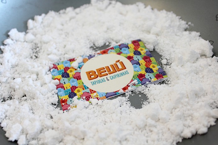
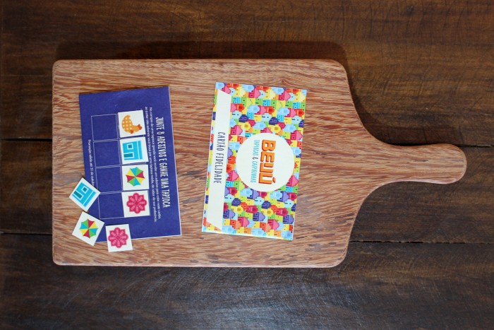
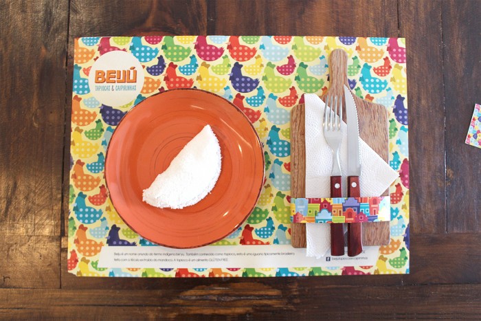
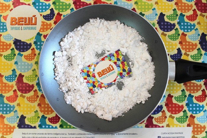
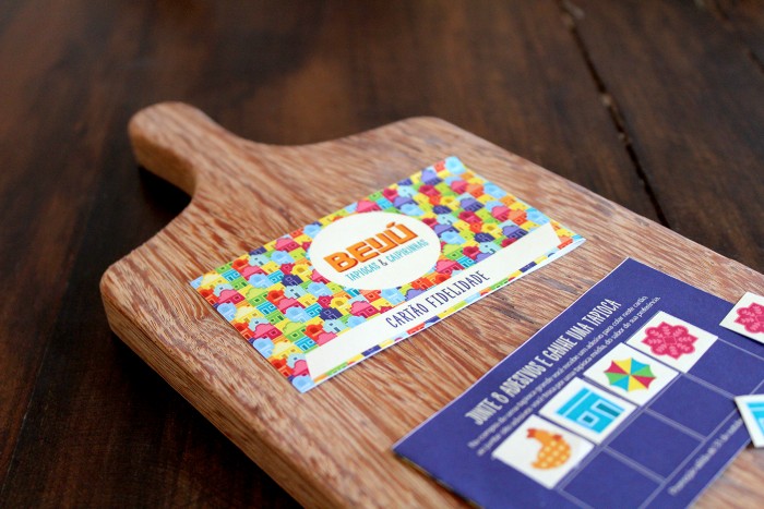
Patterns. Colorful, colorful patterns. The brand identity for Beiju, a tapiocas (brasilian crepes) and caipirinhas restaurant in Brasil, takes the spirit and vivaciousness of the country and visualizes it perfectly. The illustrations that comprise the patterns are playful and fun. The color palette is fruity, fun, and bold. Set alongside hand rendered typography completes the whimsical feel of this brand.

Designed by Bigode Ideias 

logo-01

Behance_5

Behance_4

Behance_3

Behance_2

Behance_1

logo-05


logo-04


logo-03


logo-02


The Forktales Podcast™: Interviews with restaurant industry leaders and visionaries

Restaurant and advertising industry headlines and thinking

Reviews of restaurant experiences from around the globe 

Reviews of our favorite design, business, & restaurant books

Our favorite typography and fonts

Inspiration in your inbox

Get the latest inspiration in your inbox every Monday morning, for FREE!

"*" indicates required fields

This field is for validation purposes and should be left unchanged.

Delicious Bits in your Inbox!

Get the latest and greatest content delivered to your inbox for free!

"*" indicates required fields

This field is for validation purposes and should be left unchanged.