Puro burger restaurant branding

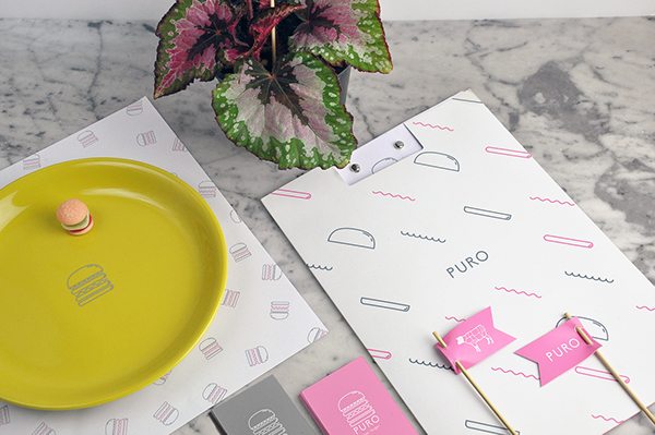
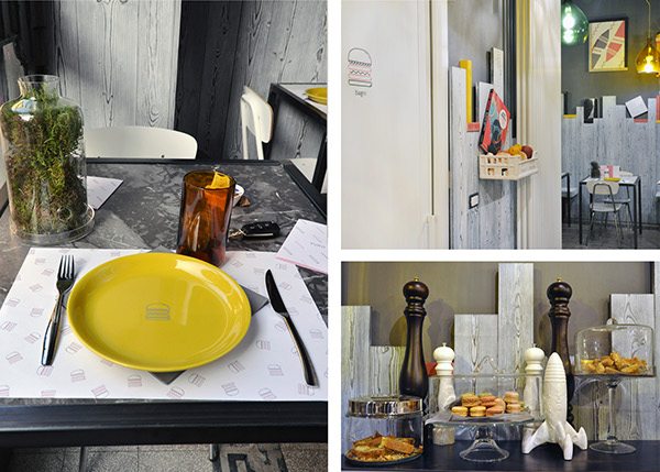
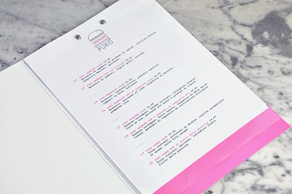
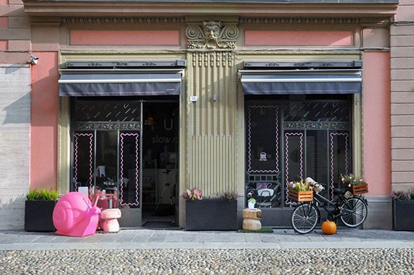
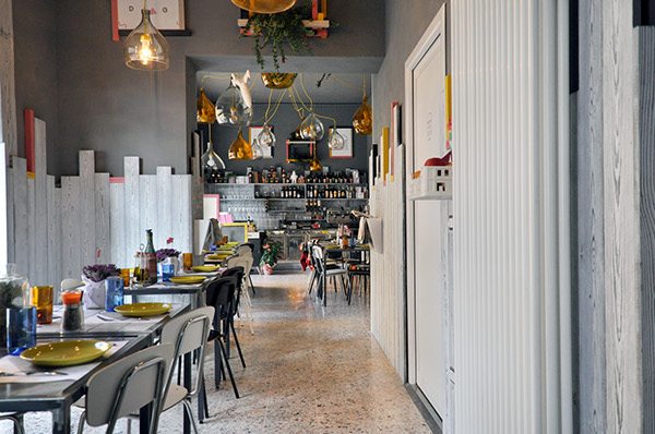
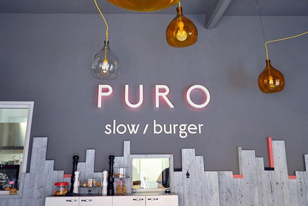
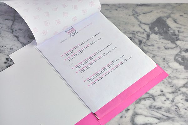
The thing that stands out to me about the brand design for Puro is how the identity and interiors are perfectly married. There is enough visual glue to draw correlations between the two without being so direct that it becomes expected or boring. In this instance it’s the use of the pops of pink and fun elements of identity in the interiors that serve as a thread to tie things together.

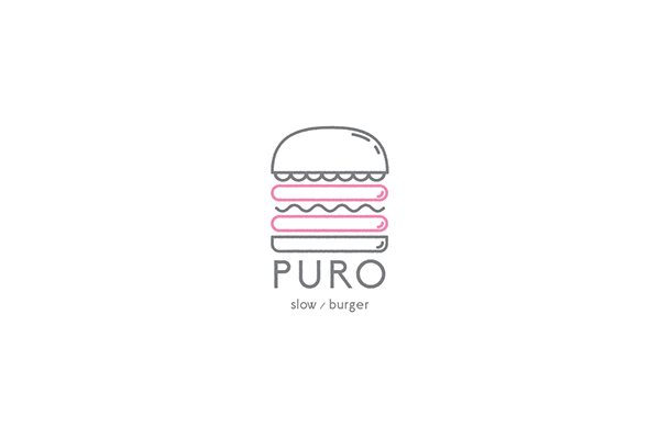
Based in Italy, the brand’s was inspired by pop art and modernism. The designer, Pino Sartorio, pulled influence from minimalist iconography and simple grids to execute this beautifully crafted restaurant brand.

Designed by Pino Sartorio

1dbab720621595.562ee5f89f931

6a8c5120621595.562ee5f890bbe

53778220621595.562ee5f896a06

d

d7f30c20621595.562fdba984c70

d630ec20621595.562fdba978684

e1084a20621595.562ee5fc67ded

f4841d20621595.562ee5f8951a4

The Forktales Podcast™: Interviews with restaurant industry leaders and visionaries

Restaurant and advertising industry headlines and thinking

Reviews of restaurant experiences from around the globe 

Reviews of our favorite design, business, & restaurant books

Our favorite typography and fonts

Inspiration in your inbox

Get the latest inspiration in your inbox every Monday morning, for FREE!

"*" indicates required fields

This field is for validation purposes and should be left unchanged.

Delicious Bits in your Inbox!

Get the latest and greatest content delivered to your inbox for free!

"*" indicates required fields

This field is for validation purposes and should be left unchanged.