Taqueria Del Pueblo food truck branding

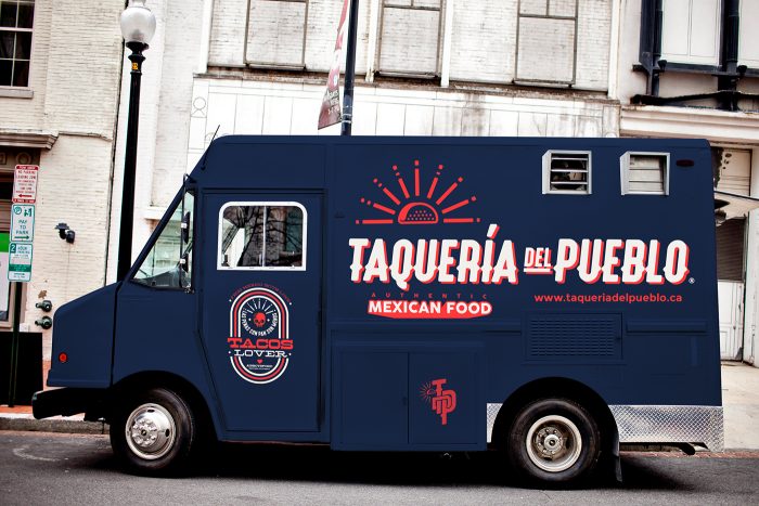
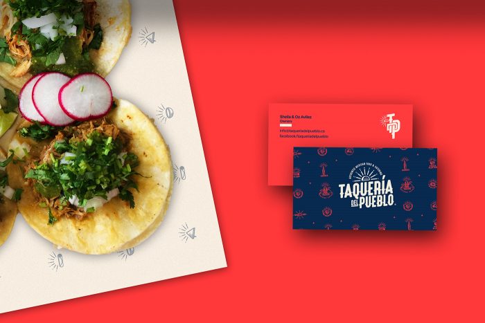
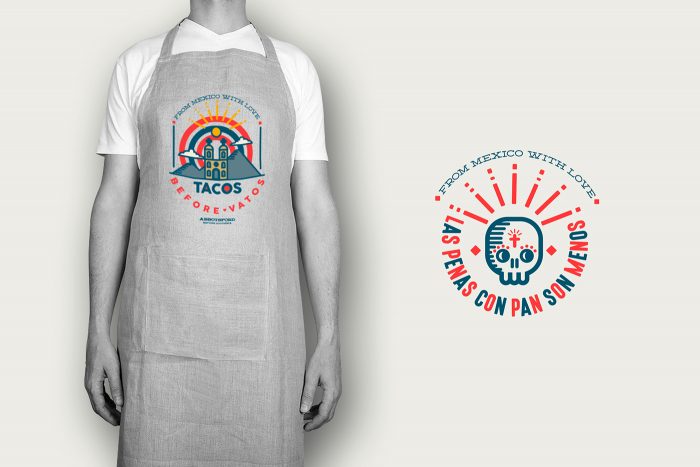
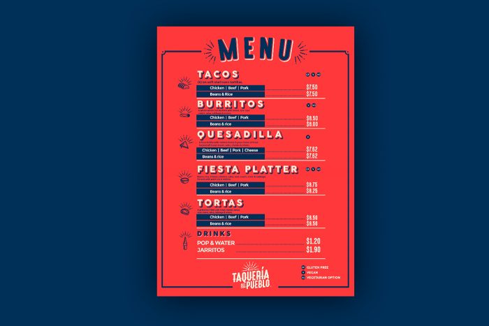
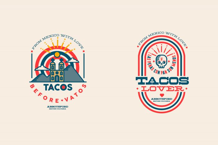
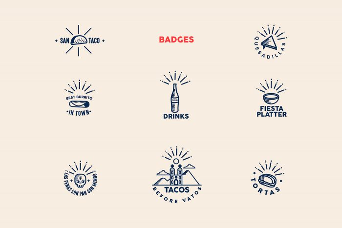
Vibrant colors pop off a deep navy blue plane creating drama and focus. I absolutely love the richness of the reds in this composition. It’s so strong. The typography is a semi-hand rendered feel with classic elements that make this identity look partly classic and partly modern. The iconography and design lockups take the brand identity to a new level with little memorable moments throughout the touch points. That skull icon is just awesome.

Designed by Jaime Espinoza

c3694634455337.56d0fba84945b

e4caf234455337.56d0fba848e87

1a241634455337.56d0fba8481ad

2eeba034455337.56d0fba848815

85ea3e34455337.56d0fba847cf4 78bbfa34455337.56d0fba847705

e1cf2234455337.56d0fba8470ce

15c01e34455337.56d0fba8466bf


The Forktales Podcast™: Interviews with restaurant industry leaders and visionaries

Restaurant and advertising industry headlines and thinking

Reviews of restaurant experiences from around the globe 

Reviews of our favorite design, business, & restaurant books

Our favorite typography and fonts

Inspiration in your inbox

Get the latest inspiration in your inbox every Monday morning, for FREE!

"*" indicates required fields

This field is for validation purposes and should be left unchanged.

Delicious Bits in your Inbox!

Get the latest and greatest content delivered to your inbox for free!

"*" indicates required fields

This field is for validation purposes and should be left unchanged.