East Brother Beer Co. Branding

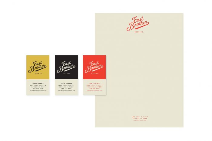
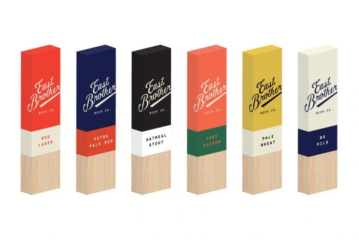
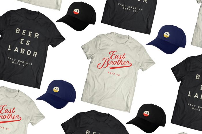
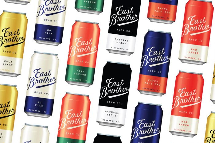
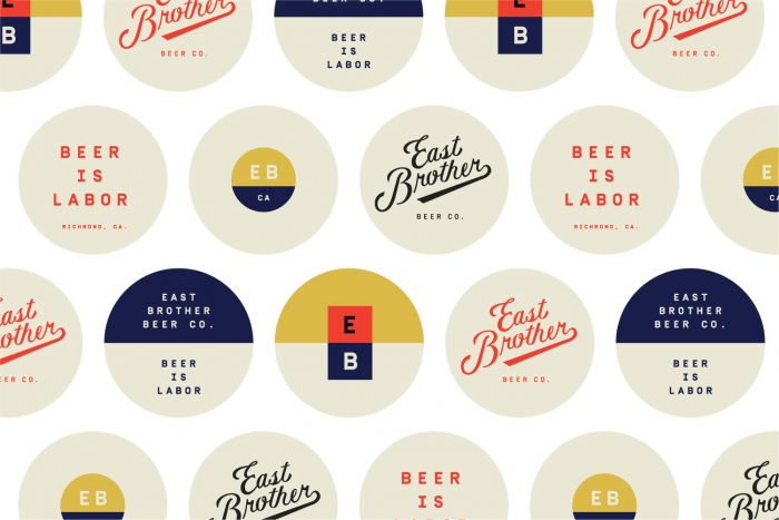
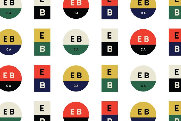
Was strolling through the interwebs yesterday when this beauty jumped out at me. At first I saw some correlations to the brand identity and package design for Creature Comforts by Young Athenians, but that’s only because of the use of solid color bars on the cans. After that the identity takes on it’s own look and feel quite excellently. East Brother Beer Co has a simple, clean look that’s semi-vintage in its approach. The colors are strong which help them jump off the shelves in a world of over design and too much illustration. The other touch points bolster the look with simple typography and no nonsense design aesthetic.

Designed by Good Beer Hunting Studio
Found on Oh Beautiful Beer


east-brother-apparel

east-brother-cans

east-brother-coasters

east-brother-identity

east-brother-logo

east-brother-print

east-brother-sign

east-brother-taps

The Forktales Podcast™: Interviews with restaurant industry leaders and visionaries

Restaurant and advertising industry headlines and thinking

Reviews of restaurant experiences from around the globe 

Reviews of our favorite design, business, & restaurant books

Our favorite typography and fonts

Inspiration in your inbox

Get the latest inspiration in your inbox every Monday morning, for FREE!

"*" indicates required fields

This field is for validation purposes and should be left unchanged.

Delicious Bits in your Inbox!

Get the latest and greatest content delivered to your inbox for free!

"*" indicates required fields

This field is for validation purposes and should be left unchanged.