Neighbourhood Eatery & Bar branding

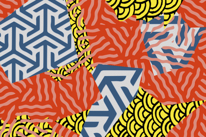
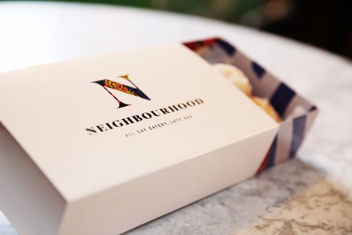
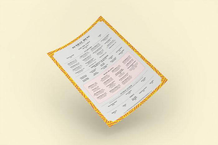
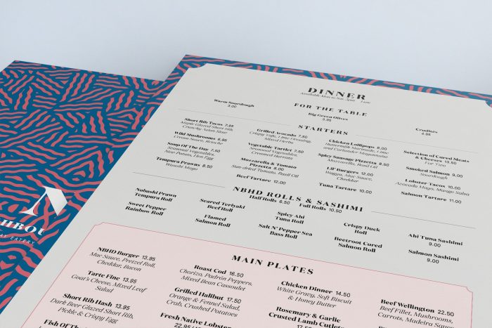
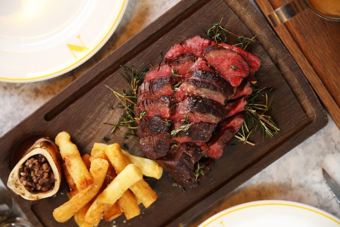
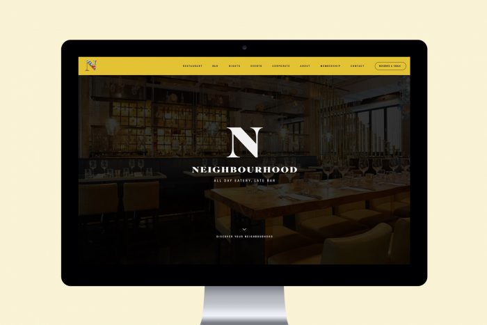
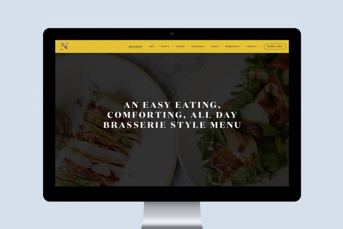
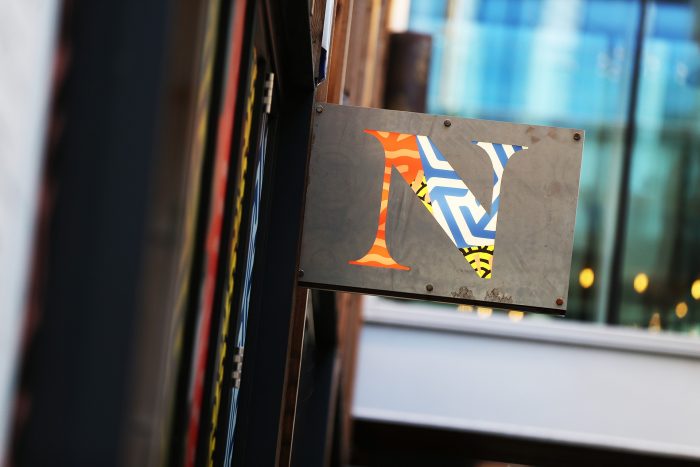
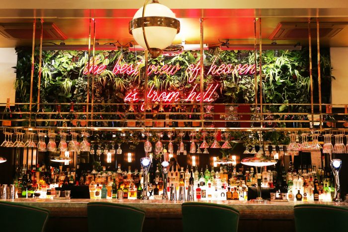
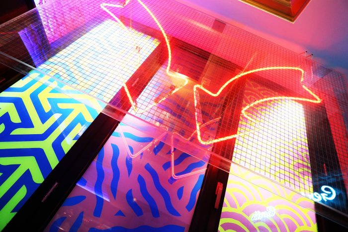
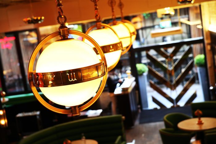
This identity jumped out as something quite different. The mix of contrasting patterns in the logo grabs your eye and sparks intrigue. Neighbourhood is a new eatery and late bar in Manchester and Liverpool London. The patterns are expressive of the brand’s experience and vibe. Bright, sporadic, nearly psychedlic in that “ive been out so long I can’t remember what day it is” way. How the patterns are introduced in composition is what really stands out to me. They’re found in the N letterform as a stand alone brand mark. They’re used as backdrops and border treatments for the menu holders. And, finally, they find a home in the interior design elements which brings the whole look together.

Designed by Ahoy

Be sure to checkout Richard Baird’s review at BP&O for more in depth commentary/opinion.

2-nbhd-logo-gif1 3-nbhd-pattern-gif 4-nbhd-box-of-doughnuts-1920x1280 5-nbhd-sunday-menu-1920x1280 6-nbhd-dinner-menu_2-1920x1280 7-nbhd-roast-1920x1280 8-nbhd-homepage-1920x1280 9-nbhd-restaurants-1920x1280 11-nbhd-business-card-1920x1280 12-nbhd-exterior-sign-1920x1280 nbhd-bar-1920x1280 nbhd-fluoro-sign-1920x1280 nbhd-lights-1920x1280


The Forktales Podcast™: Interviews with restaurant industry leaders and visionaries

Restaurant and advertising industry headlines and thinking

Reviews of restaurant experiences from around the globe 

Reviews of our favorite design, business, & restaurant books

Our favorite typography and fonts

Inspiration in your inbox

Get the latest inspiration in your inbox every Monday morning, for FREE!

"*" indicates required fields

This field is for validation purposes and should be left unchanged.

Delicious Bits in your Inbox!

Get the latest and greatest content delivered to your inbox for free!

"*" indicates required fields

This field is for validation purposes and should be left unchanged.