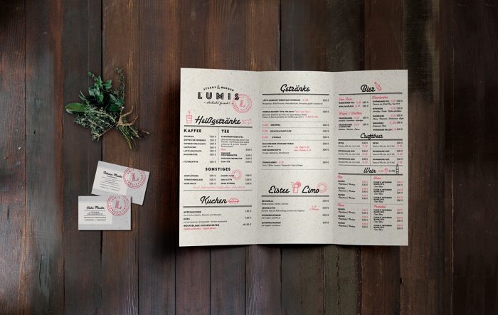
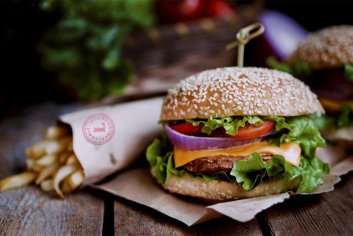
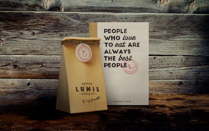
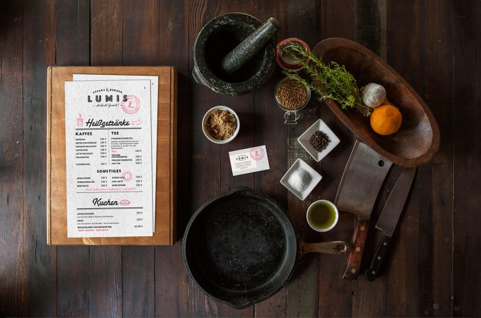
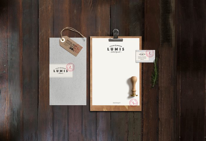
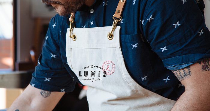
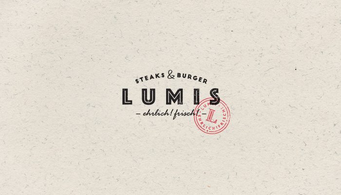
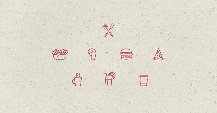
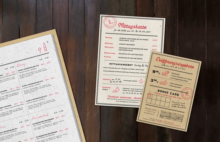
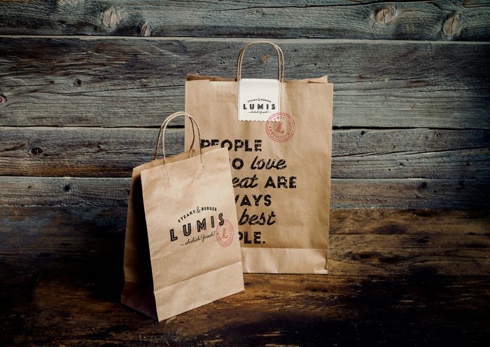
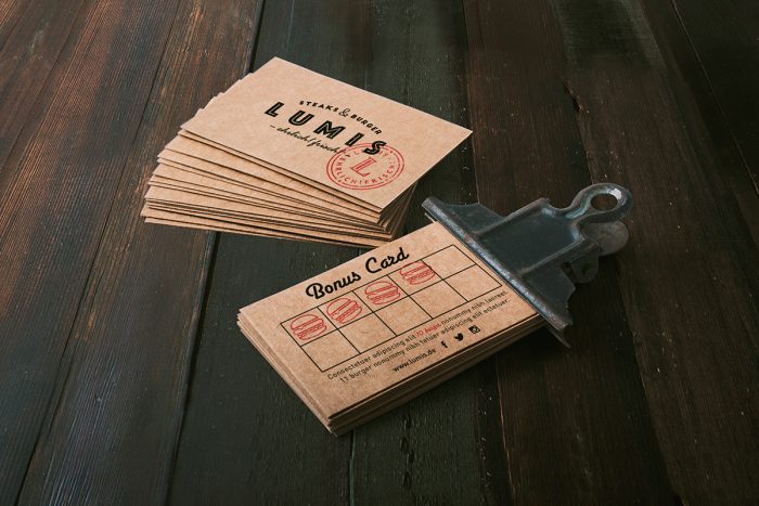
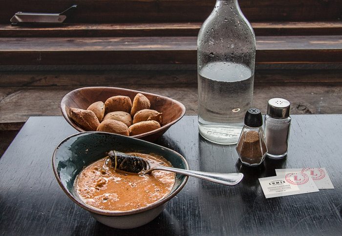
Lumis’ brand identity falls mainly into an expected farm-to-table look, except for typographic elements and pops of non-organic colors. The introduction of the fifties style headlines add a lot of intrigue to the overarching look, while the pops of cool red grab your eye and attention. While the brand is rooted in strong grid layouts, the simple illustrations and color elements break things up and keep things interesting.

The tone of voice employed is warm and approachable as read on the packaging touch points. This aligns excellently with the fifties script typography to give that diner-goes-modern feel.

Designed by Daria Po

3e8c4030469711-562567f2d562d 8b85f930469711-56254b9ae4943 79d72d30469711-56698ef1277e5 831cf130469711-5624ed73ba66e 848a4630469711-5624ed73bcdf6 3037d430469711-5647c0d4a3a6a 99287c30469711-5628c41230b14 03150730469711-5624ed73b9538 a48e7730469711-5648c73e237a8 a4434630469711-562567f2d4677 bfc12530469711-5624ed73bb88f daf69930469711-5648bd9a1043c e23bd730469711-5647c0d4a2675 fe3eee30469711-5648bd9a116cf

The Forktales Podcast™: Interviews with restaurant industry leaders and visionaries

Restaurant and advertising industry headlines and thinking

Reviews of restaurant experiences from around the globe 

Reviews of our favorite design, business, & restaurant books

Our favorite typography and fonts

Inspiration in your inbox

Get the latest inspiration in your inbox every Monday morning, for FREE!

"*" indicates required fields

This field is for validation purposes and should be left unchanged.

Delicious Bits in your Inbox!

Get the latest and greatest content delivered to your inbox for free!

"*" indicates required fields

This field is for validation purposes and should be left unchanged.