Naturoney honey packaging rebranding

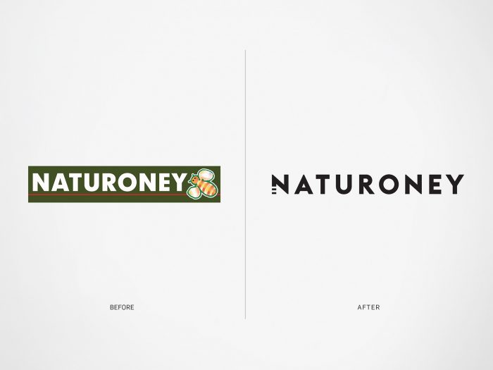
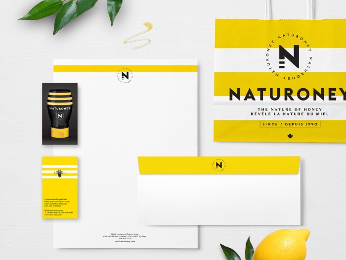
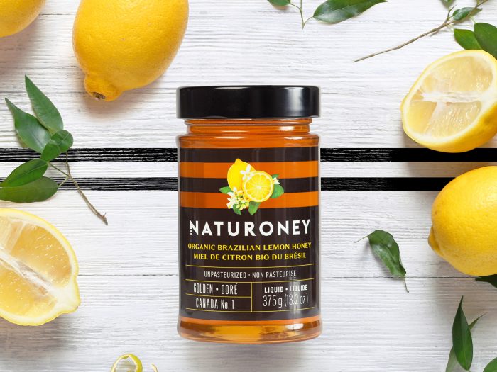
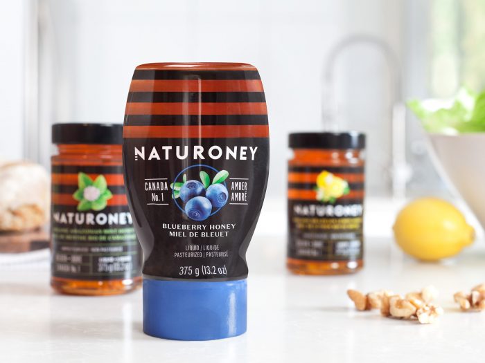
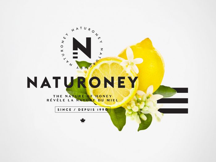
LG2 Boutique’s rebranding for Naturoney is quite brilliant. At first glance the use of bee inspired striping seems played out, but the team employs this mnemonic device in a way that’s fresh and natural.

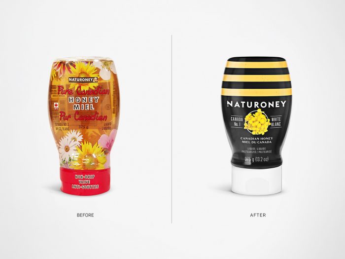
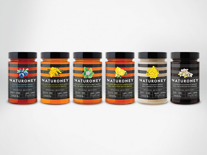
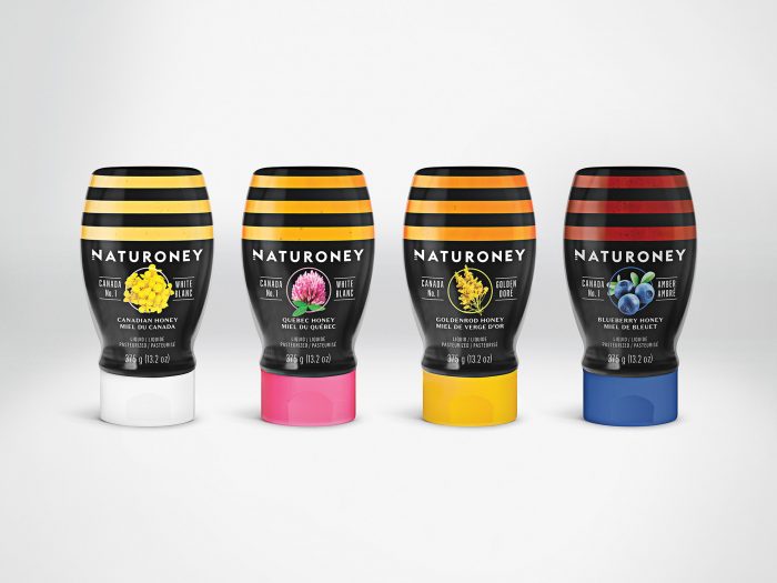
The original look and feel played up the origins of honey. Although not a terrible look, it was busy and nondescript. A cleaner, modernized design solution helped elevate the perceived quality of product while creating a unified look for ribbonization on the shelf. In short, the new identity and package design is easier to pick out and identify.

Designed by LG2 Boutique

naturoney-branding-packaging-008 naturoney-branding-packaging-007 naturoney-branding-packaging-006 naturoney-branding-packaging-005 naturoney-branding-packaging-004

Blueberries on vintage wooden white background top view, healthy food on dark table mockup, berry for smoothie on vintage rustic country board, fresh bilberry mock up closeup, copy space for text ; Shutterstock ID 458200021

naturoney-branding-packaging-002 naturoney-branding-packaging-001

The Forktales Podcast™: Interviews with restaurant industry leaders and visionaries

Restaurant and advertising industry headlines and thinking

Reviews of restaurant experiences from around the globe 

Reviews of our favorite design, business, & restaurant books

Our favorite typography and fonts

Inspiration in your inbox

Get the latest inspiration in your inbox every Monday morning, for FREE!

"*" indicates required fields

This field is for validation purposes and should be left unchanged.

Delicious Bits in your Inbox!

Get the latest and greatest content delivered to your inbox for free!

"*" indicates required fields

This field is for validation purposes and should be left unchanged.