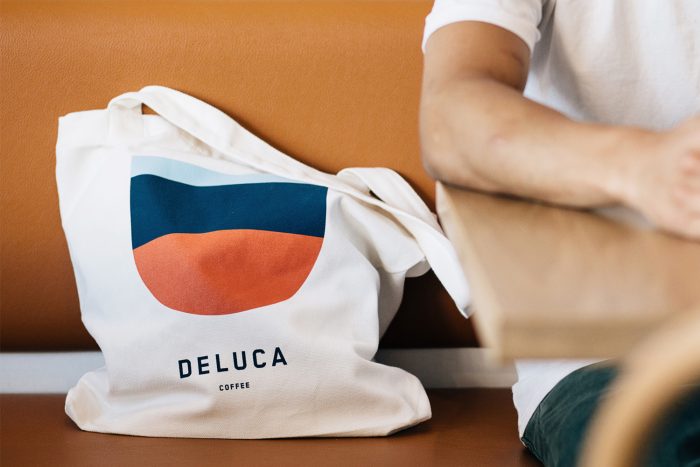
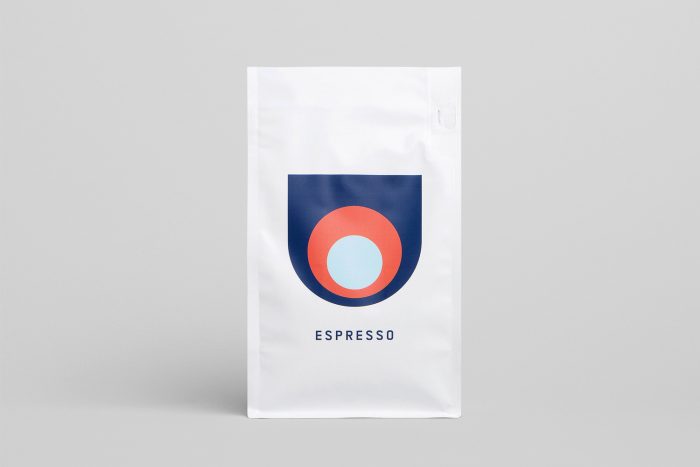
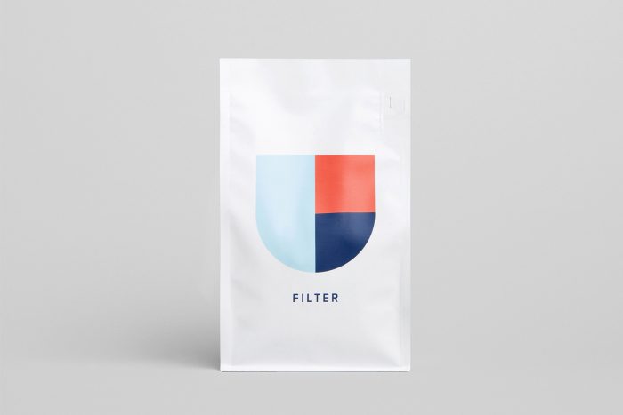
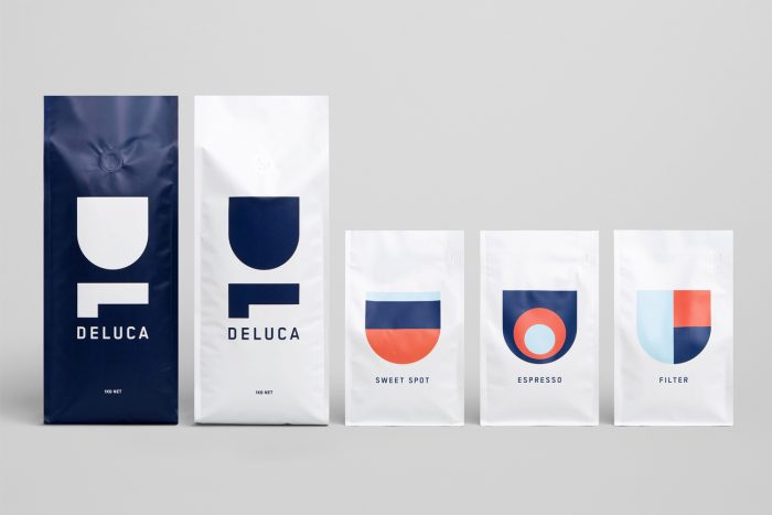
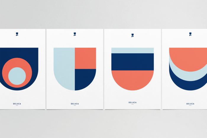
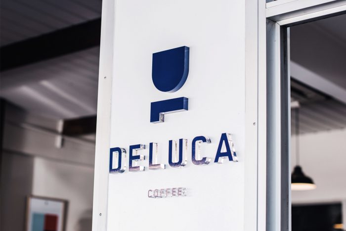
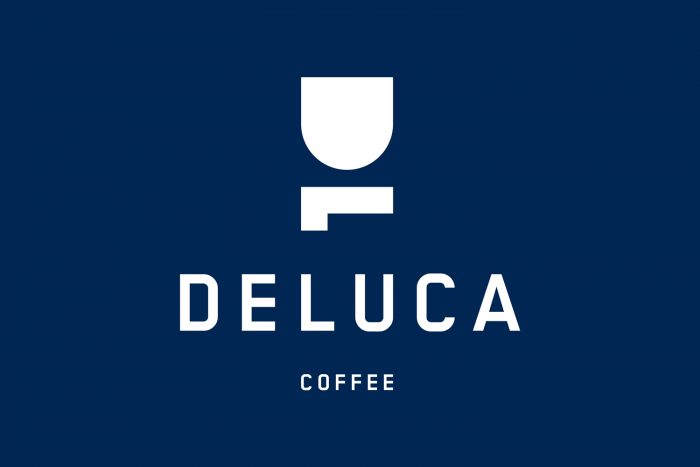
I’m a sucker for simplicity and minimalism and the brand identity and packaging for Deluca Coffee nails it. Deluca Coffe is a family-run cafe and roastery based in Banksmeadow, Sydney. They not only serve up their delicious coffee, they also sell it to restaurants and cafes across the city. The brand’s identity is centered around a profound brandmark that employs a D and L letterform into the shape of a cup on an expresso machine tray. A brilliant device that’s powerful in its minimalism. The mark is supported by clean, modern typography that has a semi-industrial vibe. The colors are a powerful mix of red and blue that create patterns in the brand’s mark. Each pattern nods to the packages contents in a subtle, but unforgettable way.
Design: Christopher Doyle
Photography: Alana Dimou
Product Photography: Foliolio
And a special thanks to Mindsparkle Magazine for bringing this to light