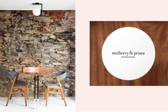
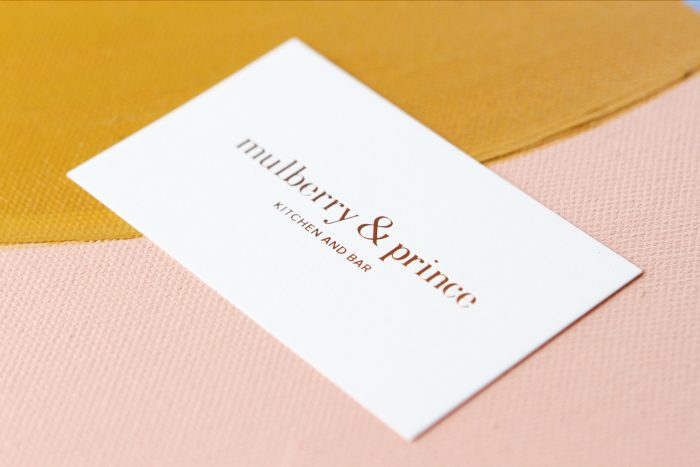
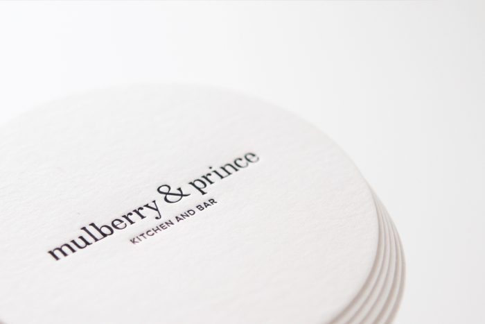
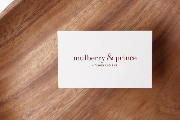
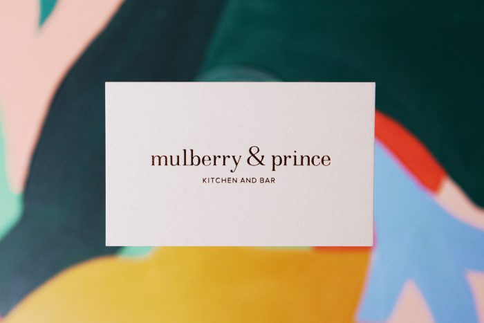
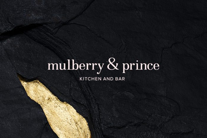
Clean, reserved, and perfectly transitional in style, the brand identity design for Mulberry & Prince keeps things no-nonsense. It lets the beauty of the typography sing across the touch points.
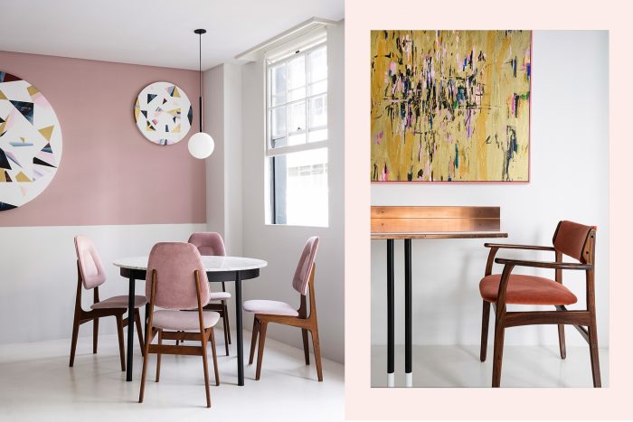
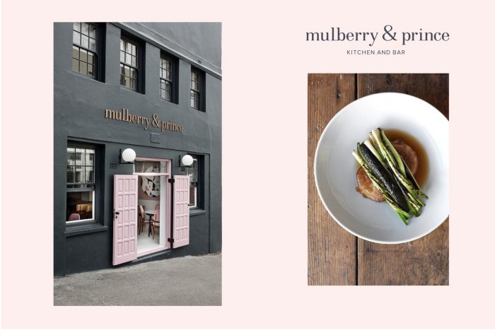
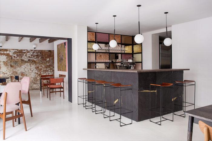
Mulberry & Prince is a restaurant and bar located in Cape Town, South Africa. It’s named after two popular streets in NYC that are known for their culinary delights. The design solution for bringing this concept to life was to merge modern and classic design aesthetic to create that vibe found in New York where the new and old exist together so lovely.
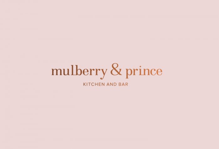
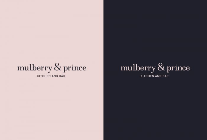
The soft peach/pink color is a welcomed shift from classic bar and restaurant identities. In this case it pulls in the vibe of the interior space so perfectly. It would’ve been nice to see more exploration in the supporting graphic elements of the brand. For instance, how does it perform on menu designs? Is there an opportunity for an insignia or monogram? This is a great start to a beautiful brand, hopefully there will be more opportunities for Ms. Van Vuuren to push it further.
Brand designed by Kim Van Vuuren
Interiors designed by Atelier