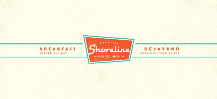
This identity puts you in a Delorean and sends you back in time to a moment of nostalgic bliss. Classic design aesthetics reminiscent of the 50’s and 60’s mark this coffee shop’s look and feel. The typography is what really sends it hope in all it’s post-modern glory.

I love the teal and red/orange combination. It’s one that I’ve struggled with in the past because I can’t see anything but Miami Dolphins. However, the team at VK employes this palette with excellence.

Designed by VK Design


The Forktales Podcast™: Interviews with restaurant industry leaders and visionaries

Restaurant and advertising industry headlines and thinking

Reviews of restaurant experiences from around the globe 

Reviews of our favorite design, business, & restaurant books

Our favorite typography and fonts

Inspiration in your inbox

Get the latest inspiration in your inbox every Monday morning, for FREE!

"*" indicates required fields

This field is for validation purposes and should be left unchanged.

Delicious Bits in your Inbox!

Get the latest and greatest content delivered to your inbox for free!

"*" indicates required fields

This field is for validation purposes and should be left unchanged.