Buchberger butcher shop branding

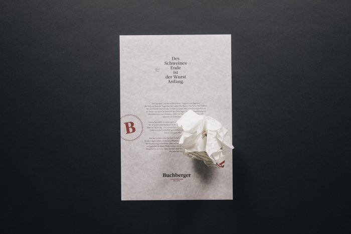
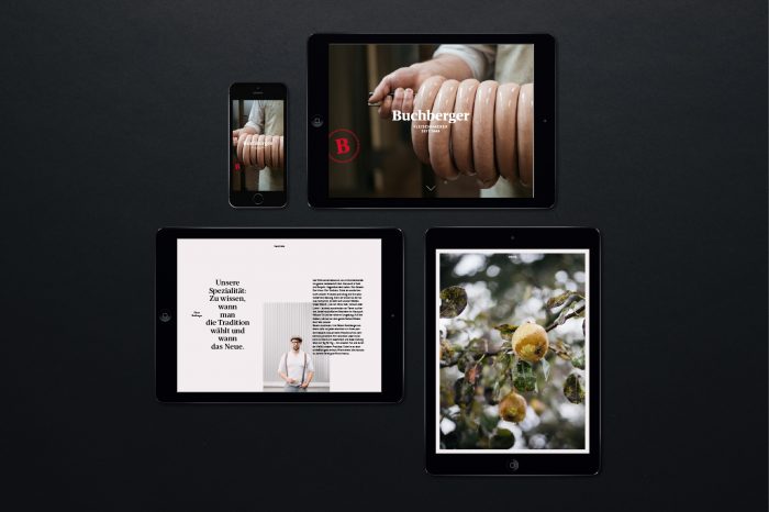
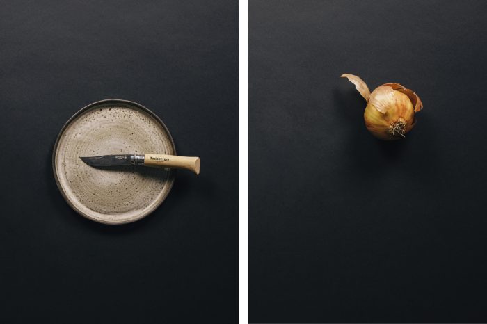
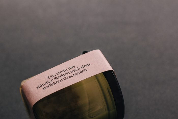
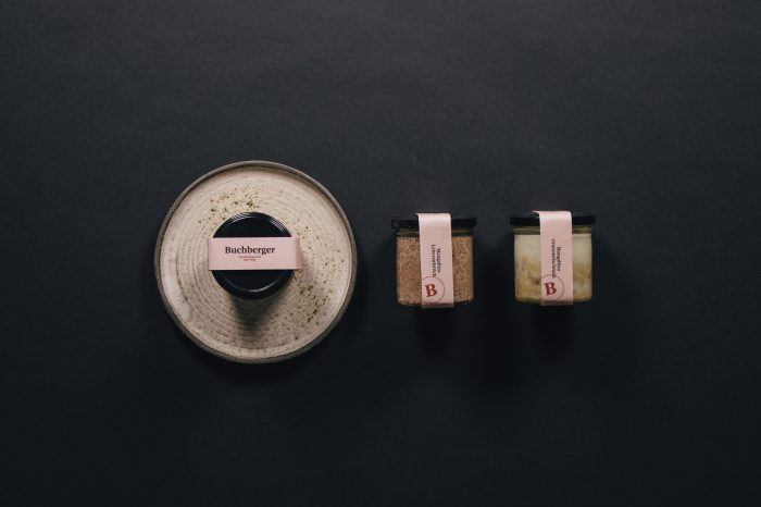
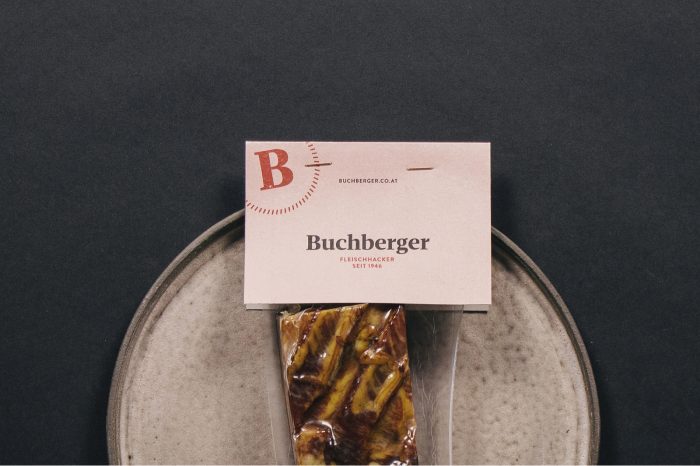
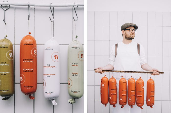
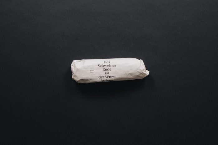
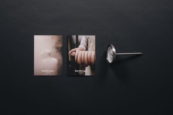
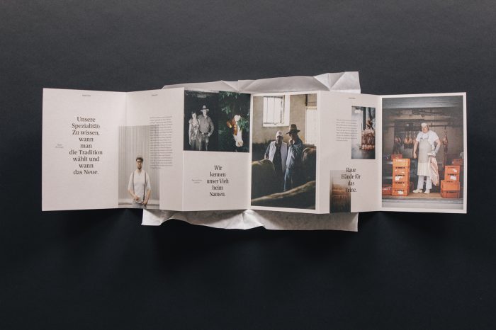
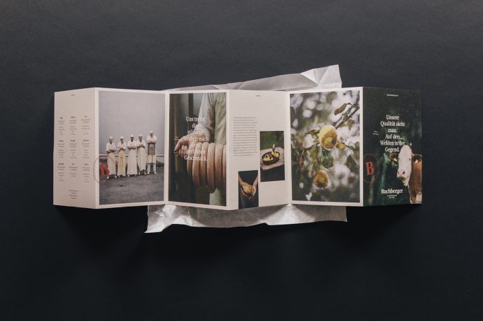
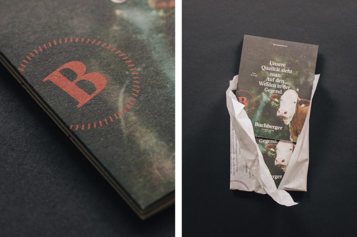
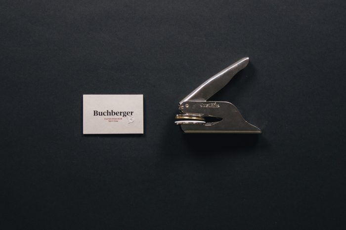
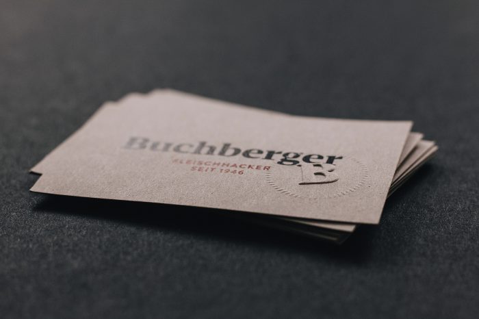
Wonderfully simple, clean, and confident, this identity for a butcher shop in Austria let’s the craft take the center stage. Starting from the simple “B” monogram, the brand creates a direct, no nonsense aesthetic. Typography is allowed to shine in all its glory while common colors create unique, unexpected pops for a butcher brand.

Designed by Riebenbauer Design


The Forktales Podcast™: Interviews with restaurant industry leaders and visionaries

Restaurant and advertising industry headlines and thinking

Reviews of restaurant experiences from around the globe 

Reviews of our favorite design, business, & restaurant books

Our favorite typography and fonts

Inspiration in your inbox

Get the latest inspiration in your inbox every Monday morning, for FREE!

"*" indicates required fields

This field is for validation purposes and should be left unchanged.

Delicious Bits in your Inbox!

Get the latest and greatest content delivered to your inbox for free!

"*" indicates required fields

This field is for validation purposes and should be left unchanged.