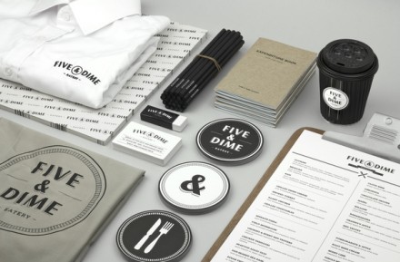
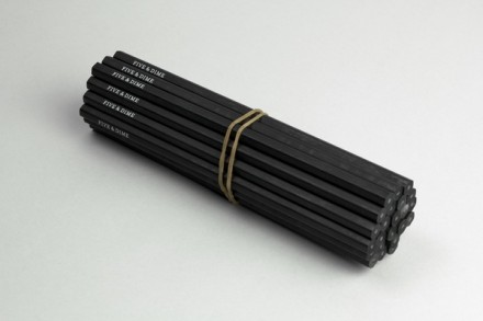
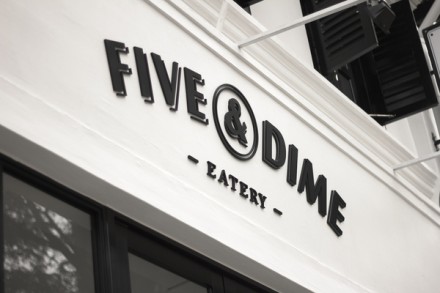
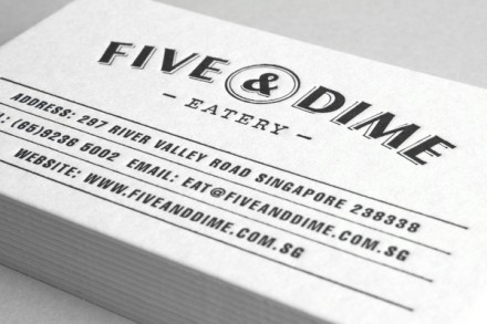
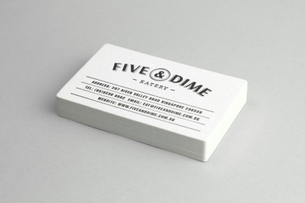
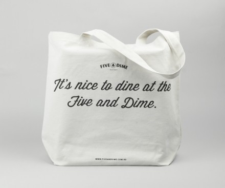
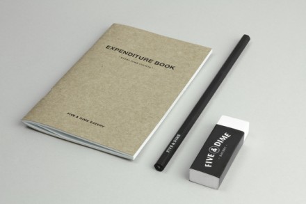
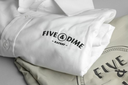
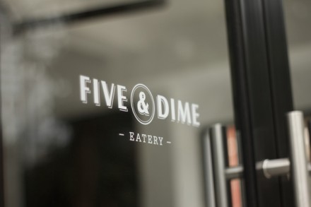
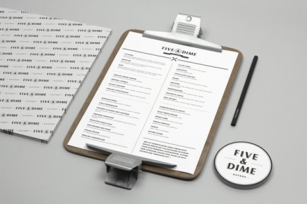
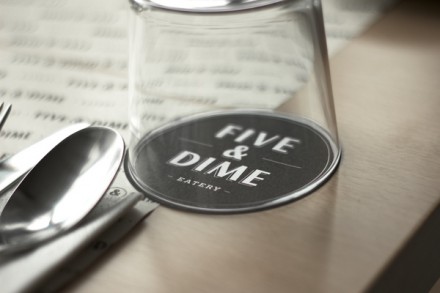
Bravo Company is churning out some seriously impressive brand concepts and another recent one is for the Singapore restaurant Five & Dime. It’s an interesting concept and Bravo makes some interesting choices. Many of us know the five & dime store from this 80’s reference and Bravo used that as the inspiration behind the restaurant. Conceptually it has little to do with what the restaurant offers, but it actually works well. The Five & Dime sells food, but also inside the restaurant is a small shop where cheap goods can be bought, not unlike the five and dime of the 60’s where guitars can be bought and played by abandoned buildings. Five & Dime sells restaurant-specific materials like shirts, pencils and notebooks. The entire brand works around the circle logo, a simple presentation that visually resembles a coin. From there a classic image emerges of a simple place providing valuable things at a good price. It’s a unique concept and Bravo makes it work with a clean design and a sharp vision.