Arby’s like a lot of the bigger brands is in the middle of reconfiguring the way they do things. According to NRN, the push forward includes a new prototype design, extensive staff retraining, and franchisee financing solution all set on pushing adoption of the new look. CEO Paul Brown stated that the effort is in support of a new branding campaign to be rolled out this year that supports their “deli-inspired deliciousness” angle.
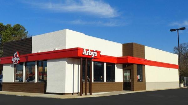
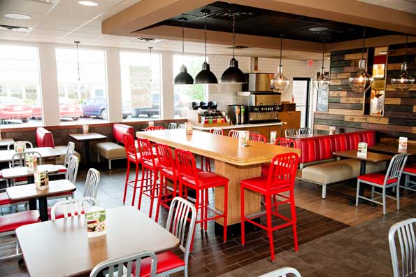
“We’re taking our inspiration from a great deli, with sandwiches with lots of meat and variety that you wouldn’t be able to make at home, and where there’s a reason to go out and get them,” Brown said. “If you ask customers to position Arby’s today, they put us between fast casual and QSR, which is an extremely attractive place to play.” That’s exactly what they used to drive the redesign of their concept. However, at first glance it falls incredibly flat and looks very similar to the new Wendy’s concept.
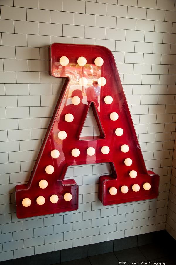
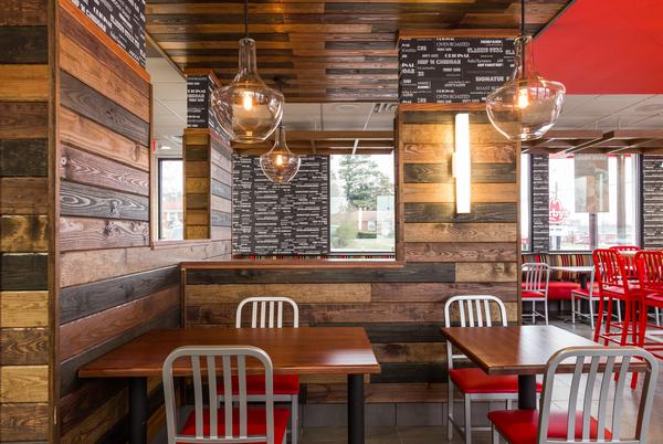
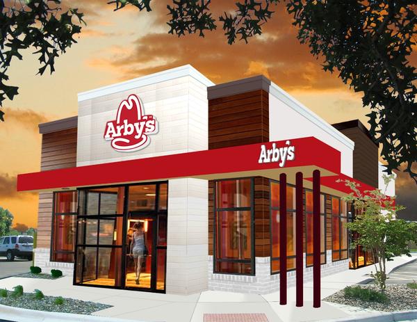
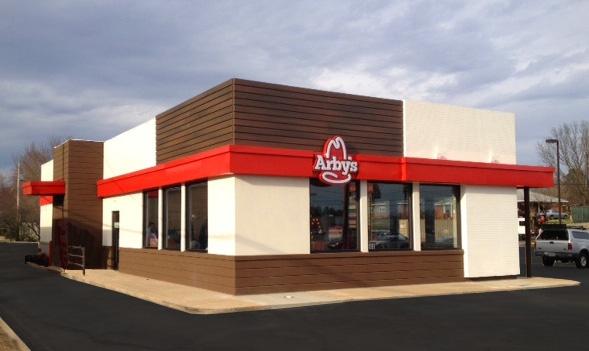
It makes sense that the brands would be influenced by each other considering they were sister brands for a few years. That doesn’t make it the RIGHT move, however. I’m not saying the new look is bad, it’s just flat. It’s nothing new. There’s nothing that jumps out that could be owned by the Arby’s brand. Reclaimed wood and subway tile are way overdone in the restaurant interior design world and the color palette of cream/dark brown/red is pretty much owned by Wendy’s at this point. At least Wendy’s has driven towards making their architecture and interiors more brand iconic. Arby’s needs a bit more work.
The brilliant part of restaurant architecture is how certain parts can become iconoclastic. Think of the Pizza Hut and McDonald’s roof. Each of them had an iconic style that was completely theirs. No one else could have a roof like that and NOT be mistaken for another brand. Where is this iconic imagery for Arby’s? Right now, it just looks like every other building in every other shopping center in every other town.


One Response
It looks more like Krystal than Wendy’s.