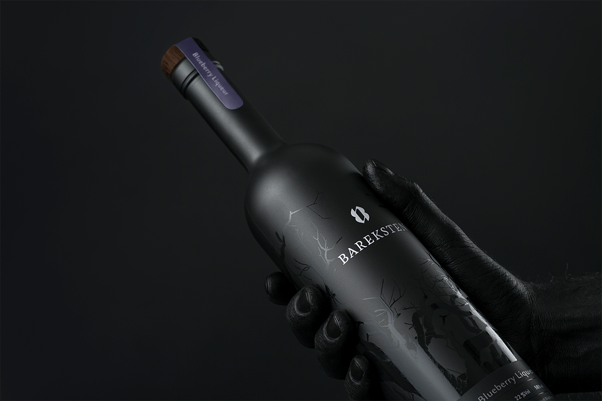
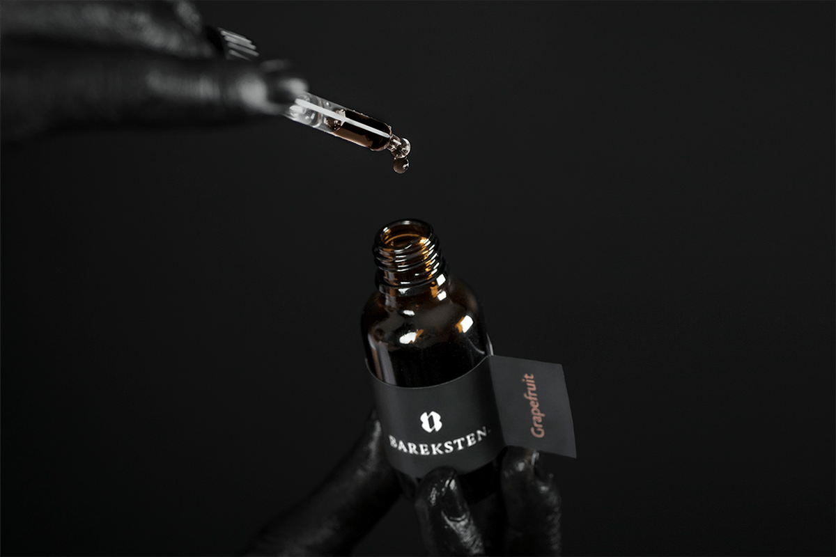
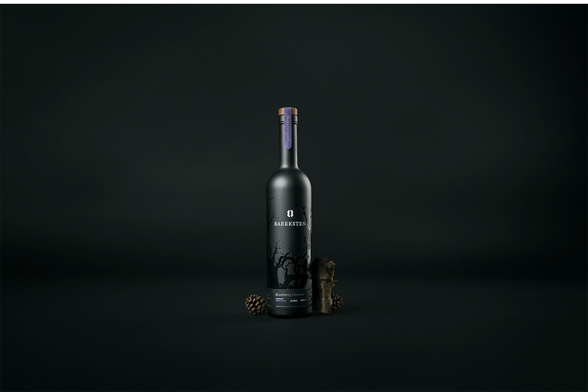
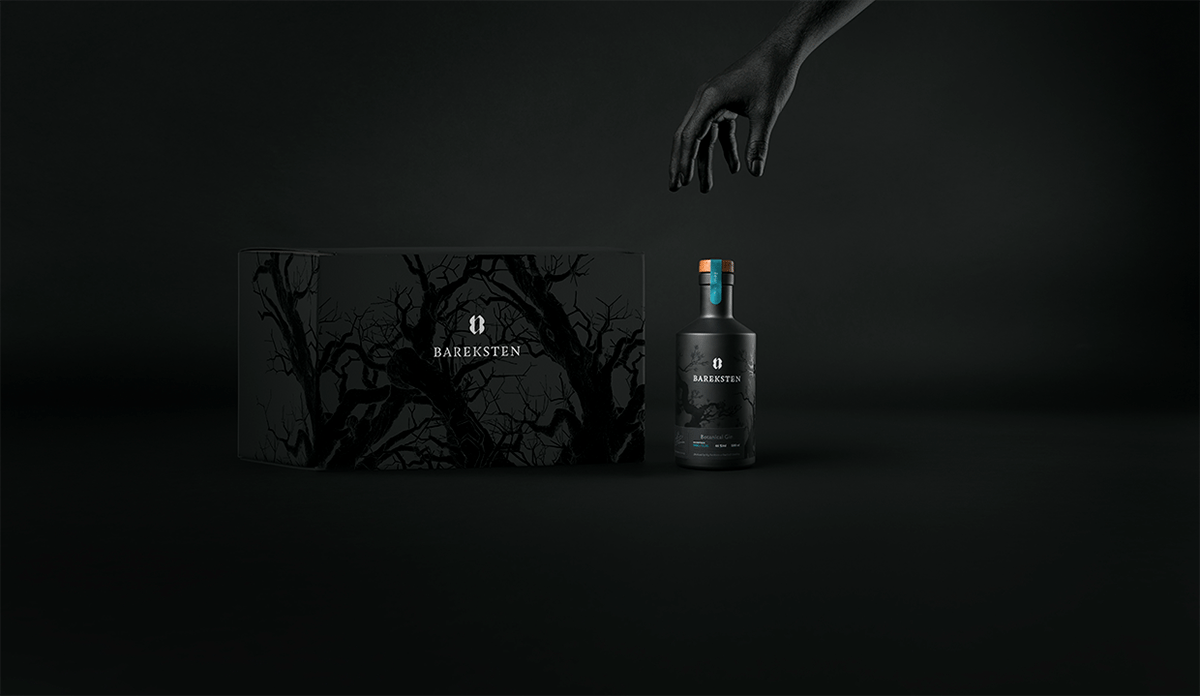
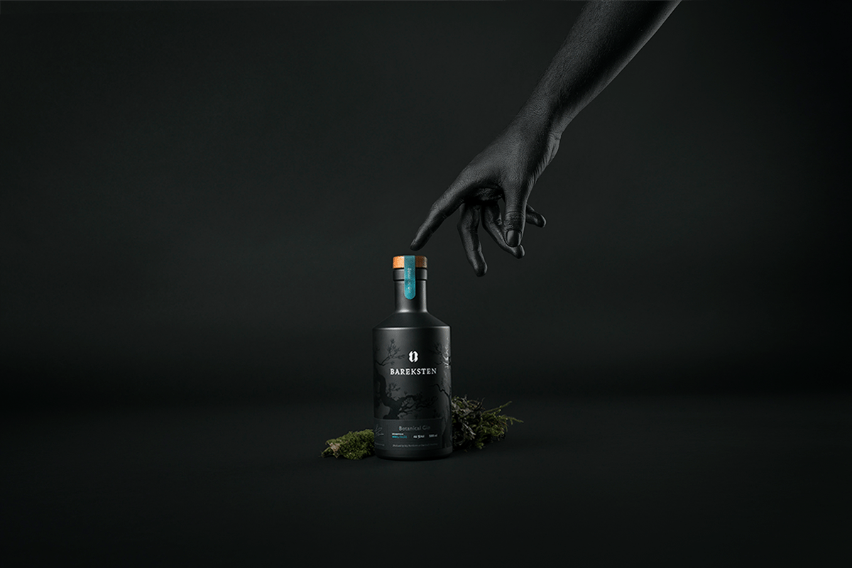
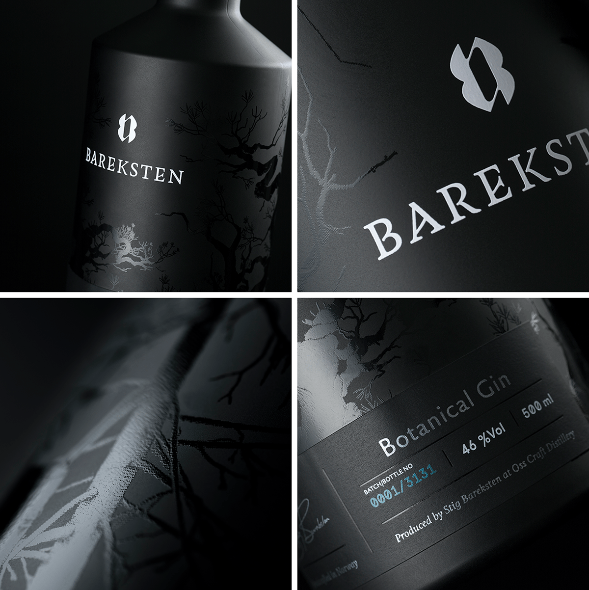
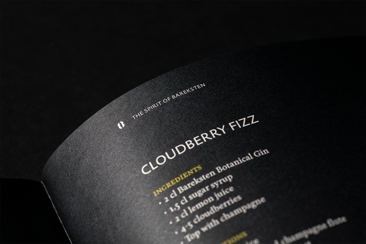
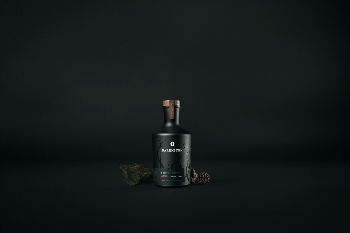
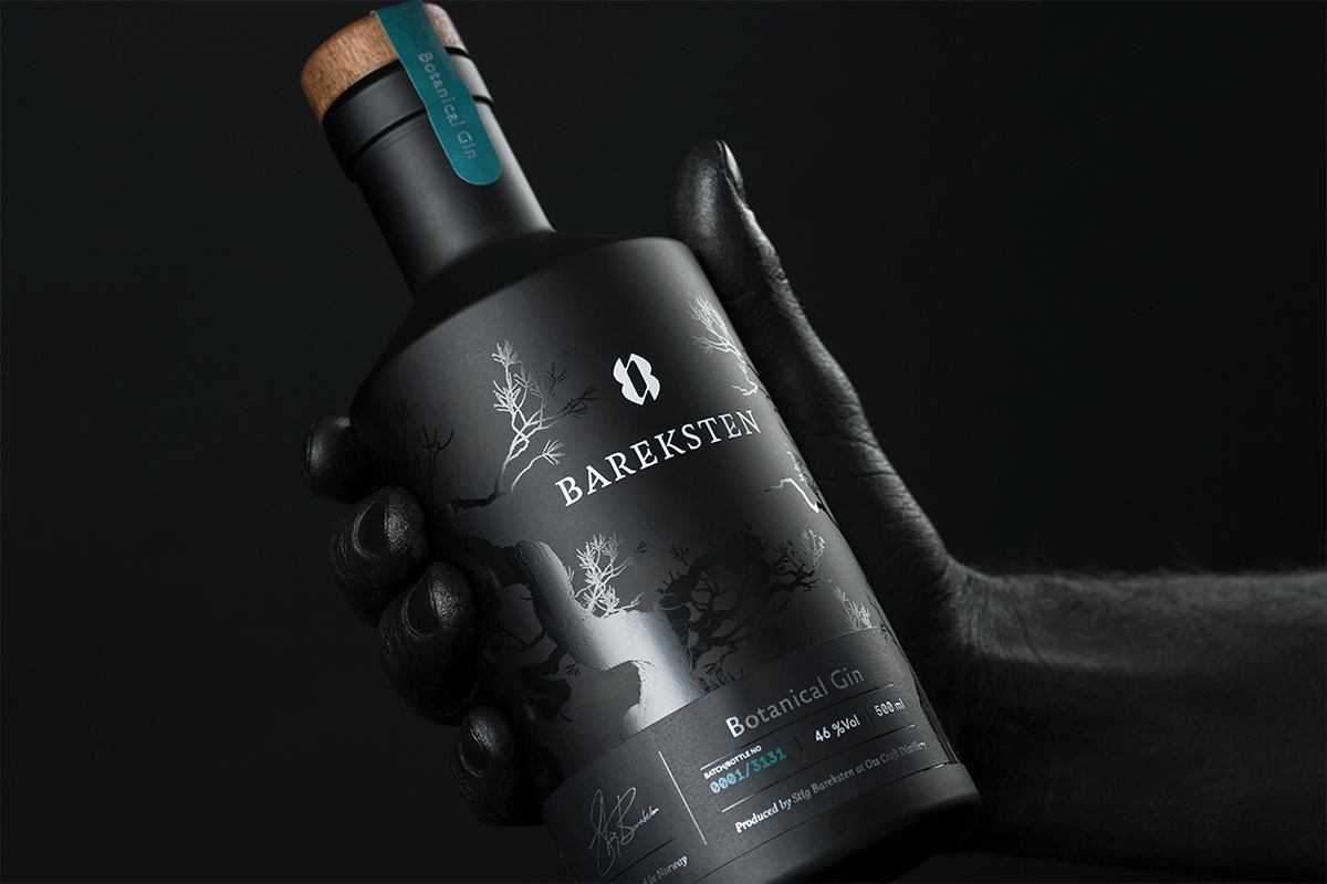
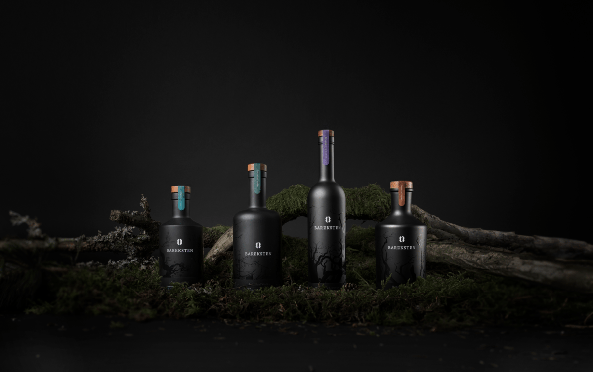
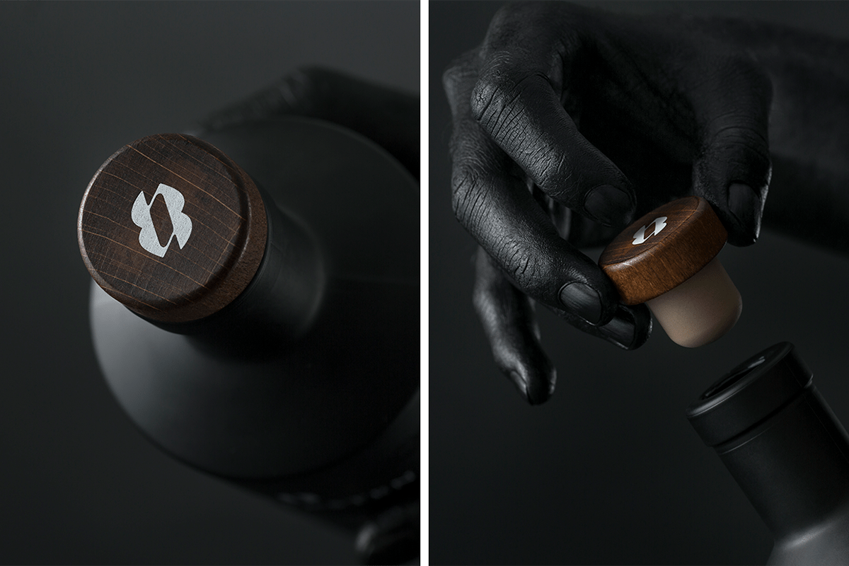
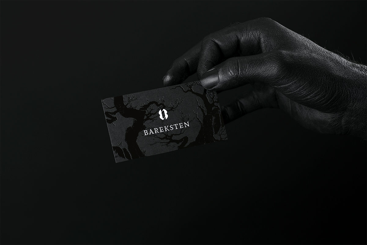
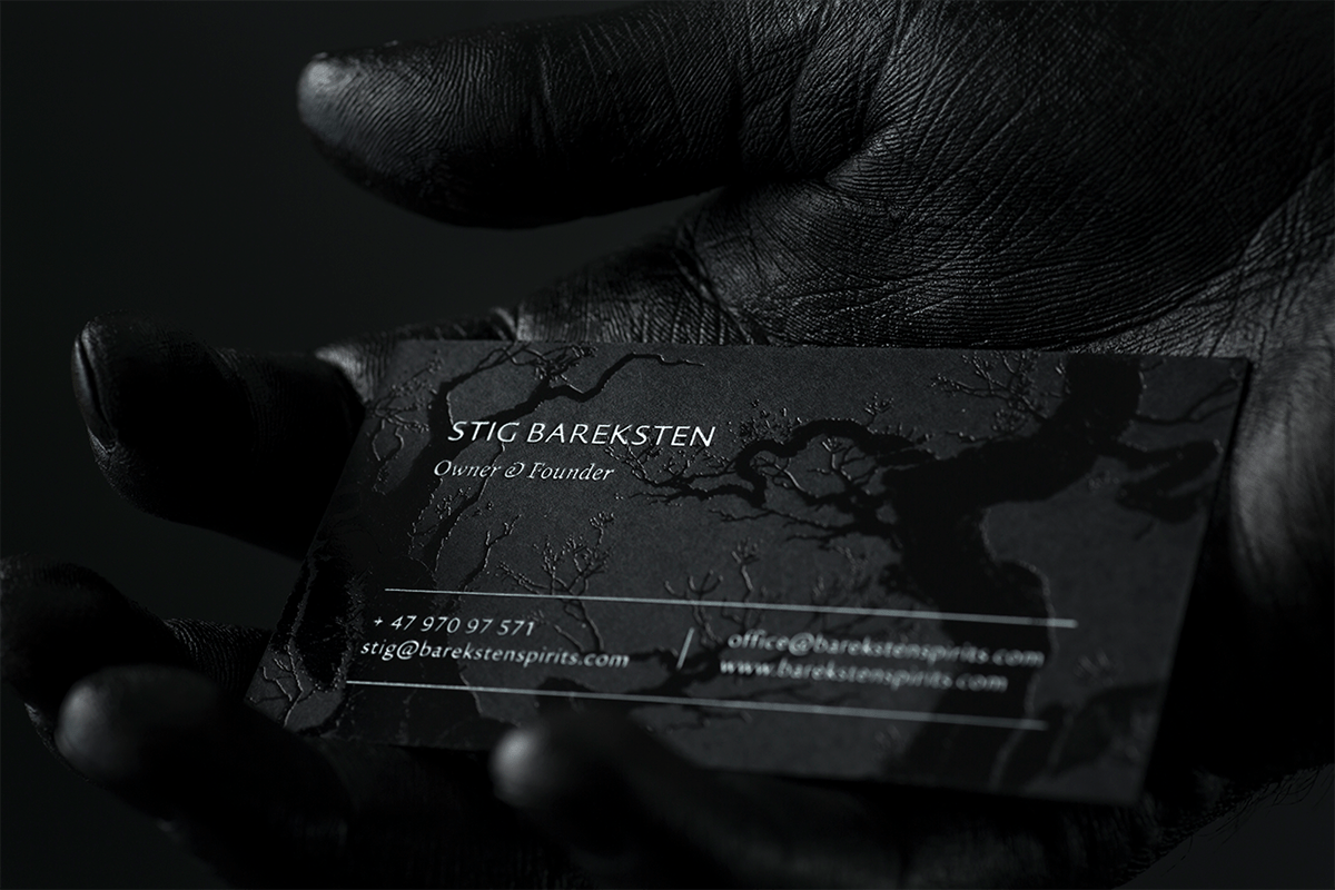
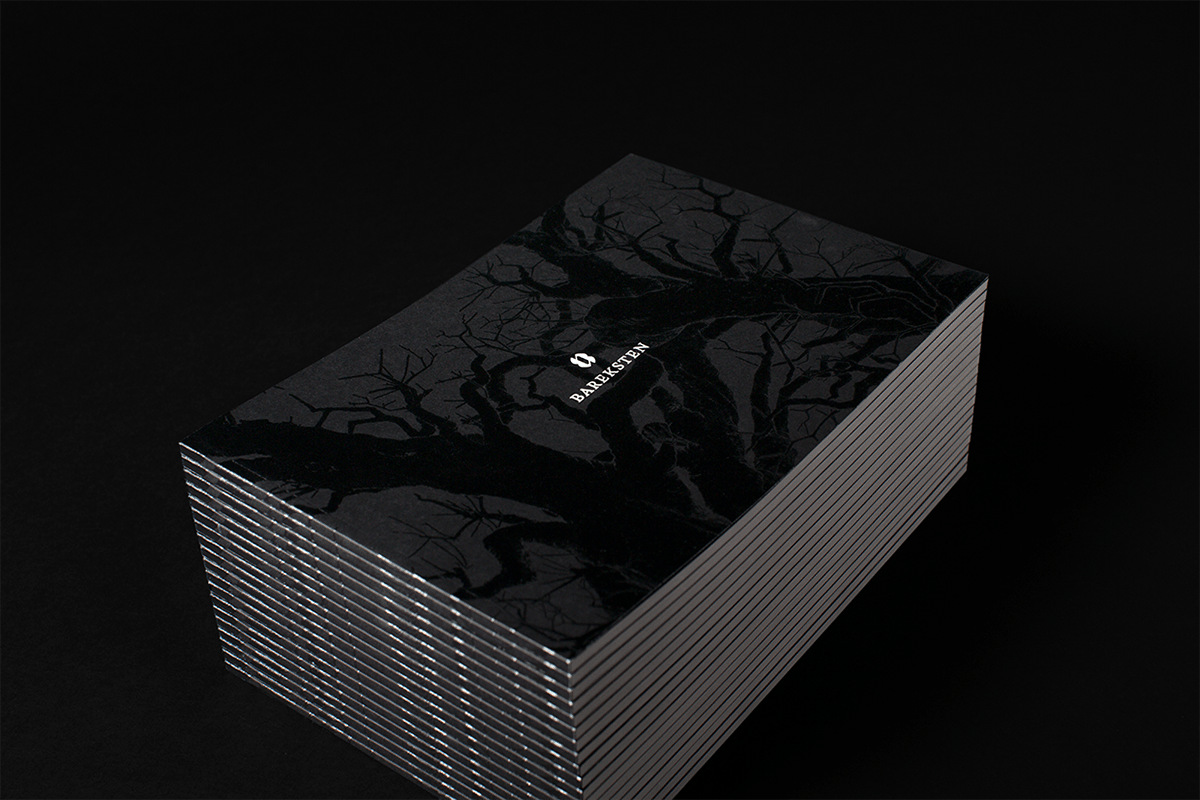
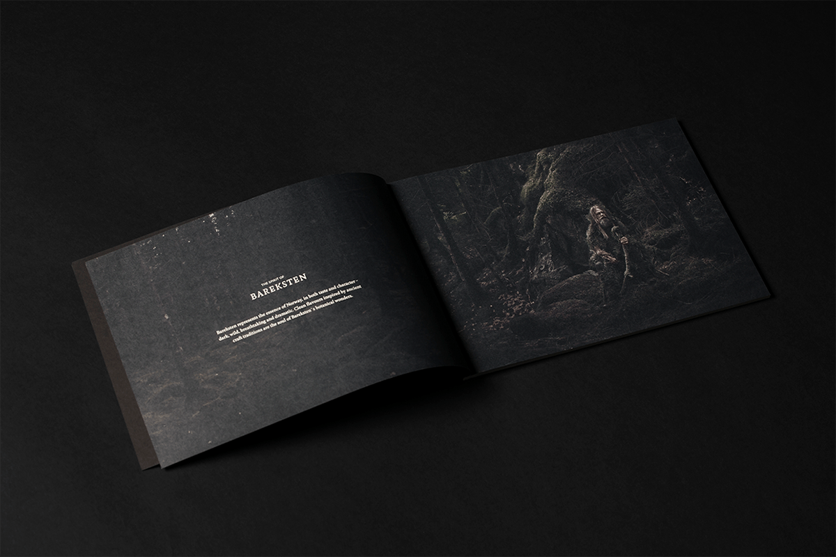
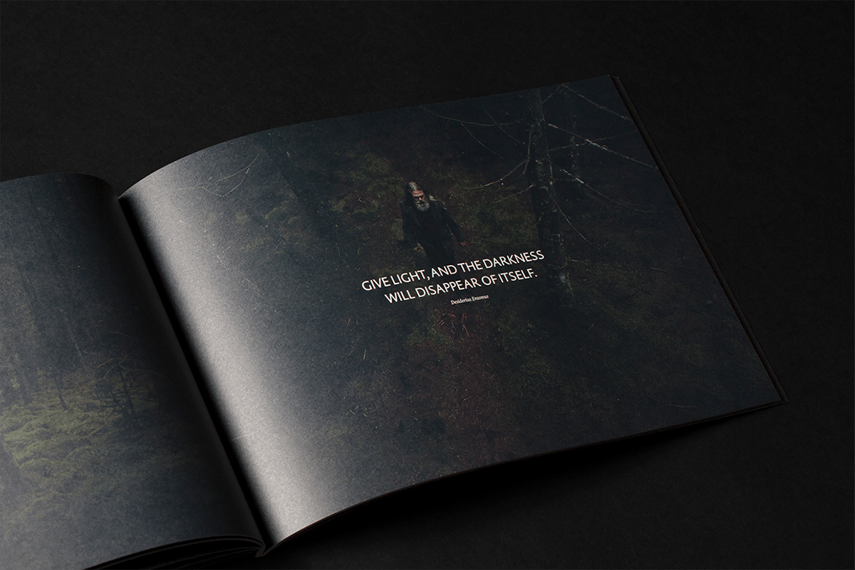
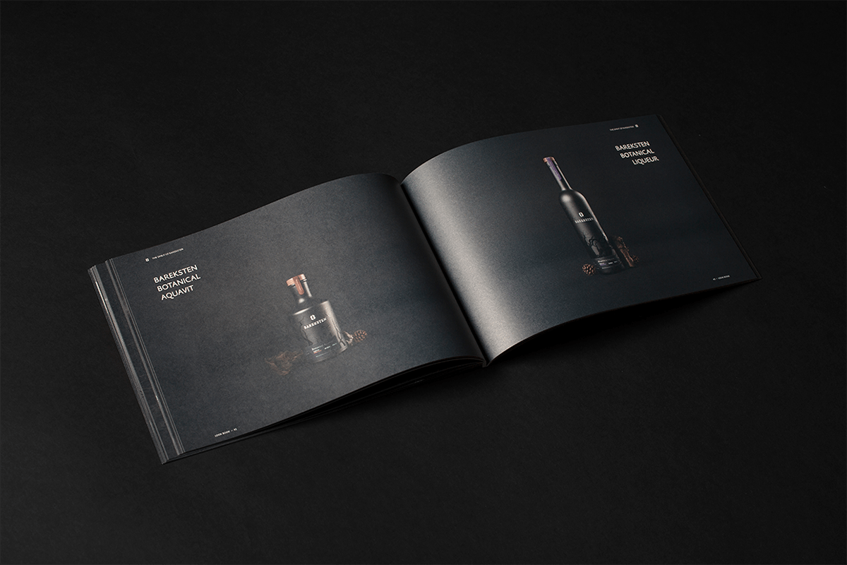
Stig Bareksten, one of the world’s top distillers of craft spirits, has chosen to launch his own brand in his own name. Choosing to represent the essence of Norway, the brand and its packaging is dark, wild, breathtaking, and dramatic. All brand touchpoints are a matte deep black, with woodland details emerging from the darkness via a spot gloss. The only instances of color here are used as flavor indicators, and even those colors are a little muted, plucked from shades of dusk. The traditionally Nordic looking wordmark is strong on its own, and its serifs mirror the craggly quality of the woodland illustrations that grace the bottles, while the sans serif used on the rest of the label modernizes this brand and makes it look less medicinal; a route most craft distillers take with their packaging. A beautiful suite of bottles, and something I plan on grabbing off the shelf as soon as I get a chance to.
Bareksten Spirits Branding and Packaging Design by Kind.