Lé Pastel Branding, Packaging, and Print Design by Claudia Arguetta

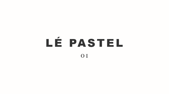
Lé Pastel is a high-end pastry shop with a variety of delicious desserts, from which it takes color palette inspiration. The brand balances these soft, feminine colors with a bold, blocky uppercase type that is used for the wordmark and some headline copy. The blockiness of the letters is carried through some of the packaging touchpoints, using stark color blocking on the cups and stationary. It’s a fun and inviting brand, without being overly whimsical and feminine, which a lot of pastry shops tend to take. I think calling themselves a ‘Desert House’ also adds a nice, bigger and bolder sense to the whole operation.

Lé Pastel Branding, Packaging, and Print Design by Claudia Arguetta.
The Forktales Podcast™: Interviews with restaurant industry leaders and visionaries

Restaurant and advertising industry headlines and thinking

Reviews of restaurant experiences from around the globe 

Reviews of our favorite design, business, & restaurant books

Our favorite typography and fonts

Inspiration in your inbox

Get the latest inspiration in your inbox every Monday morning, for FREE!

"*" indicates required fields

This field is for validation purposes and should be left unchanged.

Delicious Bits in your Inbox!

Get the latest and greatest content delivered to your inbox for free!

"*" indicates required fields

This field is for validation purposes and should be left unchanged.