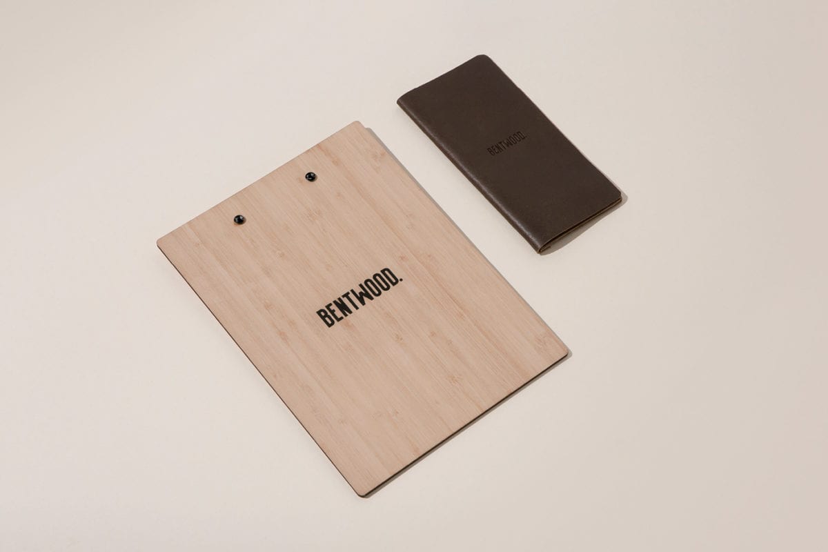
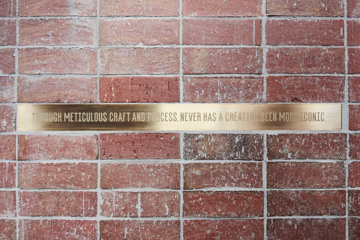
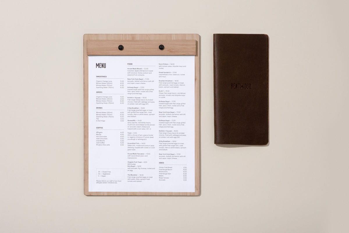
Bentwood Cafe relies heavily on its historic interiors to tell the brand story; old and rustic intersects with chic and modern , creating an intriguing space that encourages the guest to explore and immerse themselves. These metaphorical layers are represented visually in the brand across coffee cups and other packaging touchpoints. A single wordmark, set in a condensed font, boldly spells out BENTWOOD, which is then placed in perspective and stacked on itself, over and over again, creating a geometric letter-based landscape. The landscape emphasizes different letters in each new iteration, creating a visual language that is fluid and ever-changing. This dynamic energy is muted, though, with the use of a warm terracotta color that is pulled from the brickwork of the space, creating a seamless transition from minimal, flat printed design to the textured and emotive interior space.
Bentwood Cafe Branding by Pop & Pac.