Rabaska Cider Branding & Packaging Design by lg2

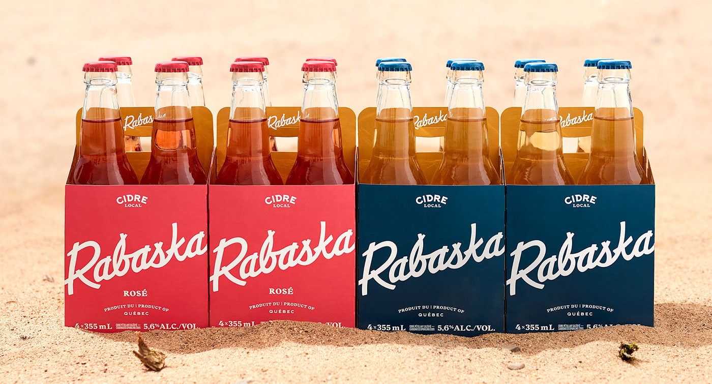
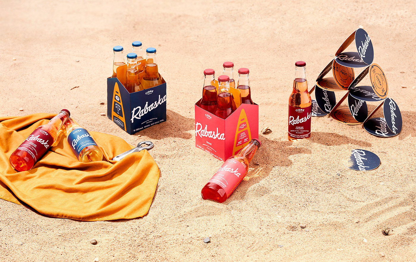
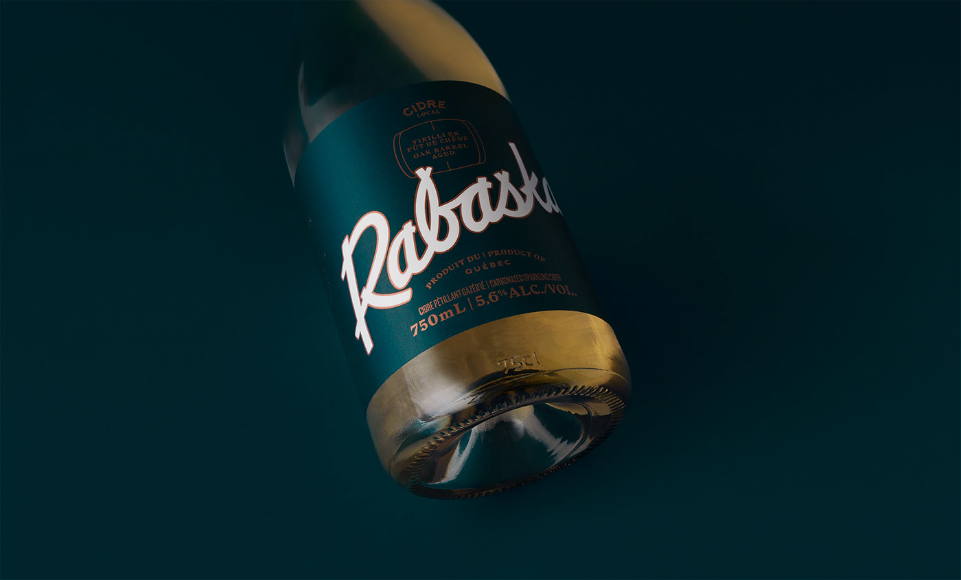
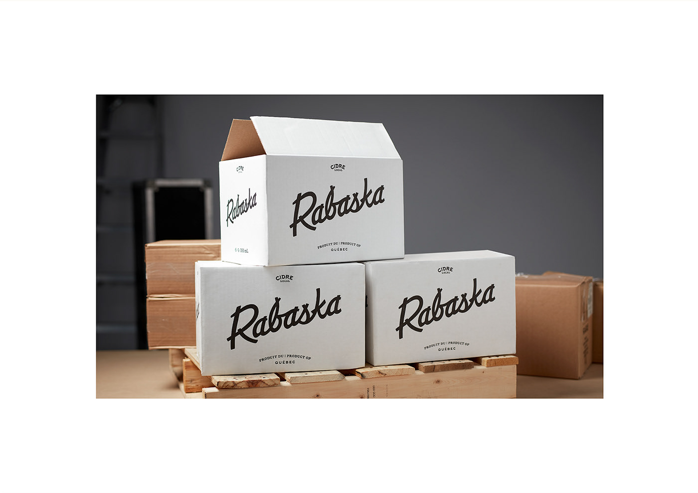
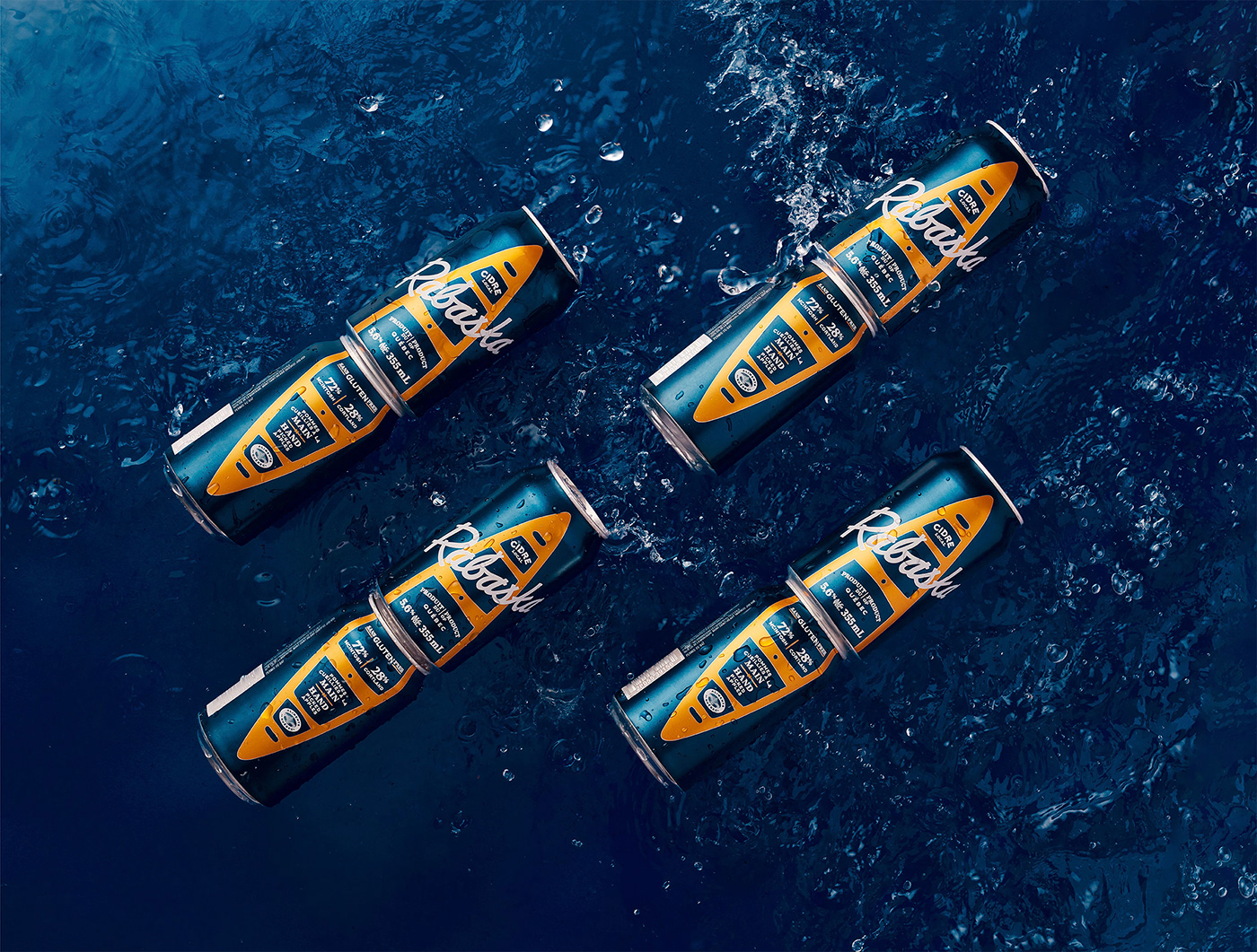
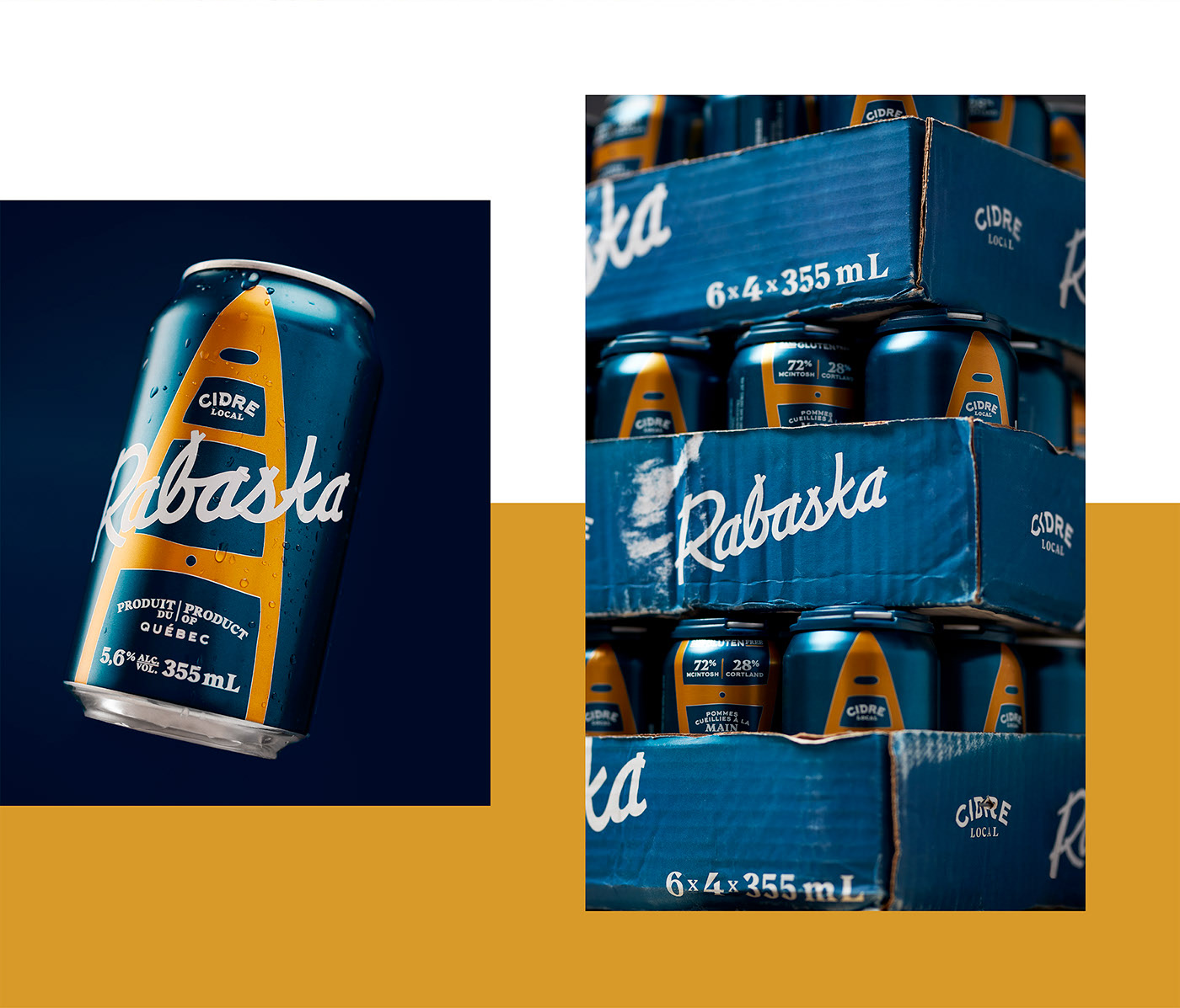
Rabaska is an artisanal, Canadian cider. It hails from an area near the Richelieu River, which served as the point of inspiration for Rabaska. The image of a large bark canoe, the same kind the natives of the area used to explore their environment, graces each can. The look of the canoe is updated to make a more contemporary tie to local watersports, in addition to this historical reference.
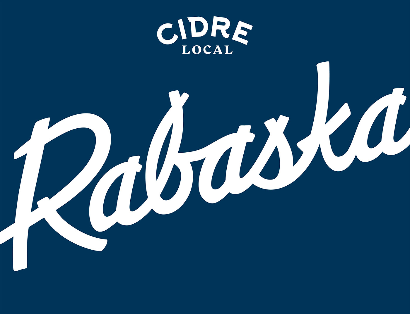
I particularly like the lettering in the main wordmark. It’s a bit rough and rugged as if someone with a thick square-tipped marker drew it without worrying too much about where the terminals meet. The canoe graphic device lends an interesting shape to the overall packaging that catches a consumer’s eye, standing out especially nicely on the saturated navy of the packaging. 
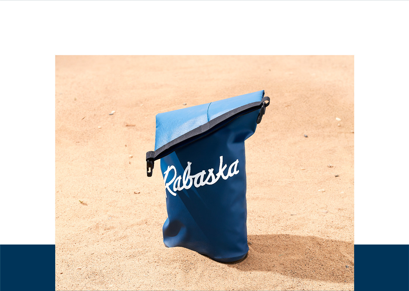
Rabaska Cider Branding & Packaging Design by lg2.


Discuss this Project

Leave a Reply

This site uses Akismet to reduce spam. Learn how your comment data is processed.

The Forktales Podcast™: Interviews with restaurant industry leaders and visionaries

Restaurant and advertising industry headlines and thinking

Reviews of restaurant experiences from around the globe 

Reviews of our favorite design, business, & restaurant books

Our favorite typography and fonts

Inspiration in your inbox

Get the latest inspiration in your inbox every Monday morning, for FREE!

"*" indicates required fields

This field is for validation purposes and should be left unchanged.

Delicious Bits in your Inbox!

Get the latest and greatest content delivered to your inbox for free!

"*" indicates required fields

This field is for validation purposes and should be left unchanged.