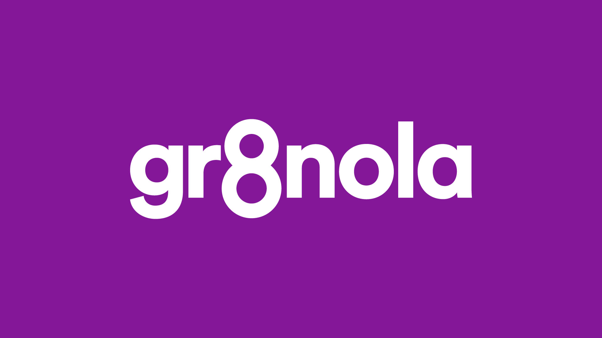
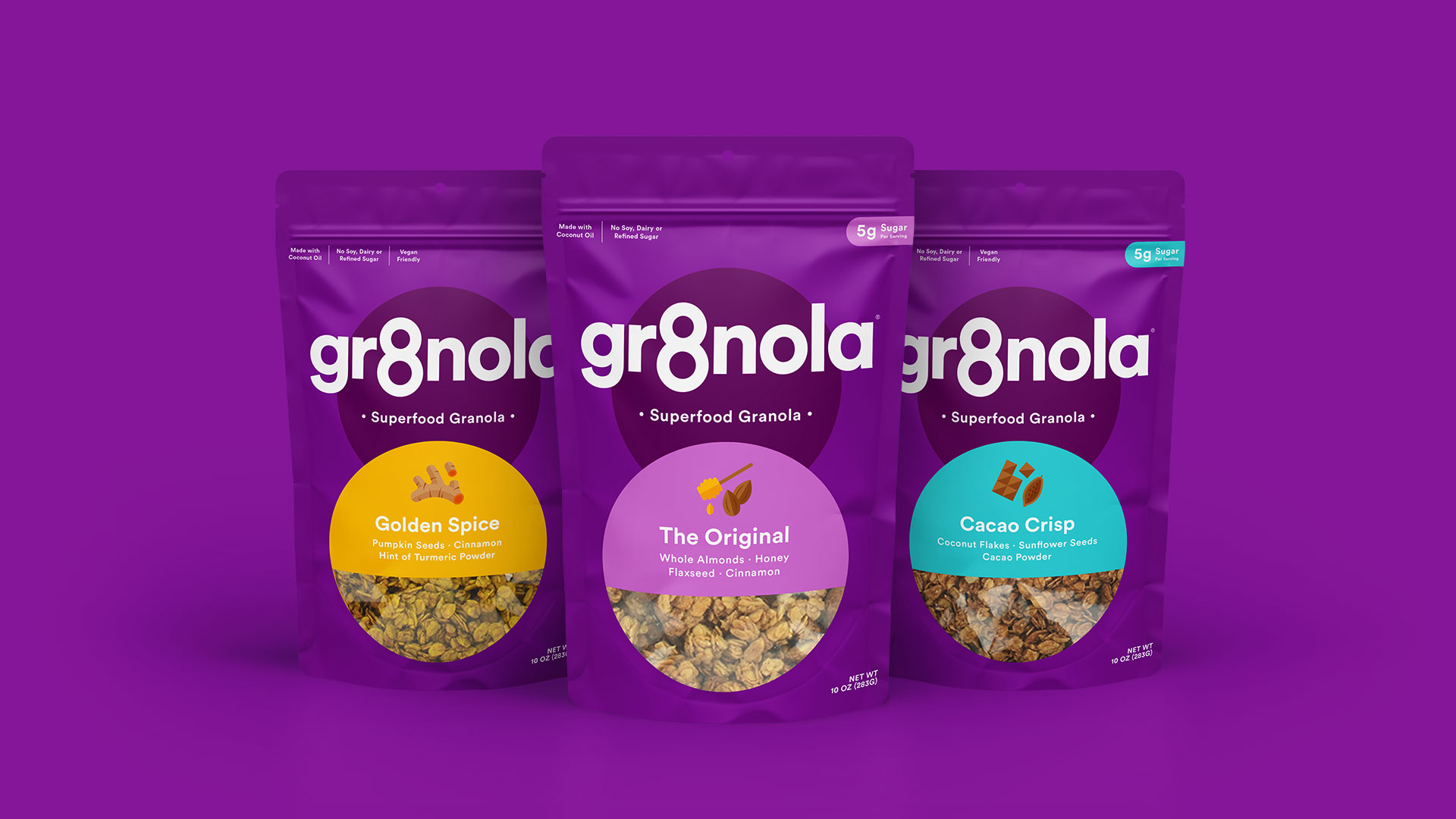
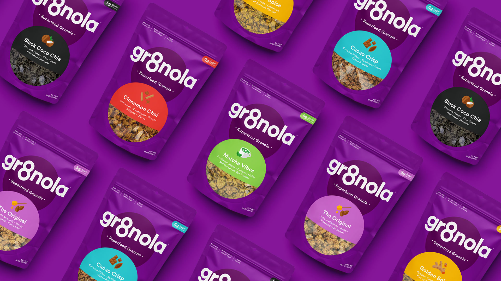
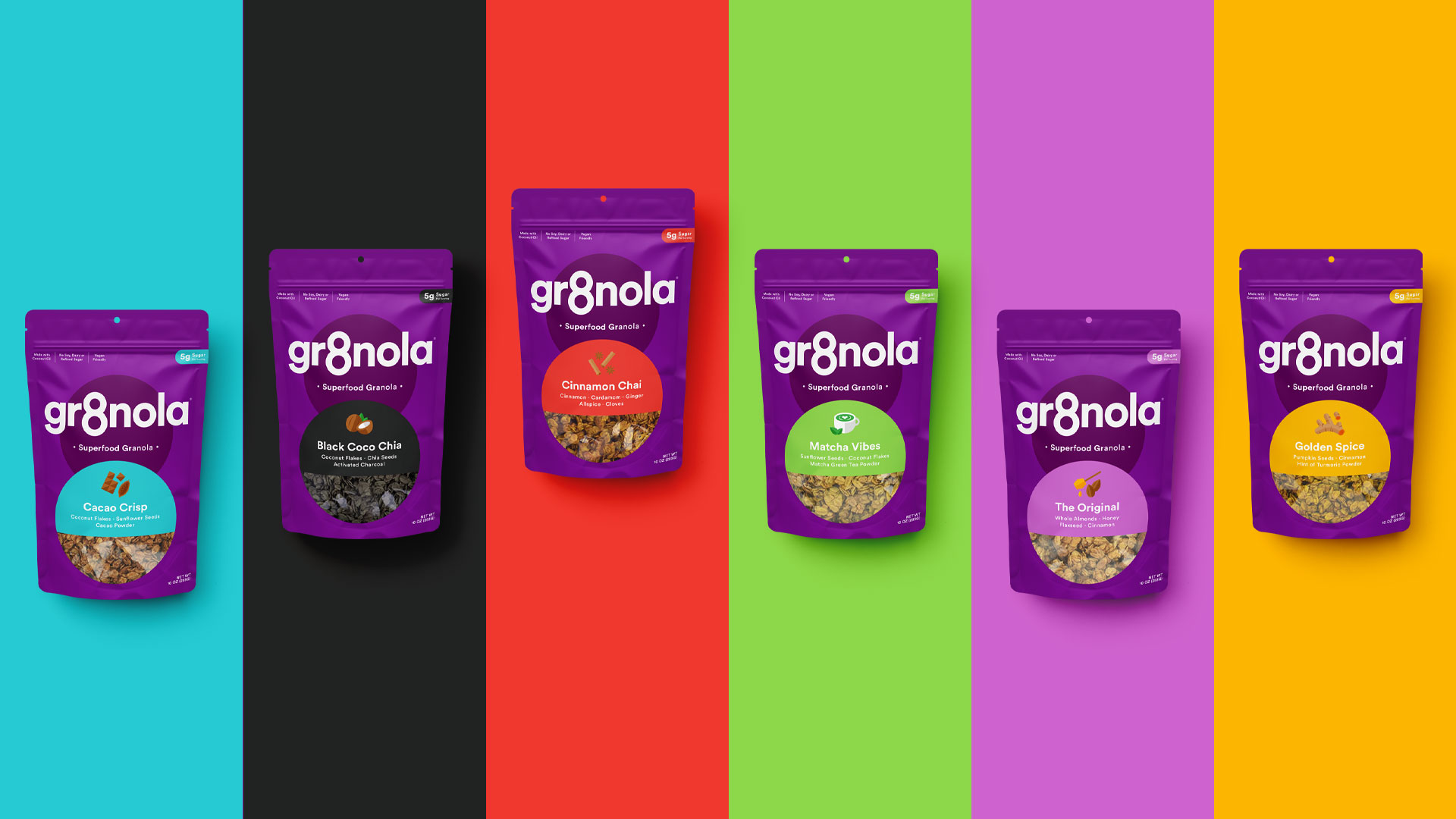
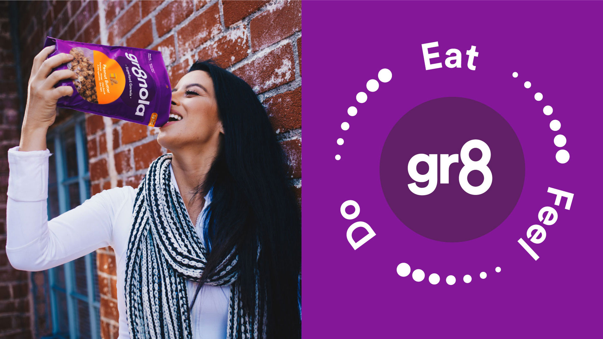
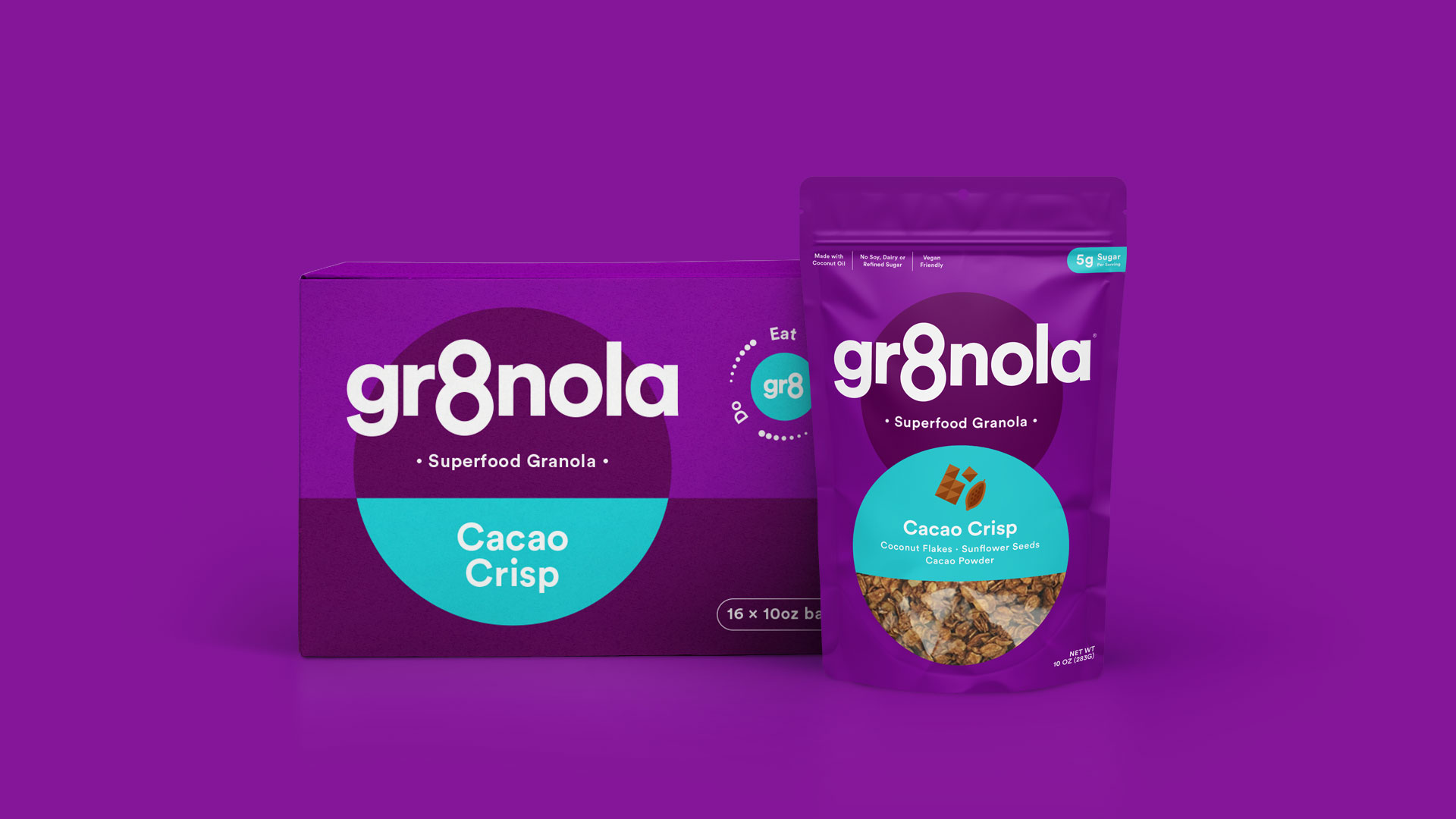
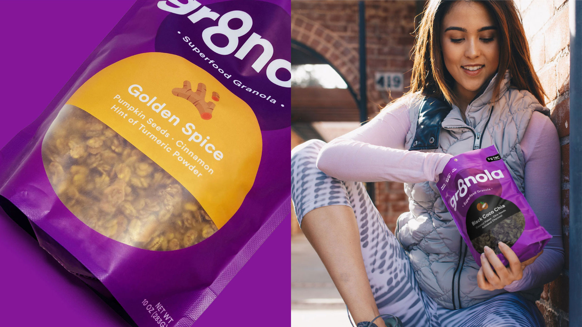
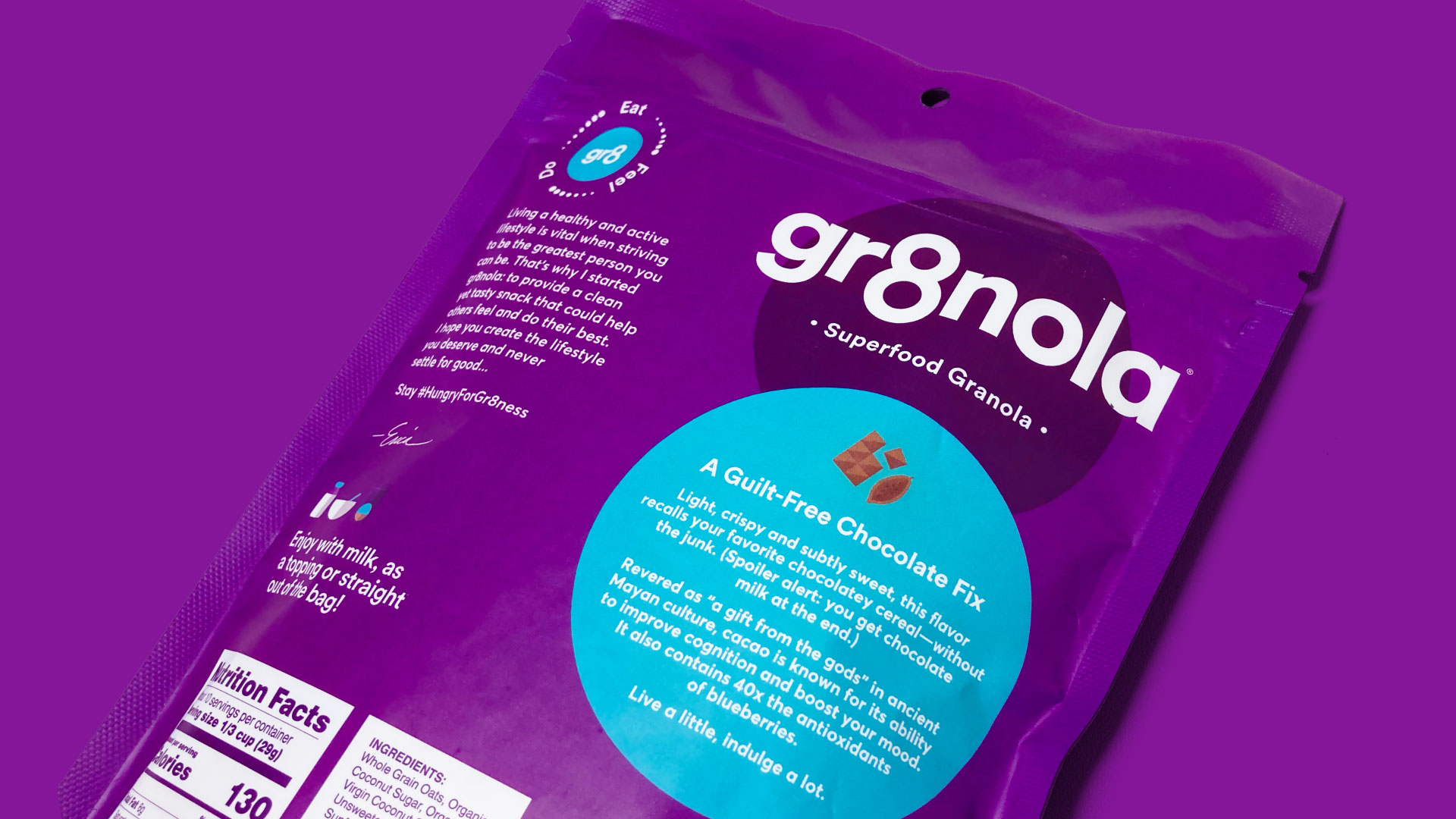
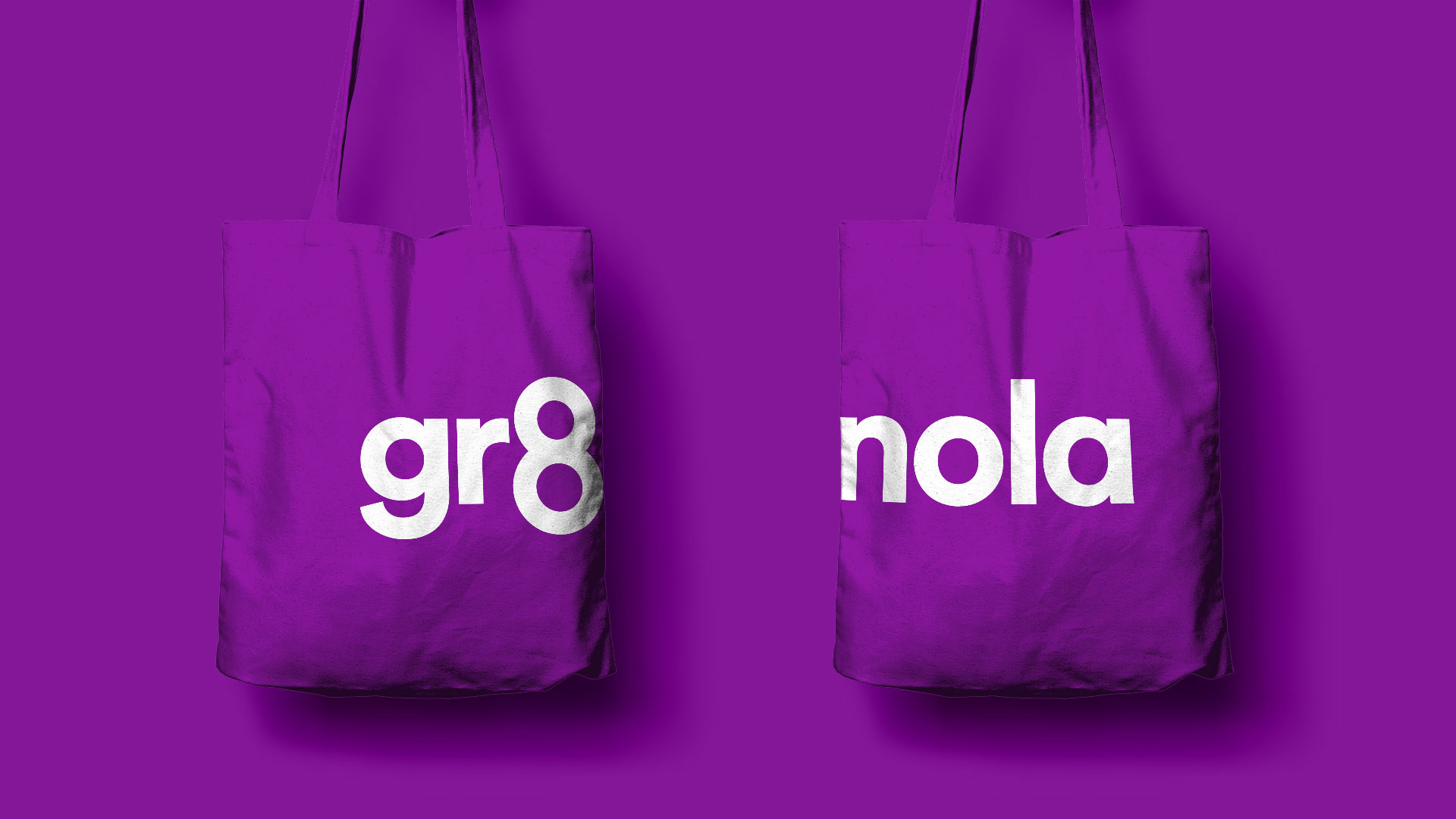
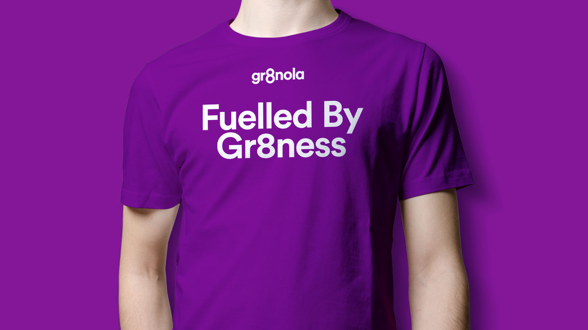
With a bold, rich purple as the core color, the brand for Gr8nola immediately draws in your eye. The brand’s confidence shines through with strong, bold typography and an excellent hierarchy of information. Gr8nola’s core logo lockup features a beautifully integrated number “8.” From this core, the design team at Deuce Studio leverages that number to drive home the brand’s unique visual language.
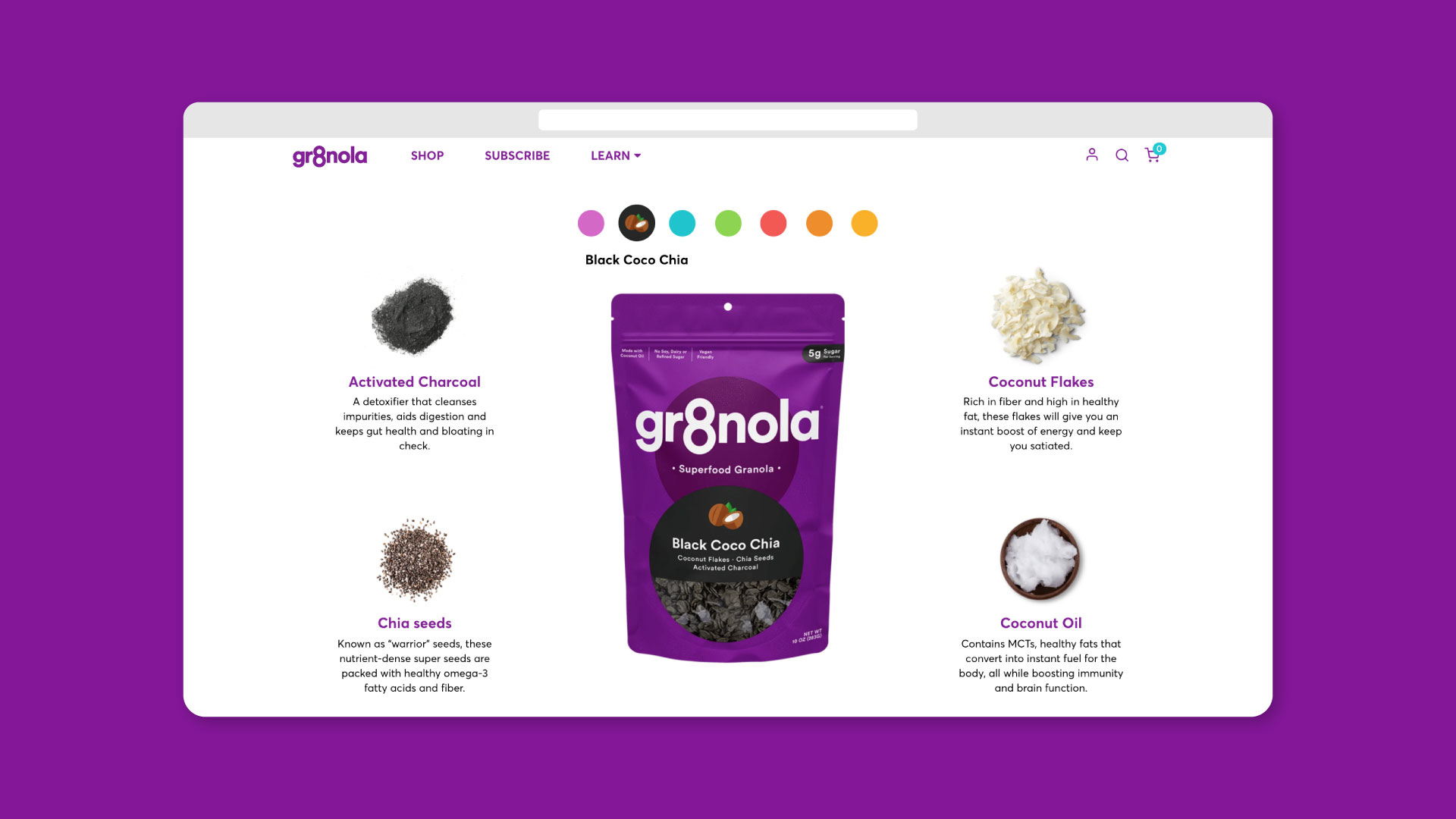
The number 8 serves as a holder for a peek inside the pouch packaging, while simultaneously introducing new colors to denote granola mixes. Accompanied by iconography and short descriptions, it’s easy for consumers to identify their preferred flavor mix with a well-ribbonized packaging system.
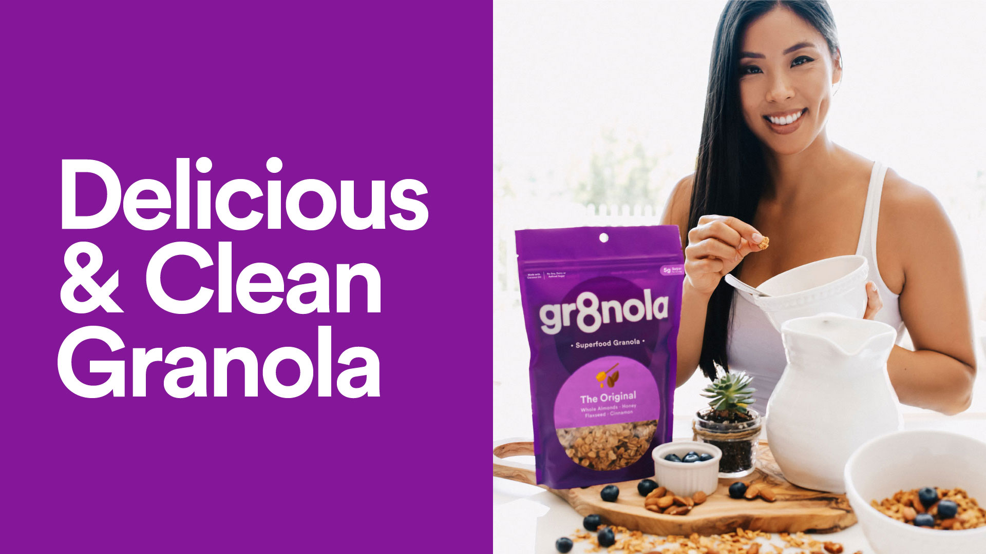
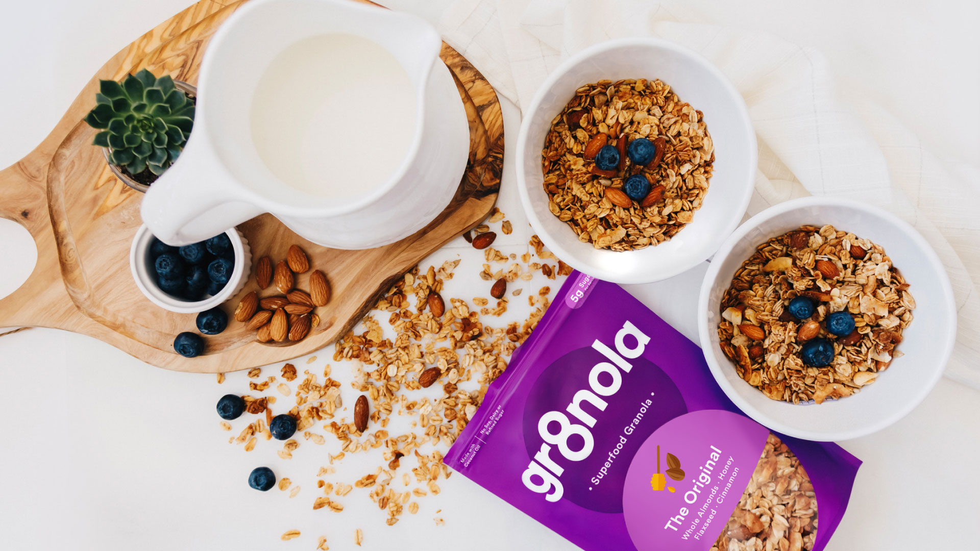
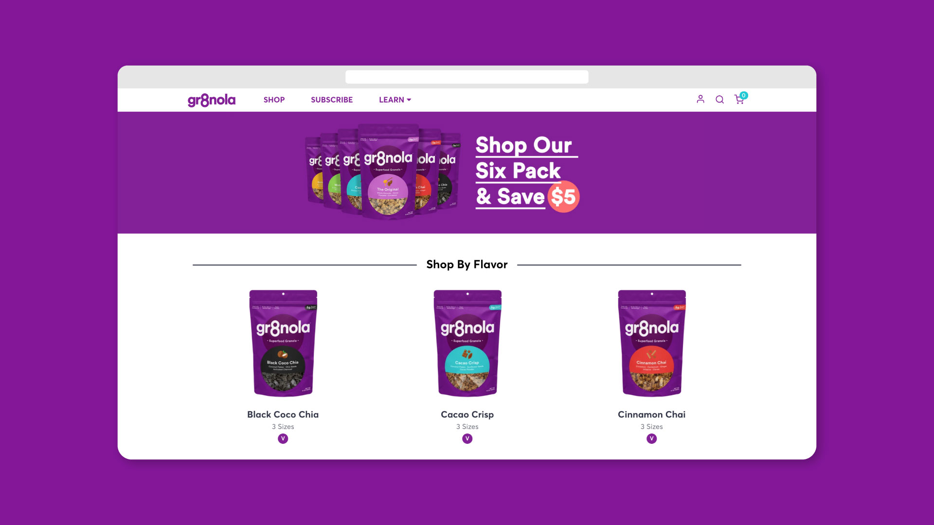
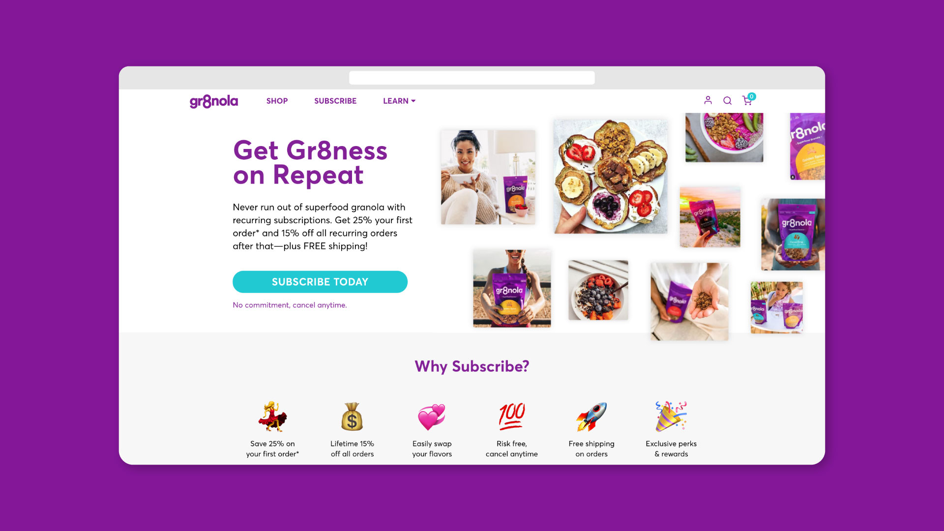
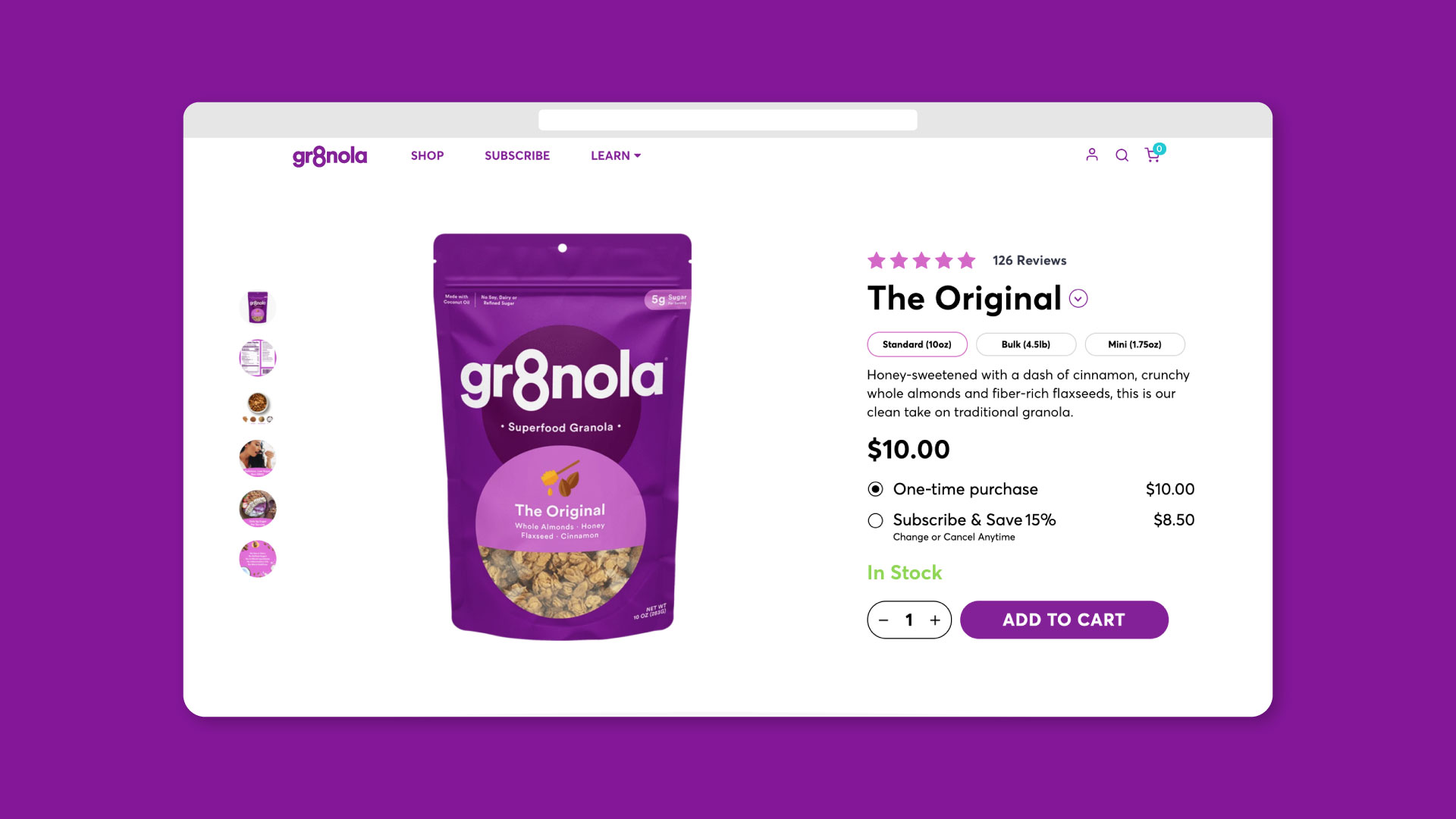
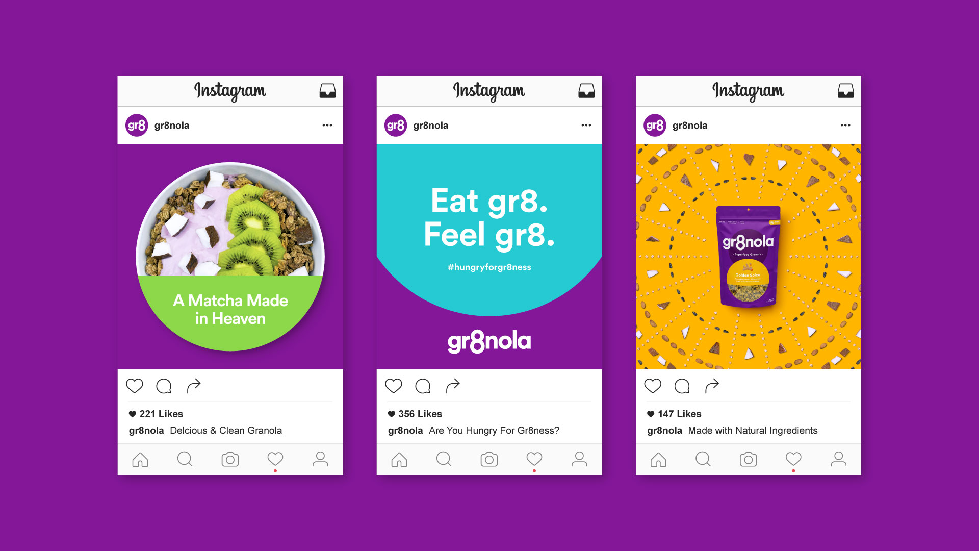
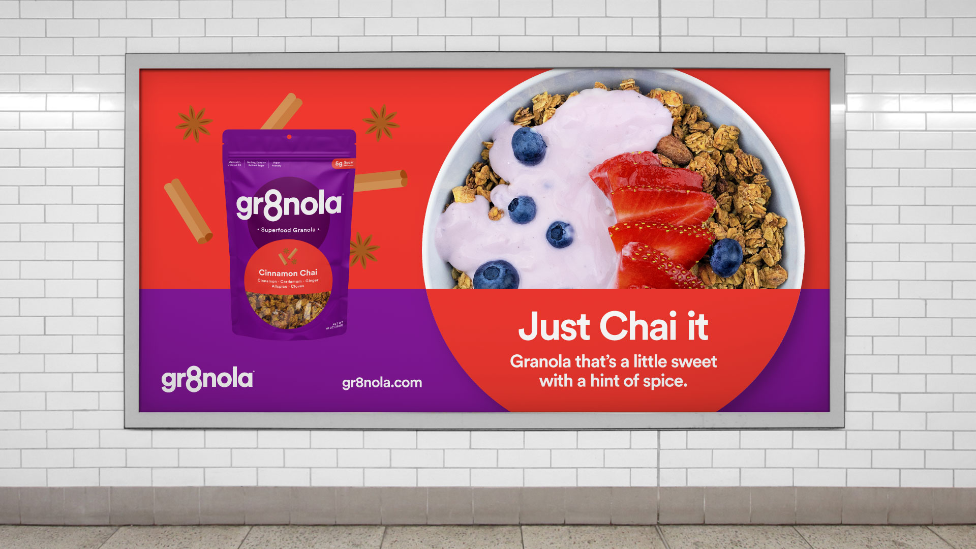
This system is seen in full effect on their website where the lineup is given its just due. The brand’s lifestyle also comes to life on the site with wonderful photography that exalts the Gr8nola vibe.