
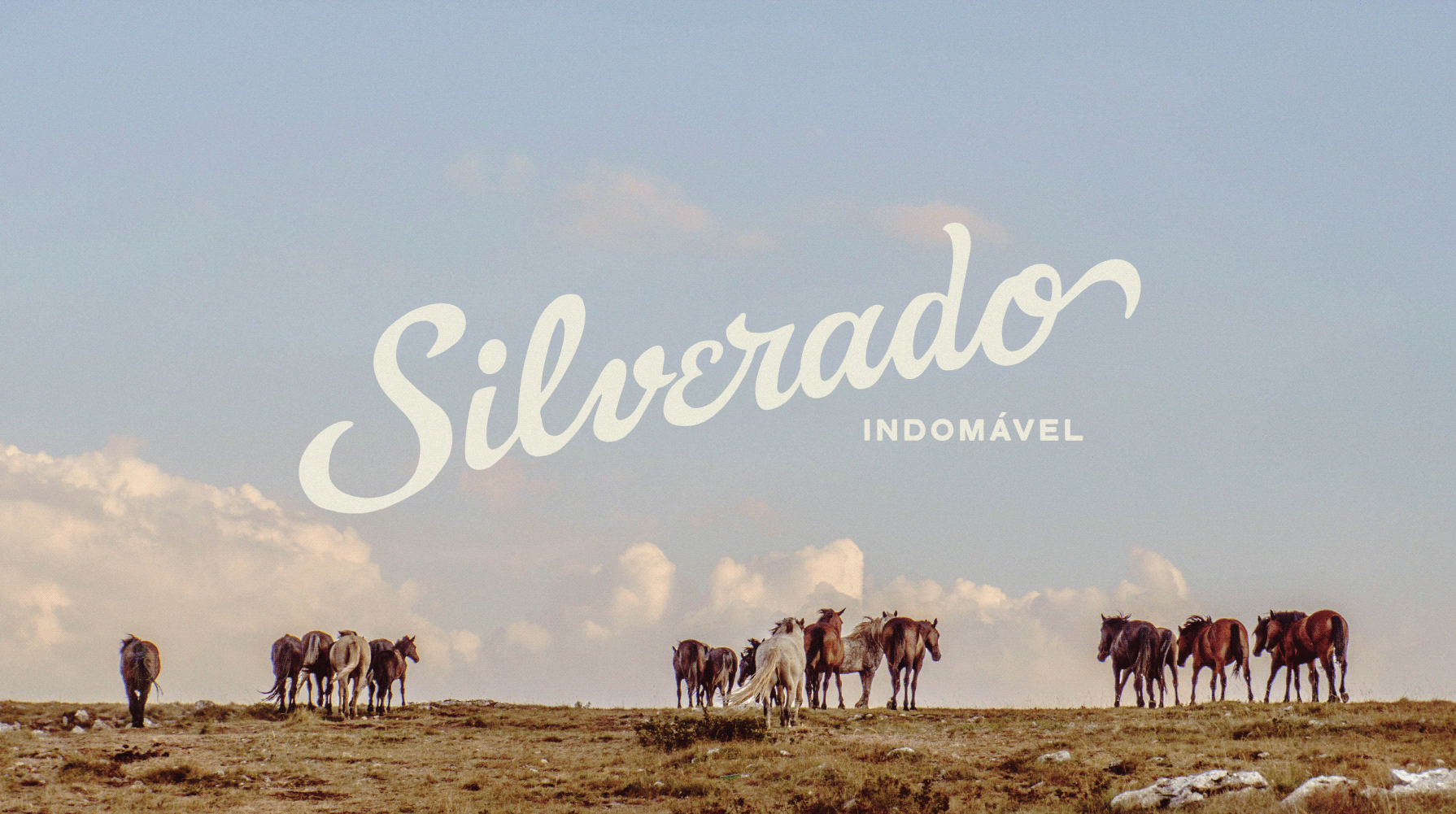
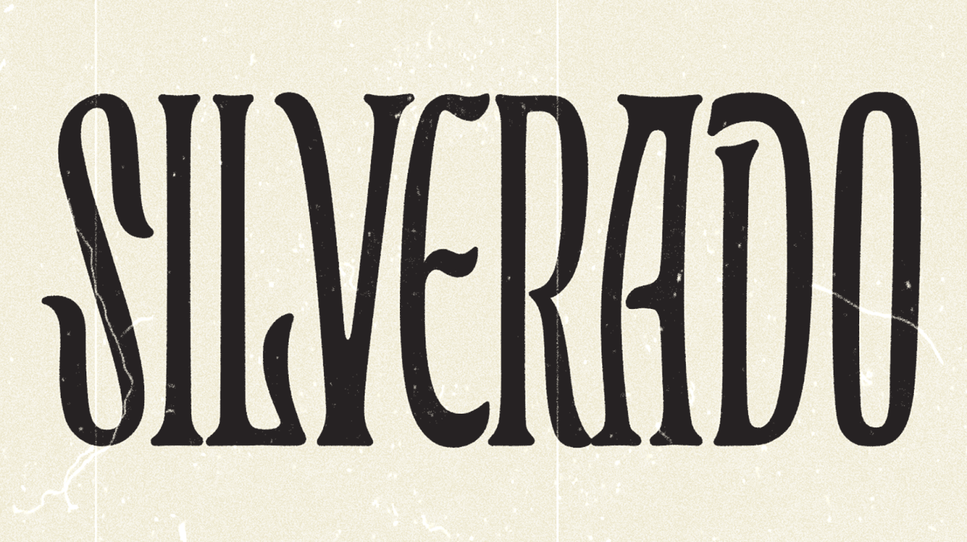
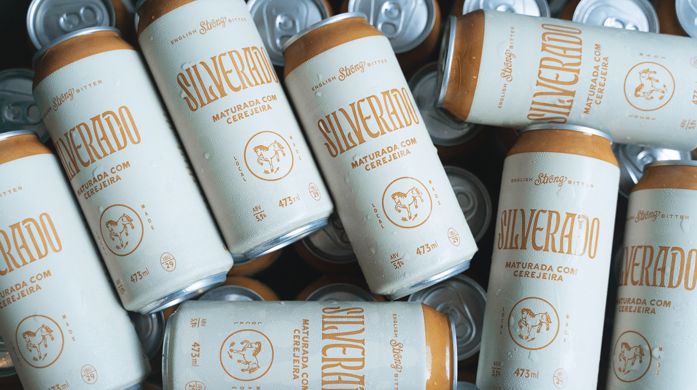
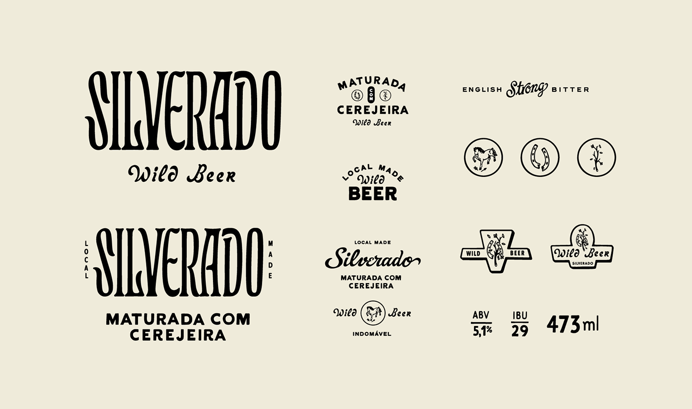
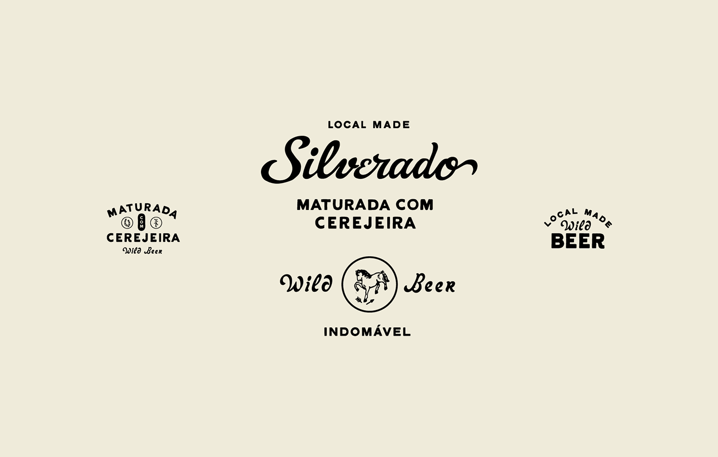
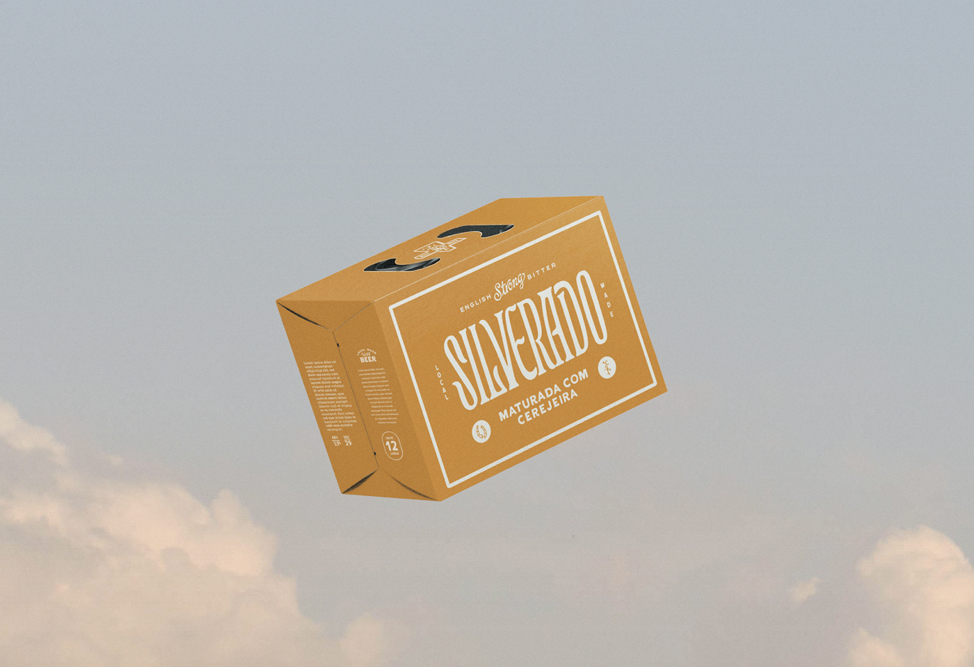
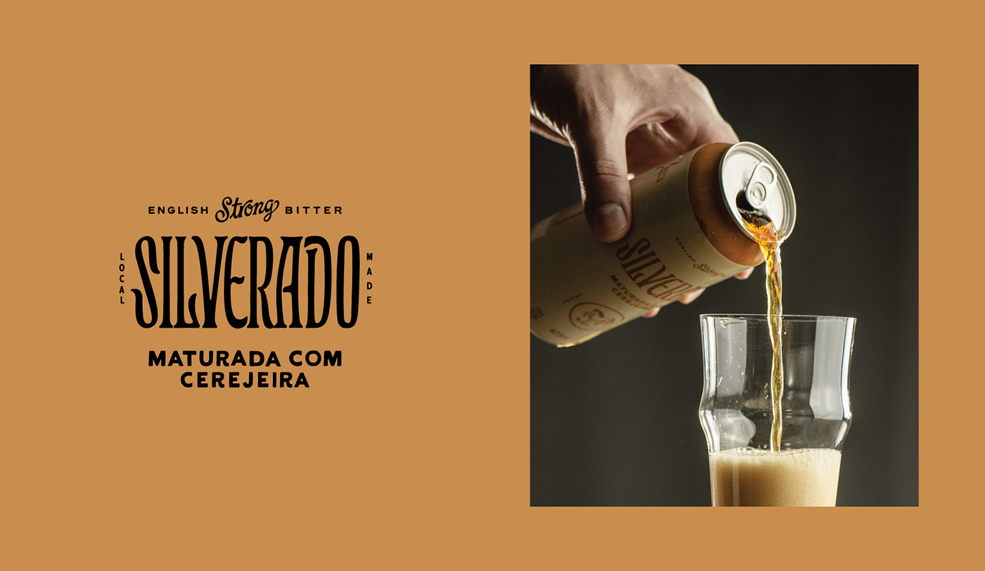
How can you not swoon upon viewing the typography in this visual identity design for Silverado beer? Whether it’s the retro vibes from the angled script, or the Art Nouveau all caps statement, the typography makes this beer brand sing.
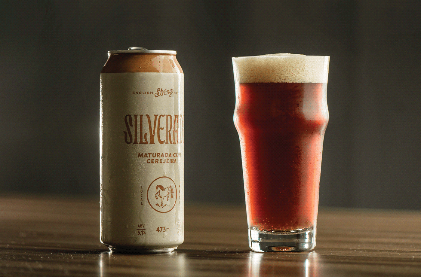
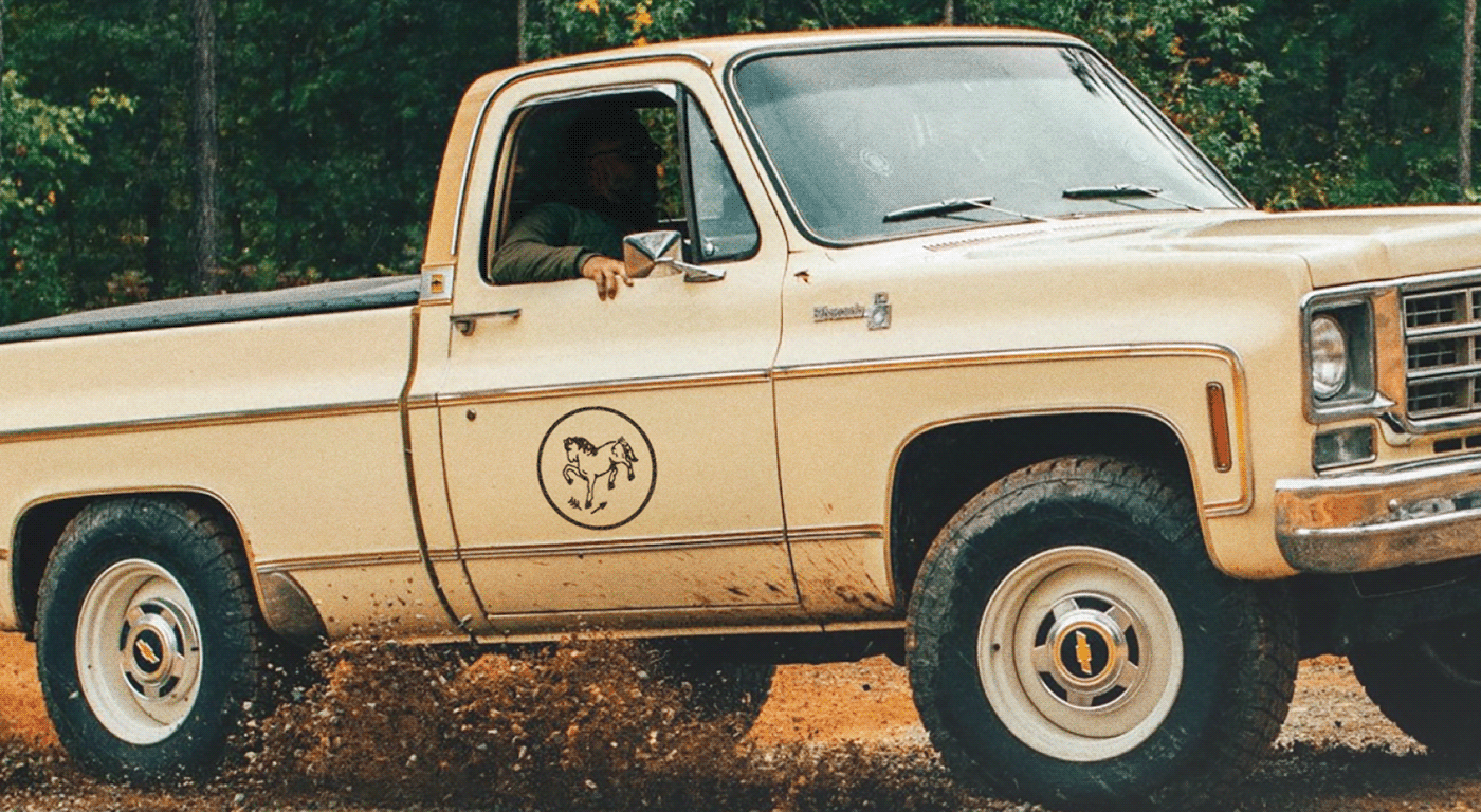
Cutterman and Woodskull lifestyle brands wanted to create a beer brand perfect for sipping on the tailgate of a truck. Mission accomplished.
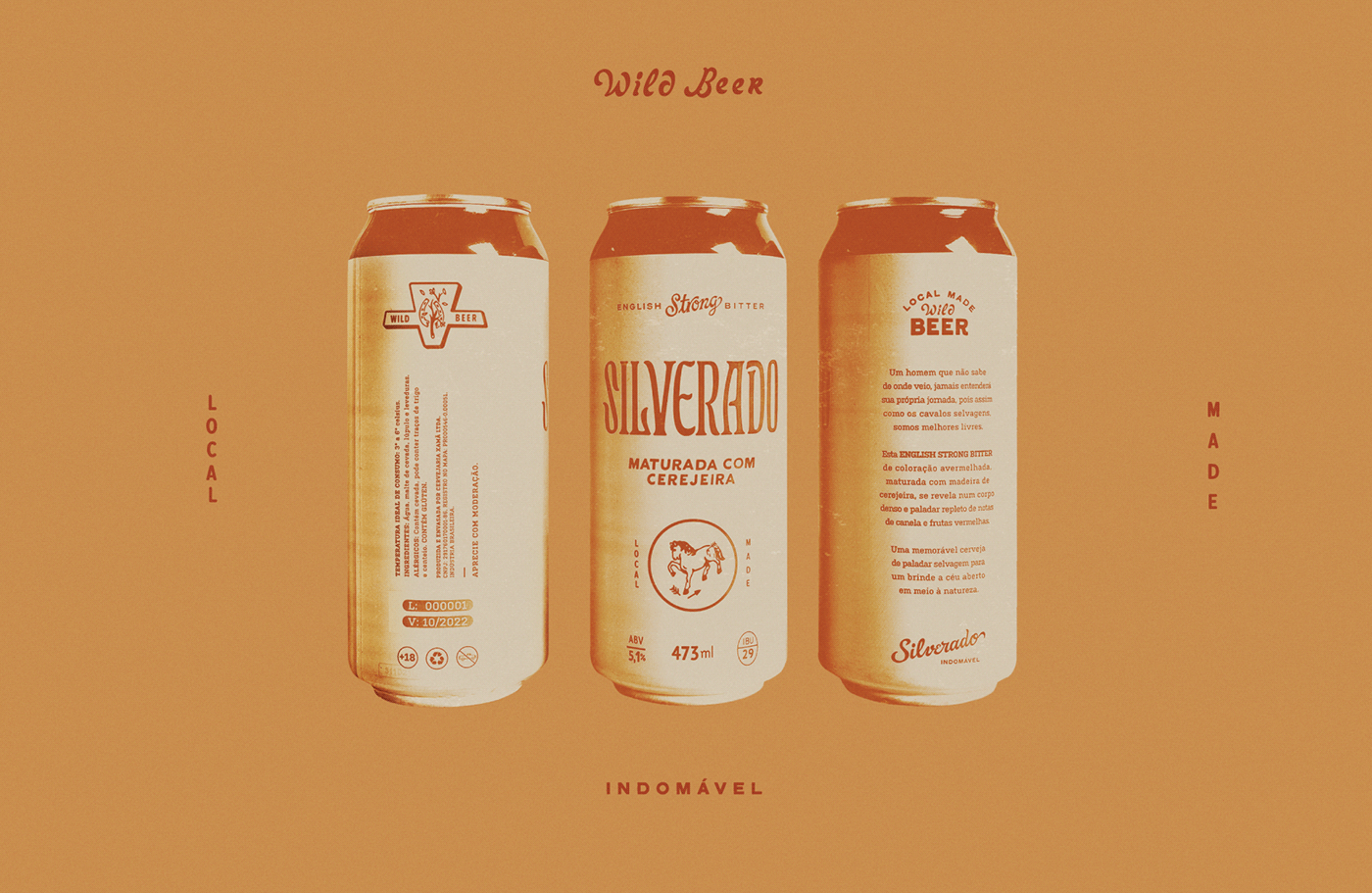
Guasca Studio took the direction and ran, creating a unique visual and verbal identity that goes great with a classic cowboy shirt. It’s a rough and tough brand that screams a grittiness evoked by the inspiration of wild horses.
Designed by Guasca Studio


